|
|
|
|
|
|
|
|
|
 Posted: Thu May 07, 2009 4:29 am Posted: Thu May 07, 2009 4:29 am
||--M.O.R.R.O.'.S S.C.R.I.B.B.L.E.S--||
[Sometimes my hands make pictures.]
So um. My stuff. Yes. Perhaps you'll see some stuff that I never finish because... I have this tendency to do that. It's horrible, I know. D:
FOREWORD/WARNING/ETC:
>> I'm not defensive about my stuff but there are times where I will try to explain myself. In which case I'm not trying to justify what I've done but simply explain the reasons behind my madness and perhaps get some more advice with circumstances in hand. Granted, a majority of the time, I will (hopefully) remember to state that ahead of time.
<< My style is very inconsistent. If you see something that gives you epic vibes--tell meee~
>> Feel free to tear my works to shreds. Spare no mercyyy~ Be brutally honest but patient? |D
<< I like red-lines--do you like red-lines?
>> I'm probably missing stuff here. Hurr. I'll be OCD and format this further if I ever think up anything.
--About--
[Sometimes I forget too.]
I have been drawing seriously since: July '06.
This makes: Roughly 3.5 years.
I like to draw: Whatever strikes my fancy.
I'm pretty good at: Colour schemes and composition. Aesthetics. :3
I fail at: Mechanical things. Hands. PERSPECTIVE. FORESHORTENING. Make background and foreground not look disconnected.
I hate drawing: Shoes, hands, feet, mechanical things, distinctive muscle mass (Bawww), and... I dunno.
My style is: Undefined, though I lean toward manga-anime with hints of realistic rendering. I love impressionists and their epic styles...
I am inspired by: Song lyrics, roleplays, TIA (<3), my characters, random things, sleep... Etc...
I am currently attempting to teach myself how to draw: Meaningful positioning.
Technical
Preferred Media: Graphite, Takamin P-chat, Watercolours, Wax Crayons. Yes, crayons...
Media Used:
[TRADITIONAL]
Graphite (H, HB, 3B, 6B), Inks, Pencil Crayons, Wax crayons, Chalk and Oil Pastels, Tempera, Liquid Tempera, Watercolours, Clay, Markers.
[DIGITAL]
Takamin P-chat, Adobe Photoshop Elements 3.0, Jasc Animation Shop 5.0, openCanvas 1.1 and 4.06 Plus, Shiipainter, Adobe Photoshop 7, SAI.
OP: Windows XP
RAM: 1 GB (Not enough these days. D: )
Notes: Can no longer live without her tablet.
Progress + Others
Commission: Closed Temporarily
Requests: Closed Temporarily
Gift Art: ---
Currently working on: School work. Too. Much.
Personal Projects: Too many to count.
--Links Out--
[Sometimes I just need to stretch my limbs.]
[-DeviantArt Account-]
|
 |
|
|
|
|
|
|
|
|
|
|
|
|
|
Posted: Thu May 07, 2009 6:23 am
They're pretty cool. ^_^ Maybe you should make the outlines of the boxes white to make them stand out and not blend with the art behind it.
|
|
|
|
|
|
|
|
|
|
|
|
|
|
|
|
|
|
Posted: Thu May 07, 2009 2:56 pm
Have a (the only) page from a short comic I've started just recently.
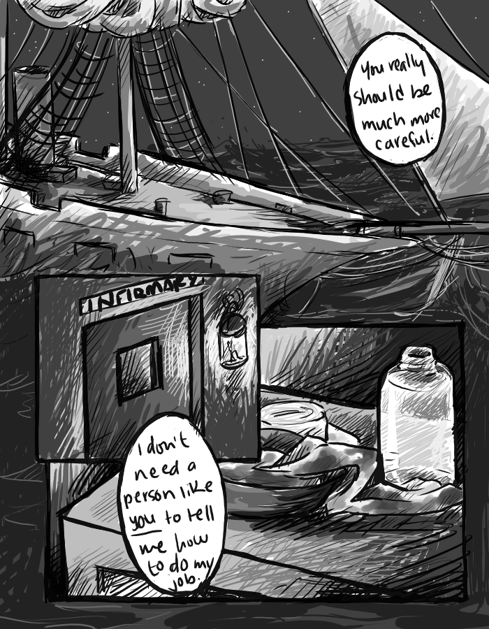
[--LINK--]
Filler!
Note: The above applies to this, I'm just.... Obsessive enough to want to separate this from the intro and stuff... Haha... sweatdrop
|
|
|
|
|
|
|
|
|
|
|
|
|
|
|
Posted: Thu May 07, 2009 3:01 pm
XD! I agree with neko on that - the boxes blend in a bit too much with the background right now... but that looks pretty cool - I don't know what the story is or where it's going, but am loving the strokes and spiffy lighting with the lantern ;3~
|
|
|
|
|
|
|
|
|
|
|
|
|
|
|
|
|
|
Posted: Tue May 26, 2009 2:10 pm
I...Haven't been alive since forever. School hates me.
[--LINK--]
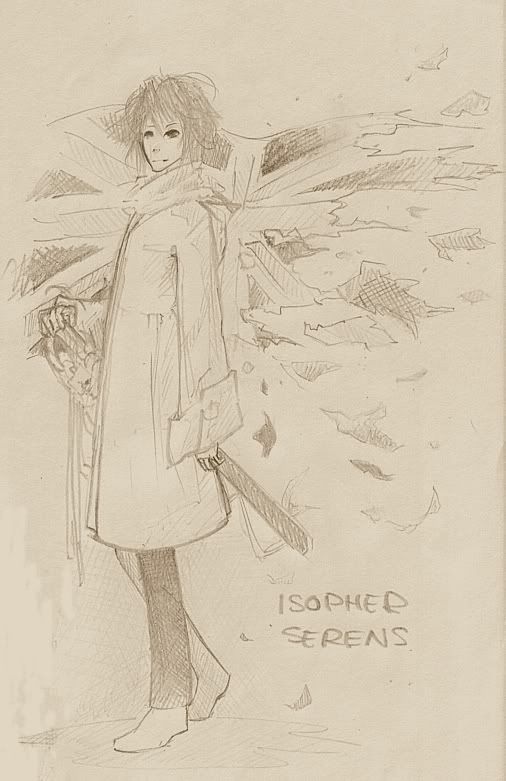
So I doodle in class? I drew this freehand without guidelines--don't know if that was a good idea?
[--LINK--]
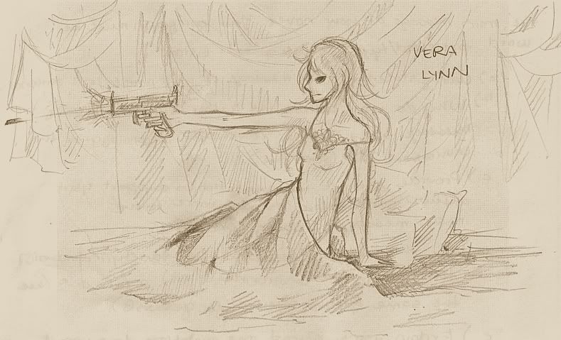
I hope this doesn't streeeetch the page... Again, more or less freehand. o3o I just like her pose... And stuff... 8D;; I'm not sure what to say.
Doodle-sketches but--tear it to pieces? :3
|
|
|
|
|
|
|
|
|
|
|
|
|
|
|
Posted: Sun May 31, 2009 12:39 am
Hurrr--this forum has not moved since I cam here last. A week ago. Oh well.

[dA LINK]
[BLOG LINK]
Here's a list of things I find irritating myself:
arrow MY PERSPECTIVE SUCKS.
arrow I CANNOT DRAW STRAIGHT LINES. (Which is understandable--I'm as straight as squiggle.)
arrow His's anatomy is off.
arrow Brown lines seemed a good idea in the first place except that turned out to be too light...
arrow I cannot draw butterflies. LOLFAIL. Or pianos.
arrow My lighting is a tad off I think...
arrow The music notes and wispy staff is too...busy for the background--it just looks cluttered/messy...
I'm experimenting with SAI--I find it quite nice. My first serious pic in a while~ Haha. I think I'mma make a second version of this with a simpler background for my desktop. :U
Anything addressing meh points is appreciated. TEAR THIS T'SHREADS GUYS. : D
Full-res is 2475x5500 pixels. I'm not really keen on uploading it since it's some 4 MB. Anyone want to see it?
|
|
|
|
|
|
|
|
|
|
|
|
|
|
|
|
Errol McGillivray Captain
|
Posted: Sun May 31, 2009 7:24 am
Why not link to it?
In the image with the gun, keep in mind that you can't target something if you aren't looking at it. Whether you're throwing a ball, shooting, or pointing, you will be looking at your target to aim. Make sure the sight of the gun lines up with the eyeline and the direction she's looking or it's not convincing.
Want to ask a specific question about perspective to start or do you not know about it at all?
|
|
|
|
|
|
|
|
|
|
|
|
|
|
|
Posted: Sun May 31, 2009 10:46 am
Hurr. Any advice for keeping it all lined up when doing things digitally? D: I find that I tend to change perspectives mid-picture if I'm doing it on the computer...
|
|
|
|
|
|
|
|
|
|
|
|
|
|
|
|
|
|
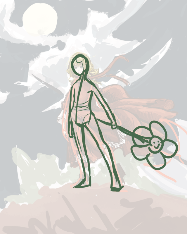
Posted: Sun Jun 14, 2009 11:01 pm
Gah. I live again.
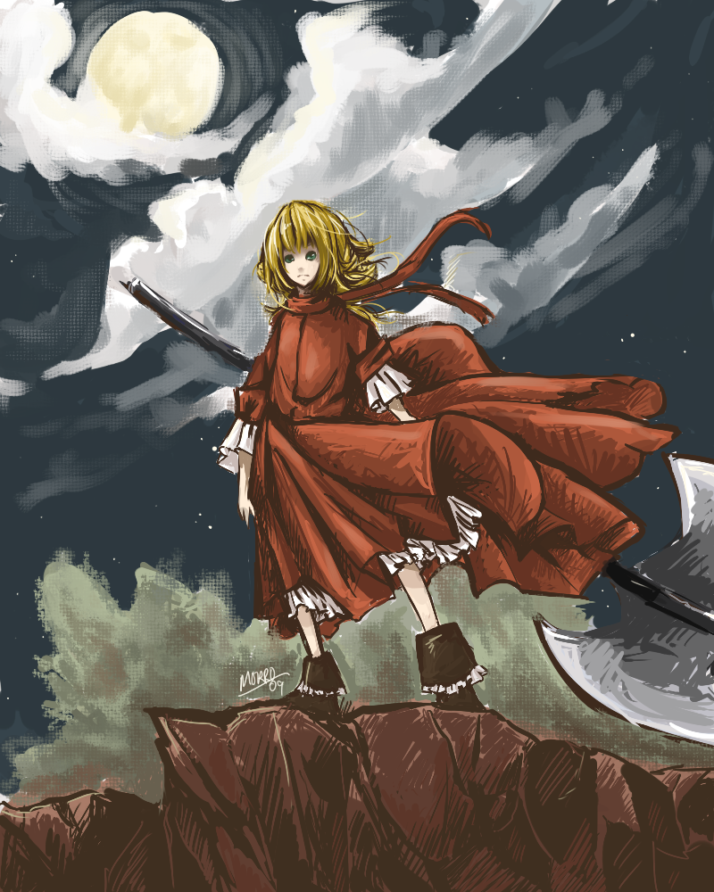
I'm quite fond of this. I'm experimenting with styles again. My biggest proud is how my rocks turned out--better than I thought it would. :3 I have all sorts of WIP shots--I should post them too. M'quite like this style--it's very sketchy. And quite a bit like how I draw in traditional media--crosshatching.
Though there is a question of anatomy here. With the odd angles, people have been suggesting that I move her right leg (our left) inward a bit. But when I do that, the balance looks a little off. ANATOMY SPECULATION PLEASE. D:
The WIPs:
[THUMBNAIL]
[ANATOMY OUTLINES]
I dunno anymore. Thoughts/comments/harsh crits?
|
|
|
|
|
|
|
|
|
|
|
|
|
|
|
Posted: Tue Jun 16, 2009 10:16 pm
okay so getting right into it
i'll be referring to your red line a lot just so you know
as for the stance its theoretically possible its highly uncomfortable and the person wouldn't be able to hold it for very long
there are a few ways you could fix it. one would be pulling the left . and the reason the balance looks off when you do that is the torso is too straight. when the body makes the jutting hip stance its 90% of the bend is in the lumbar portion of the spine. the thoracic spine on the other hand will barely bend.
secondly when someone is standing(especially in this stance) there will be a weight bearing leg. so the hip/pelvis will have a tilt
something you may want to consider when you're at the beginning of a drawing next time. instead of going straight into the box for the torso and hip(which you should be drawing as 2 separate pieces anyway) is start with the head and use a center line to the hip and you can start to fill in the rest form there
looking at your red line i noticed the left arm bent the wrong way. it doesn't matter so much in this pic but i thought you would like to know that and be aware of it for next time
i hope that helped if there is anything else in particular you didn't understand or have questions on let me know
|
|
|
|
|
|
|
|
|
|
|
|
|
|
|
|
|
|
Posted: Wed Jun 17, 2009 9:15 am
Kay so lumbar portion of the spine... How exactly is that supposed to bend?... |D;;
I 'greenlined' this according to how I read through the post--is it any better? o3o
|
|
|
|
|
|
|
|
|
|
|
|
|
|
|
Posted: Wed Jun 17, 2009 2:12 pm
yea its a lot better but i thought it might be easier for you to get if i just showed you. i green lined over your 1st red line. 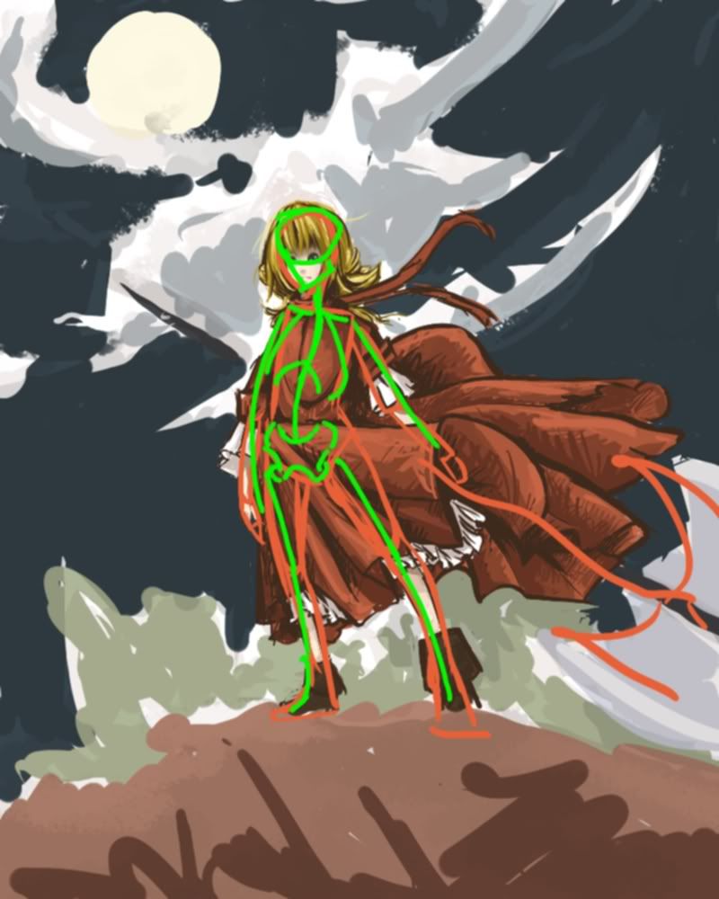 i hope that helps you understand alittle better Edit: oh don;t mind the head and pelvis they're not 100% correct they're more like markers for the spine
|
|
|
|
|
|
|
|
|
|
|
|
|
|
|
|
|
|
Posted: Wed Jun 17, 2009 8:59 pm
I don't have a lot to say critique wise, except that maybe the forehead looks a bit big..but if you made the hair so it didn't seem so far up, it could be fixed. But even that, it just looks stylized.
But I really wanted to just tell you that those clothes are absolutely beautiful. *w* I really like it. xD
|
|
|
|
|
|
|
|
|
|
|
|
|
|
|
Posted: Thu Jun 18, 2009 6:59 pm
@ Folken: ... I UNDERSTAND NAO. -gasp- 8DDD Much thaaaanks.
@ Zedhryx: ... Now that you mention it, her skull does look too big on her. Durrrrr... But yeah, thanks, I'm a sucker for flowing fabrics. Rofl.
|
|
|
|
|
|
|
|
|
|
|
|
|
|
|
|
|
|
Posted: Thu Jun 18, 2009 8:43 pm
no problem bro
human anatomy is really hard to understand. but once you get it its an awesome tool
|
|
|
|
|
|
|
|
|
|
|
|
|
|
|
|
|
|