|
|
|
|
|
|
|
|
|
 Posted: Sat Oct 11, 2008 12:20 pm Posted: Sat Oct 11, 2008 12:20 pm
Photoshop Tutorial: Avatar Editing
+Table of Contents+
. Post 1-Intro
. Post 2-Tutorial
. Post 3-Resources
. Post 4-Extra
Thanks for stopping by! I've put together a little tutorial for avatar editing.
I've also included some neat little resources for Photoshop, if you're
intersted. I hope you like it!
This tutorial was created for Adobe Photoshop CS. However, most earlier
versions of Photoshop are similar, like Photoshop v7.0 so feel free to apply
this tutorial there as well.
|
 |
|
|
|
|
|
|
|
|
|
|
|
|
|
Posted: Sat Oct 11, 2008 12:22 pm
Tutorial
I'll start by explaining a little about how I set up my work area. Start a new
document or open an existing base or naked avatar. If you don't have
any, go to www.tektek.org and access the free Dream Avatar Creator. I
always try to work with a document without a background; i.e a
transparent background. You can create edits with a color in the
background or even white if you wish, but I find it harder to make pieces
like wings and such that sit behind the actual avatar. On the left hand side,
I keep my reference pictures, usually it takes up 1/3 or less of the screen.
The avatar I'm editing I put on the right side of the screen that takes up
quite a bit of space. The only windows I keep open are the navigation
window, the layers window, and the toolbar. The navigation window I use
to check my editing progress while I edit so I don't have to zoom in and
out constantly. n.n I normally work at 600-800%, but sometimes zoom in
closer when I'm working on little details such as jewelry, gloves, or shoes.
Some people like to keep their color palette open, but it just seems a
waste of space to me when I can pick my colors just as easy on the toolbar.

So here is a new document, set up to work comfortably. Remember to
create a new layer for each piece you work on! You can create new layers
by using the small button on the bottom of the layers window. Layers are
awesome! Layers are love. heart You can switch them on and off (visible
or not visible) by using the little eye icon in the small box next to the
actual layer. It's helpful in many ways, to edit pieces that sit underneath
the piece you are working on (i.e wings, underskirts & tops, etc...) or to
check what it looks like with or without the piece. And to name your layers
for those of you that don't know how, right-click on the layer in the layer
window and left-click Layer Properties. It will bring up a box to name your
layer. Right-clicking the layer can also bring up the Blending Options which
is also very awesome, but I won't cover that here.

Locate your toolbar. Sometimes I place it to the far-left side of the page,
or right between my reference and my new document. Whichever works
best for you. Take the pencil tool (some people like to use the brush tool,
but I think the image is sharper if you use pencil) and begin to draw a
quick outline of the part you want to start with. It's simpler to start big and
work your way small. Pick larger parts like the tops, bottoms, or dresses.
You can always even start with the pieces that sit underneath everything
else, but if you remeber to create a new layer for each piece, it's not a
problem to take that layer and drag it under another. >.> (For settings on
the pencil, brush, and dodge/burn read further, I'll explain.)

Make sure the clothes outline is 'closed' meaning there are no open pixels
before choosing your Paint Bucket Tool and filling the area in with color.
It's okay if it's not perfect and a little sloppy, you'll be editing those parts
out with the next few steps.

I generally like to work with 4 main colors: an outline color, a base fill
color, a shadow color, and a highlight color. Sometimes I'll use 2 shadow
& highlight colors, because I don't like to rely on the lightening and
darkening tools much. For this edit, I used only 4 colors. I chose colors
that are similar, but lighter and darker than each other. You can also blend
in different colors to give it a multi-colored effect, like bringing in some
purple or pink. So take your pencil tool once again and starting with the
next darkest color, fill in some of the shadows, or darker parts of the
dress. Do as little or as much as you like. It's okay if the colors overlap
each other or it they touch the outline. After you place the colors where
you want them, locate your smudge tool. It's also on the toolbar, in the
shape of a hand with a finger sticking out. You might have to hold it down,
as it sits with the sharpen and blur tool. Take your smudge and blend the
colors until it looks right. (For setting the smudge tool, refer to the
instructions further down on setting the burn/dodge. The only difference is
with smudge, the higher the setting, the farther the pixels move. Set it
small for optimum blending.)

Continue to do this with all of your colors until you come to the highlights.
It's just the opposite if shadowing, finding the parts where the light
touches most. So add highlights as you see fit. I'm definately not an
expert on shadowing and highlighting, but this is the method I use. After
you're satisfied with your color placement, go to your toolbar and locate
the dodge/burn tool. The dodge tool looks like a round ball with a stick on
the end, and the burn tool looks like a hand. It's the same button though,
so whichever you want you'll have to hold down the tool to bring up the
other. Since I always do darker colors first, click your burn tool.
Burn/Dodge can be a good and a bad thing if you use it correctly. Like I
said, try not to rely on it too heavily because it's definately noticeable.
(Yet on black clothing I seem to use it alot... sweatdrop ) Set your tool so it
doesn't completely destroy your coloring. After you click on the burn tool,
adjust the settings by going to the top of the document. Notice that bar
under the File, Edit, Image, Layer, etc? That's your Tool Settings. You can
change brush size, range, and exposure or even enable airbrush settings.
For now, just set your brush to something small (like 3), keep your range
@100%, and adjust your exposure to something SMALL. Like 3-4% You
can adjust it higher, but just remember more exposure=darker shadows
way faster. If you keep it small you can control wherer your shadowing
goes much better. The same method can be used for the dodge tool.

Now that we're finished with the main part of the dress, let's move on the
the underskirt. Normally, I would create a new layer and edit an entire
underdress, but for now I'll just be doing a partial so the tut goes quicker.
Take your handy-dandy pencil tool once again and block out the color. I
didn't use an outline color for this step since the piece we're working on
sits underneath the dress. You can do it either way, it really doesn't
matter. Whatever you're comfortable with. whee

Pick your colors and begin to fill it in, using your darker>lighten method
until you're satisfied.

Finish up with your burn/dodge if needed. On the skirt I used a lot of
dodge (which I don't normally do! gonk ) just to bring up a contrast
between the blue colors I chose and the white parts of the dress.

Using the above method, continue onto other parts of your edit, such as
the sleeves of the dress. Block in your color, add 3 more colors, and
darken/highlight till it looks the way you want.

Now you can zoom in and work on smaller parts, like the lace on the dress
(which I only used one color for), the choker, (also only one color) and the
shoes. For some reason I always do shoes 2nd to last, but they always
seem to be UNDER the skirt, pants, or dress. This is where the visibility
button is helpful. Click on the eye next to the dress layer to switch it off.
Then you can edit your shoes without having the clothing in the way. You
could always just edit the shoes first, but this is the method I use, and
sometimes I like to edit the dress before picking which shoes will go with
it. Its like picking out your clothes in the morning. xp

Now lets do hair. It's important to always have good reference pictures!
The hair on our original reference picture isn't very great, so I picked a
new one. You can do this on all of your pieces; have separate reference
pictures if you want. Better reference = more detail. So we'll create an
outline for the hair, and fill it in with color. Add your shadows.....and on
this particular hairstyle we want the strands to show. So make sure you
use a dark enough color for that.

Continue to add your colors, paying attention to the shadows and
highlights on the bangs and top of the head.

Now let's do the veil! Oh joy. Switch back to your first reference pic, and
zoom back out. The veil was tricky, and I still don't like the way it came
out. Don't feel bad if you have to delete you layer and start over again. I
have to do it alot, and I catch myself re-editing parts constantly. No one's
perfect. Except for maybe Meriko, her edits are teh gorgeous. gonk heart
Take your first color, and outline the veil, fill it in with your base color.
Then, take your second color, and pencil over the lighter parts of the veil,
creating the darker parts, and filling them with a base color as well.
There's something else I'd like to mention here, and it has to do with using
the Paint Bucket Tool. When you fill in an area of color, do you notice that
some of the base color gets outside of the pixels? I call it overfill! <3 If
you're checking your progress in the navigation window, you'll notice that
it makes the lines look sloppy to have the base color outside of your
outlines. You can do one of two things: 1) go to your eraser tool, and
erase it pixel by pixel or 2) leave it and hope it gets covered up by the
blending. I always use method one. To avoid getting this overfill, you can
always opt to use just your pencil tool to fill in your layers, in place of
using the Paint Bucket Tool. I only use it because for me, it's quicker than
trying to block in color.

Then just use your smudge tool to blend the colors, add your dark/light
coloring.....

And drop the opacity of the layer. I only did this on the veil since it's not
an opaque piece of clothing. In the layers window, at the top of the layers
next to the box where you choose the layer style, there is an opacity
button. Slide it as low or as high as you want. For the veil, I set it at 81%.
To get a better idea of just how see thru you want it, you can create a
layer just for a background color to check it against. Switch it on and off,
and delete it when you're done.
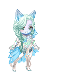
Finished Product: (w/veil, w/out veil)
 
Other Edits Created w/This Method:
  
|
|
|
|
|
|
|
|
|
|
|
|
|
|
|
|
|
|
Posted: Sat Oct 11, 2008 12:27 pm
|
|
|
|
|
|
|
|
|
|
Posted: Mon Oct 13, 2008 7:01 am
|
|
|
|
|
|
|
|
|
|
|
|
|
Posted: Mon Oct 13, 2008 7:31 am
Okay, tutorial done! Hopefully it's useful heart
|
|
|
|
|
|
|
|
|
|
|
|
|
|
|
Posted: Thu Oct 16, 2008 10:32 am
"I'll never forget taking this journey with you? and meeting you. Being with you." ♥  ♥ ♥ Awesome tutorial ^^ thank you princesspwrm! ♥♥ ♥"If there really is a God, and he could grant me just one wish, I'd go back to the day we met ♥"If there really is a God, and he could grant me just one wish, I'd go back to the day we met..."
|
|
|
|
|
|
|
|
|
|
|
|
|
|
|
|
|
|
Posted: Sun Oct 19, 2008 7:28 pm
Your welcome! And thanks ^^
|
|
|
|
|
|
|
|
|
|
|
|
|
|
|
Posted: Wed Oct 29, 2008 2:01 pm
Thanks for the tutorial. I always have trouble with the highlights in black hair =P
|
|
|
|
|
|
|
|
|
|
|
|
|
|
|
|
|
|
Posted: Sun Nov 23, 2008 1:10 am
ooh! lovely tutorial! thanks ~ <3
|
|
|
|
|
|
|
|
|
|
|
|
|
|
|
|
|
|