|
|
| Going to enter? |
| of course! |
|
60% |
[ 3 ] |
| .. I don't know... |
|
40% |
[ 2 ] |
| no... |
|
0% |
[ 0 ] |
|
| Total Votes : 5 |
|
|
|
|
|
|
|
|
 Posted: Thu Sep 01, 2005 1:52 pm Posted: Thu Sep 01, 2005 1:52 pm
----[September Contest]----
September is here, the summer is over and everyone is going back to school. In honor of getting back to business, this months contest, it business like. What you will design is letterhead and a matching envelope. it could be for you, for a pretend business, your school, a real business, whatever you would like.
for anyone who is unsure, letterhead is just a fancy was of saying business stationary. it''s a design that goes on the paper for a business'' letters, usually has the company name, phone number, etc... kind of the same idea as a business card.
Resources: Please stick to images you have made your self, no copying logos and such, letterhead is not something you need stock images for smile
Deadline: Midnight September 31, 2005
Limitations: 10 entries per member.
File Format: .jpg, .png, or .gif are best, .bmp is ok if you must.
Size: Please try to keep your submission less than 800px wide. ( you may submit a link to a lager version for people to view)
Prize: Thank you letter for September 2005.
To enter: Post you submission in this topic.
Rules: This must be your own work, and must adhere to Gaia Online''s rules.
P.S. I''m running low on contest ideas, so if anyone is thinking "wow, it would be neat if we could do ____" please, speak up, ok?
|
 |
|
|
|
|
|
|
|
|
|
|
|
|
|
Posted: Thu Sep 01, 2005 2:00 pm
ack, guilds are going down. I'll fix the color/title issue as next week when they come back, it won't let me now.
|
|
|
|
|
|
|
|
|
|
|
|
|
|
|
|
|
|
Posted: Sat Sep 03, 2005 10:05 am
LetterHead: (It's a letterhead, I didn't see the need to put it one a fake sheet of paper that would just make it take longer to load.)  http://img233.imageshack.us/img233/9760/letterhead8xu.jpg Envelope: http://img400.imageshack.us/img400/492/env4fl.jpg
|
|
|
|
|
|
|
|
|
|
|
|
|
|
|
Posted: Sat Sep 03, 2005 7:39 pm
weee....i like to enter in this contest!!!! must invent business name sweatdrop
|
|
|
|
|
|
|
|
|
|
|
|
|
|
|
|
|
|
Posted: Mon Sep 05, 2005 3:25 am
my entry: too simple but i'll try to get another entry click the image for the bigger version 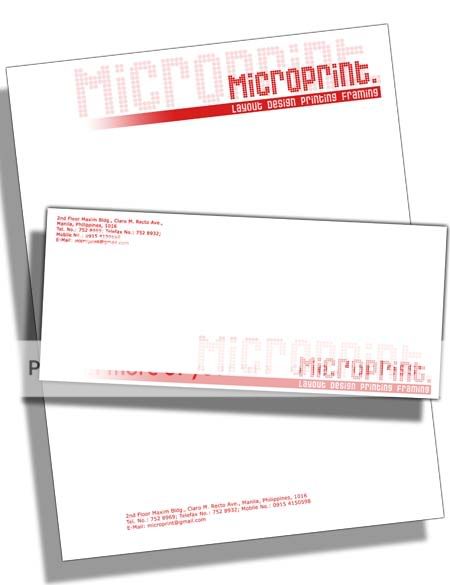
|
|
|
|
|
|
|
|
|
|
|
|
|
|
|
Posted: Mon Sep 05, 2005 5:19 am
Tohru Honda-san I'm going to make it RIGHT now. So I won't forget like last time. domokun EDIT Here it is. http://img233.imageshack.us/img233/9760/letterhead8xu.jpg EDIT- Epppp, I forgot the Envelope. I'll post it. biggrin they are really good, I remeber my marching band instructor in high school had us watch video tapes of them to try to show us where we could improve. 3nodding I'm not sure If I ever saw them live, I don't think I did sad
|
|
|
|
|
|
|
|
|
|
|
|
|
|
|
|
|
|
Posted: Mon Sep 05, 2005 5:41 am
|
|
|
|
|
|
|
|
|
|
Posted: Mon Sep 05, 2005 3:21 pm
[ P r i s e a ]: That is VERY nice, I really like how you handled your placement. Looks very, very clean, sharp and professional. I have to say that you already stand a great chance at winning, it'll be fun trying to top what you've made biggrin
|
|
|
|
|
|
|
|
|
|
|
|
|
|
|
|
|
|
Posted: Mon Sep 05, 2005 10:42 pm
Raine Dragon they are really good, I remeber my marching band instructor in high school had us watch video tapes of them to try to show us where we could improve. 3nodding I'm not sure If I ever saw them live, I don't think I did sad Cool! biggrin I seen them live several times in 03, when I was in corps, our corps housed with them for a week for everydays. biggrin
|
|
|
|
|
|
|
|
|
|
|
|
|
|
|
Posted: Tue Sep 06, 2005 1:55 pm
 Wow that ended up looking like [Prisea]'s, hmm, maybe I'll find time to do another entry...
|
|
|
|
|
|
|
|
|
|
|
|
|
|
|
|
|
|
Posted: Mon Sep 19, 2005 7:42 am
@Tsujigiri-san: hmmmm....that remind me to make another one sweatdrop
i think ours look the same xp
|
|
|
|
|
|
|
|
|
|
|
|
|
|
|
Posted: Mon Sep 19, 2005 10:17 am
Yeah, I know they look very similar. I was debating whether or not to post it, but I decided that since I had started it before you posted I would just go ahead. There are some very slight but important differences in the design...
|
|
|
|
|
|
|
|
|
|
|
|
|
|
|
|
|
|
Posted: Mon Sep 26, 2005 3:10 pm
I wish I had time to do this sort of thing.
Too busy doing this sort of thing for classes though. sweatdrop
|
|
|
|
|
|
|
|
|
|
|
|
|
|
|
Posted: Wed Sep 28, 2005 9:05 am
w00t! I'm not going to miss out this time! It's only the 29th! xd Lemme turn this strange design into something actually printable... *edit* ok, here they are! Hope they don't stretch the page too much... The letterhead:  The envelope: (top left corner; no need to show the rest) 
|
|
|
|
|
|
|
|
|
|
|
|
|
|
|
|
|
|
Posted: Wed Sep 28, 2005 10:49 am
shoot, I'm not going to have time to enter another one.
|
|
|
|
|
|
|
|
|
|
|
|
|
|
|
|
|
|