|
|
|
|
|
|
|
 Posted: Sun Mar 30, 2008 9:28 am Posted: Sun Mar 30, 2008 9:28 am
Name: Katia Age: 14 Sex: F Experience: Taken proffesional classes at MIAD and from private art teachers. Have been drawing anime for about 9 months now. I know how to use almost any media, so I can help with not only CG or sketching. Strong points: Females, Bishounen, elegance, cuteness, lollitas Weak Points: Muscular men, animals, mechs Gallery: http://0vera.deviantart.com/ <-- (New and doesn't have very much on it) Please critique me to your full extent. I hate it when people sugar coat. If something looks horrible, please say so. I handle critique very well, so do not worry about offending me in any way. I will post pictures that I need critiques on in the next post with titles. When critiquing, please put the title of the piece you are reffering to. Red lines are loved.
|
 |
|
|
|
|
|
|
|
|
|
|
|
|
|
Posted: Sun Mar 30, 2008 9:29 am
ART IN NEED OF CRITIQUE
Justine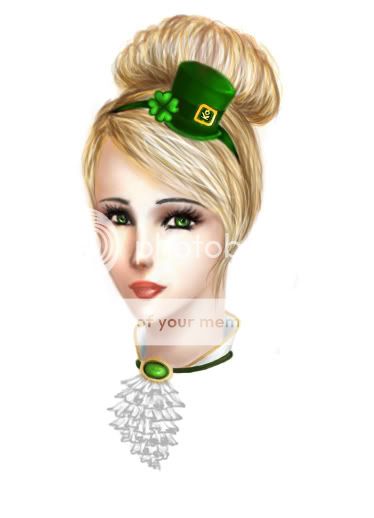 I am really frustrated right now because the image is so much worse when I upload it onto the internet. The image is just darker and doesn't look as fresh. Anyone know how to fix that?
|
|
|
|
|
|
|
|
|
|
|
|
|
|
|
|
Errol McGillivray Captain
|
Posted: Sun Mar 30, 2008 12:44 pm
I think your problem is lack of defining planes with light. I'm fairly new at it myself, but I'm okay at it with charcoal and working on pencil is getting better. (I haven't really done much digitally, but it's all the same s**t anyway.) Check this out. Check this one out too.A lot of people use greyscale as an underpainting before they start to work in color. I'm not sure how it works, but I'm sure one of the better painters will come and say something. Sorry I can't be more useful on this one.
|
|
|
|
|
|
|
|
|
|
|
|
|
|
|
Posted: Sun Mar 30, 2008 12:53 pm
I quite like that head shot. Her face look delicate though slightly rigid. Her eyes appear to be a little tilted but the bottom half of her face goes straight down. [Though I wouldn't recommend you tweak this based on just my opinion as it may be just me.]
Perhaps try some more dynamic shading to further define her facial shape/features?
|
|
|
|
|
|
|
|
|
|
|
|
|
|
|
|
|
|
Posted: Sun Mar 30, 2008 1:11 pm
Errol McGillivray I think your problem is lack of defining planes with light. I'm fairly new at it myself, but I'm okay at it with charcoal and working on pencil is getting better. (I haven't really done much digitally, but it's all the same s**t anyway.) Check this out. Check this one out too.A lot of people use greyscale as an underpainting before they start to work in color. I'm not sure how it works, but I'm sure one of the better painters will come and say something. Sorry I can't be more useful on this one. It's just that whenever I try to do more of a contrast between light and dark, the face looses it's softness and femininity. Any tips on that?
|
|
|
|
|
|
|
|
|
|
|
|
|
|
|
Posted: Sun Mar 30, 2008 1:13 pm
Danaidae I quite like that head shot. Her face look delicate though slightly rigid. Her eyes appear to be a little tilted but the bottom half of her face goes straight down. [Though I wouldn't recommend you tweak this based on just my opinion as it may be just me.] Perhaps try some more dynamic shading to further define her facial shape/features? Thanks, I'll try it and where that takes me.
|
|
|
|
|
|
|
|
|
|
|
|
|
|
|
|
|
|
Posted: Sun Mar 30, 2008 1:29 pm
I don't see any ears. Are they behind her hair or something?
|
|
|
|
|
|
|
|
|
|
|
|
|
|
|
Posted: Sun Mar 30, 2008 3:49 pm
oVera Errol McGillivray I think your problem is lack of defining planes with light. I'm fairly new at it myself, but I'm okay at it with charcoal and working on pencil is getting better. (I haven't really done much digitally, but it's all the same s**t anyway.) Check this out. Check this one out too.A lot of people use greyscale as an underpainting before they start to work in color. I'm not sure how it works, but I'm sure one of the better painters will come and say something. Sorry I can't be more useful on this one. It's just that whenever I try to do more of a contrast between light and dark, the face looses it's softness and femininity. Any tips on that? Well, do what the professionals do. Grab some pictures of different women and reference. You get the base shape you want, then mix and match features. And then tweek to fit your character. I would say that if you feel things are too hard, look at creating more of the forms from the color and shading and not with lines. Also, you can put in the harder lighting and then tone it down. That's what I do with charcoal. I add the shade and then lift off the tone to soften the forms.
|
|
|
|
|
|
Errol McGillivray Captain
|
|
|
|
|
|
|
|
|
|
|
|
Posted: Sun Mar 30, 2008 6:08 pm
I have redone the image, so please critique that one now :]
Thank you for everyone's help!
I am really frustrated right now because the image is so much worse when I upload it onto the internet. The image is just darker and doesn't look as fresh.
Anyone know how to fix that?
|
|
|
|
|
|
|
|
|
|
|
|
|
|
|
Posted: Mon Mar 31, 2008 7:08 am
oVera I have redone the image, so please critique that one now :] Thank you for everyone's help! I am really frustrated right now because the image is so much worse when I upload it onto the internet. The image is just darker and doesn't look as fresh. Anyone know how to fix that? You might need to check it out on a different monitor. This one is far better than the last as far as values go. Now that you have more of a range, with darker ones, the form is turning more in space and getting some volume.
|
|
|
|
|
|
Errol McGillivray Captain
|
|
|
|
|
|
|
|
|
|
|
|
Posted: Mon Mar 31, 2008 4:39 pm
Errol McGillivray oVera I have redone the image, so please critique that one now :] Thank you for everyone's help! I am really frustrated right now because the image is so much worse when I upload it onto the internet. The image is just darker and doesn't look as fresh. Anyone know how to fix that? You might need to check it out on a different monitor. This one is far better than the last as far as values go. Now that you have more of a range, with darker ones, the form is turning more in space and getting some volume. Thanks, I think so too :] It's just in Photoshop, the face looks a lot warmer and is generally a warmer image. When I upload it only the internet, it becomes slightly more dull.
|
|
|
|
|
|
|
|
|
|
|
|
|
|
|
Posted: Fri Apr 04, 2008 11:29 am
That's because of the compression you use when you save it as a flat image. pjegs are lossy and you will lose resolution. I believe tif files are lossless. (It's been some years since I've done this when I was doing 3d and importing textures). They're huge files though. I'm sure you can find something online that will talk about compression and the different file types.
What resolution are you working at? (Pixel size and dpi)
|
|
|
|
|
|
Errol McGillivray Captain
|
|
|
|
|
|
|
|
|
|
|
|
Posted: Fri Apr 04, 2008 2:02 pm
Errol McGillivray That's because of the compression you use when you save it as a flat image. pjegs are lossy and you will lose resolution. I believe tif files are lossless. (It's been some years since I've done this when I was doing 3d and importing textures). They're huge files though. I'm sure you can find something online that will talk about compression and the different file types. What resolution are you working at? (Pixel size and dpi) Actually, it has to do with the Photoshop gamma display. When I open the jpeg into Photoshop, it looks just fine. 72dpi
|
|
|
|
|
|
|
|
|
|
|
|
|
|
|
Posted: Sat Apr 05, 2008 4:04 am
This could be your problem.
72dpi is good for quick color roughs and sketches - it is a very low resolution. This means when you save it and export it to the internet - the result will be more pixilated, with colors that aren't true to the original.
If you didn't create this using a higher resolution you might be SOL aside from attempting to manually adjust contrast/saturation to brighten the image and then re-saving.
~*~
Other possible solutions for future work:
If you must use 72dpi for it's lower file size, try to use larger canvas sizes. When you're ready to export the image for the internet, shrink your image down to the size you want. That way you'll get a sharper image with a low file size.
In general though most artists who want a true-to-original image work at 100dpi and up. 300dpi is the (required) standard for print quality.
Some artists save their file as a .png because it holds more detail but again you will have a larger file size.
~*~
I hope this has helped. I am not too knowledgable when it comes to the technicalities but what i've described has been my personal experience.
I have also noticed that when I work on a painting in photoshop the picture will be crisp before I save it - but once saved (locked in to image quality parameters) the picture changes - the quality seeming to fade depending on the resolution and image quality I chose.
I use Photoshop 5.5. I don't know if this is true for other versions.
~*~
|
|
|
|
|
|
|
|
|
|
|
|
|
|
|
|
|
|
Posted: Sat Apr 05, 2008 3:19 pm
Arezou - The Dream Walker This could be your problem.
72dpi is good for quick color roughs and sketches - it is a very low resolution. This means when you save it and export it to the internet - the result will be more pixilated, with colors that aren't true to the original.
If you didn't create this using a higher resolution you might be SOL aside from attempting to manually adjust contrast/saturation to brighten the image and then re-saving.
~*~
Other possible solutions for future work:
If you must use 72dpi for it's lower file size, try to use larger canvas sizes. When you're ready to export the image for the internet, shrink your image down to the size you want. That way you'll get a sharper image with a low file size.
In general though most artists who want a true-to-original image work at 100dpi and up. 300dpi is the (required) standard for print quality.
Some artists save their file as a .png because it holds more detail but again you will have a larger file size.
~*~
I hope this has helped. I am not too knowledgable when it comes to the technicalities but what i've described has been my personal experience.
I have also noticed that when I work on a painting in photoshop the picture will be crisp before I save it - but once saved (locked in to image quality parameters) the picture changes - the quality seeming to fade depending on the resolution and image quality I chose.
I use Photoshop 5.5. I don't know if this is true for other versions.
~*~
Actually, that did help :] Thanks.
|
|
|
|
|
|
|
|
|
|
|
|
|
|