Welcome to Gaia! ::

Reply Art Fags
That's not what your mom said last night

Quick Reply

Enter both words below, separated by a space:

Can't read the text? Click here

Submit

otimohoT

PostPosted: Mon Feb 25, 2008 6:42 pm


User Image
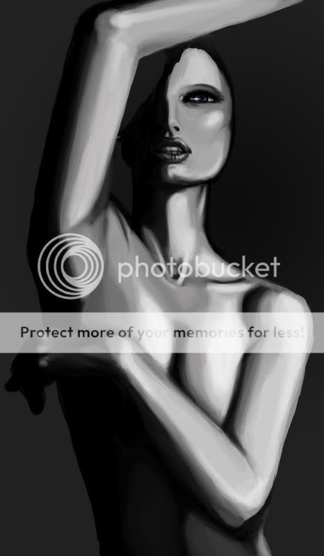
Critiques on the body shading? I'm not sure where to go with the stomach and I think it looks a little too flat to me, fyi
Hair will be overflowing and going everywhere, that's just me laying down where it'll be so far, hair shading update to come soon
PostPosted: Mon Feb 25, 2008 7:07 pm


The shading isn't really all that great, technique wise; you're not blending it enough so it seems to smoothly transgress from one area to another; especially around the eye area (are you following a reference carefully?)
There also isn't enough attention to details; the shadows shouldn't completely be back if there's that much light.

Professor_Markus


otimohoT

PostPosted: Mon Feb 25, 2008 8:47 pm


The dramatic shading and abrupt value change on the eye is intentional, moving on
I seriously don't get the shading thing, I mean I can see some rough areas esp. her left shoulder but otherwise I kinda disagree
It's slightly modified but otherwise the pose and shading is done from a ref
PostPosted: Mon Feb 25, 2008 10:46 pm


Ya, I dig the shading actually, it gives the piece kind of an oil-painty look. Her face is a little boxy- and the left shoulder's shading is kinda messed, but nothing too big.

Would love to see you post more- Tom, sketches especially. I always dig your sketch-o-tronic style.

THIS NAME IS QUITE SMART

6,550 Points
  • First step to fame 200
  • Megathread 100
  • Mark Twain 100

Wyf

Liberal Garbage

8,625 Points
  • Gaian 50
  • Statustician 100
  • Member 100
PostPosted: Mon Feb 25, 2008 11:46 pm


I think your main problem from before has been fully addressed (and unmentioned?) You are getting the dramatic poses right and the anatomy pretty well.
I can't really judge because I know you'll add more twists to it making it better, so just keep going!
PostPosted: Tue Feb 26, 2008 8:54 am


http://img155.imageshack.us/img155/3361/holyballshd4.jpg

I second the professor on the lack of reflected light (right?)...you've got such a bright color for the bg right now it makes s**t look awkward. It doesn't have to be much, something to help define the forms and dramatically give the figure some substance (I suddenly ponder if you're going for something mignola-ish). Speakin of bright colors, you really should either change the value/hue of the hair or the bg, they're so damn close value wise its a hassle on the eyes.


blah blah blahbitty blah

warrior_of_boognish

Destructive Lunatic


mountain pony

Aged Gaian

PostPosted: Tue Feb 26, 2008 6:57 pm


the top of her right (our left) boob looks completely flat
her nose is michael jackson pointy and sticks out next 2 her lushes lips and huge a** eyes
and whats is her top hand gonna be doing???
PostPosted: Wed Feb 27, 2008 10:11 pm


User Image
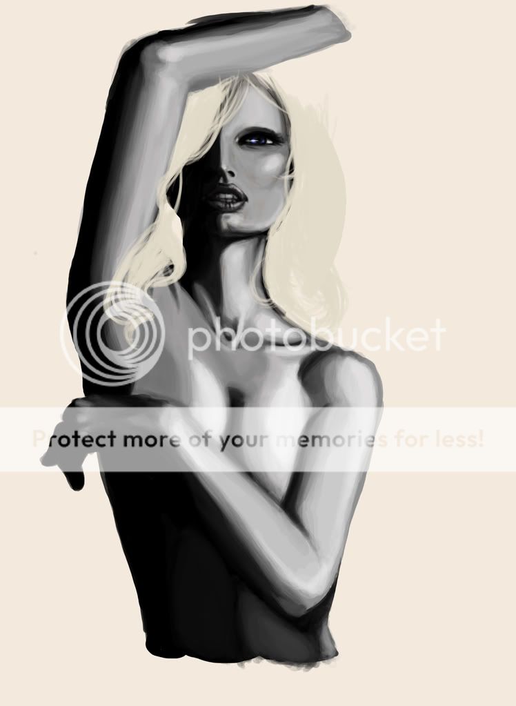
ok so I smoothed out the shading a bit or I hope I did
I added a darker bg and I would like to keep the more dramatic lighting, I think the large dark areas are workin for me on this piece
I tried to round out the breast a bit more but I'm not really sure how round a free-sitting breast would look when it would essentially be lifted by her arm movement hmmm

Took out the hair for now so I can focus on the body and then do the hair and shade to account for that a bit later, idk I like to think in parts
However I give up on her right armpit, the hair will be covering it like it was before sighs

No idea what to do with the hand either so it's not a priority atm
otimohoT


reapersun


Naughty Goat

19,400 Points
  • Demonic Associate 100
  • Survivor 150
  • Somebody Likes You 100
PostPosted: Thu Feb 28, 2008 10:53 am


I strongly agree about adding more reflected light in the shading, even if it's just subtle; it would really make the form pop out more. If you're adamantly against it, you could just finish it to your liking then go back and try the chiaroscuro, just to see how it would look. No harm in experimenting.

Are you going to spend some more time on the face? It looks very awkward right now; it's like it's supposed to be tilted up, but the chin's too short and the eyes are too high up for that. Also, her jaw is reeeeally wide, as is her eye... But I guess the eye could be written off as some stylization that may work for the finished piece.
PostPosted: Thu Feb 28, 2008 3:21 pm


Karolina Kurkova has a wide jaw, and she is my ref
I'm trying to work against the archetypal face and body shape that I'm in the habit of drawing for my women

otimohoT

Reply
Art Fags

 
Manage Your Items
Other Stuff
Get GCash
Offers
Get Items
More Items
Where Everyone Hangs Out
Other Community Areas
Virtual Spaces
Fun Stuff
Gaia's Games
Mini-Games
Play with GCash
Play with Platinum