.ONE.
The first thing you need is a head. It's very hard to draw hair without one! A mistake I see very often happens when people draw just the face, or start with the hair, and something's not right.. either the top/back of the head isn't big enough, or it's the wrong shape, or the part in the hair is too deep and looks a bit like a part in the head, instead.
Things like this will not be nearly as much of a problem if you draw the head first. ^_^ And if you just draw it lightly, (which you should, so you can erase it easier later) you won't even notice it once you get the hair on there, so don't worry about it distracting from the overall picture. And don't worry about having to erase it.. you can do that in the later stages of the drawing. (Or you don't even have to, it's up to you of course. :3 )
These are the guidelines I use for the head.
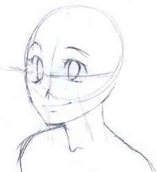
Just a couple lines for the face, and one line coming from the very center of the head for the neck. Notice how the back of the head is bigger on the top, while the front of the head (the face) is larger lower down.
It's not just a round sphere.. if it helps you, you can think of it a bit like an upturned egg, with the large part as the back of the skull, and the tip of the egg as the chin. It works really well, in anime style, to exaggerate this, and make the top/back of the head quite large. Try exaggerating it much further than you think you can, and see what happens. (Actually, try this with everything. ^__~ It will teach you a lot, and can really help you improve.)
I try to get the features sort of in the right place, but don't entirely finish them, because I may want to change the placement a bit when I've got some of the hair on. (Actually, that first example pic with the guidelines is more finished than usual because I drew it for the tutorial. XD; My faces often start out looking sort of mutated.) Basically, I try to draw everything at once. That way, I can change things much easier and more quickly, as I don't waste time perfecting things I'll have to erase later, and I (usually) don't have to erase anything I really like and have worked hard on. It's especially good to sketch light when you're just starting to use this technique, because it can be difficult to estimate how the head should look without hair, and getting the proportions and placement can take some practice. Don't get discouraged if it's hard at first, it will most likely help you out a lot once you get the hang of it!
(But wait, isn't this a hair tutorial? XD; On to the hair!)
.TWO.
Now comes the rough sketch of the hair. This is probably the most important step, so pay attention! Just draw the basic shape of the hair. :3 No matter what the hairstyle is, (long or short, male or female...) it works best, in my opinion, to use loose, flowing strokes... just relax, don't go too slowly, and don't worry about making it perfect right now. Real hair does whatever it wants, so I figure it's good to keep that in mind while you're drawing it.
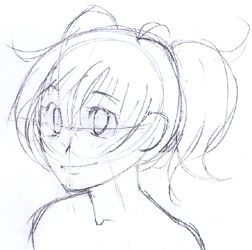
(See how you barely notice the light drawing of the bare head anymore, like I mentioned in step one? Also, notice how the hair doesn't lay down flat against the head. Fluffy/thick hair is important in many anime styles, especially on cute characters!)
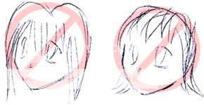
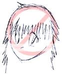
Trying to carefully sketch and control every strand, like this:
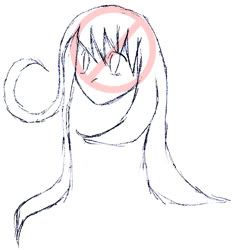
will only make it look stiff and unnatural, because you can't control every strand of hair... that's just not how the world works. (And whenever you get stuck in art, the first thing you should do is turn to the real world for guidance. ^__~ ) Just pay attention to the overall shape that the hair makes, (because hair doesn't just fly everywhere, it tends to move in masses, with just the occasional few strands that go astray) especially if it's long. This could be an important part of your composition.* Also, pay attention to where the hair is growing from, and the logic behind it. The example girl has a part in her hair, because it's done up in pigtails. And all the lines in the pigtails are drawn from the direction of the place where they are tied. The strands of the bangs are all drawn from the general direction of the top of the head.
I really want to emphasize how effective it can be to use loose, long strokes. And also, to think of the length of the hair. Sometimes people will use short, fuzzy lines to draw hair, probably because hair is made up of many tiny strands, and fuzzy lines may seem like a good way to represent that.
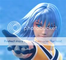
But hair is usually smoother than that, and most of the time, all the strands are about the same length. (Unless it's layered, like, say.. Riku from Kingdom Hearts.
But this is still not the best technique to use, even in that situation, because you still have to keep in mind the direction from which the hair is growing, and that's harder to do with erratic, fuzzy lines.)
A quick and easy technique to make hair, something I do often, is to use two kinds of lines: some that are fairly straight, and some that are more curved.
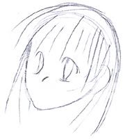 and with the curved lines added ===>
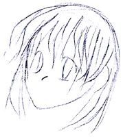
(You may have noticed that the scanner I'm using, which is my mom's, has issues with pencil.. but, like, only half the time;;; Sorry about the grainy pics. ^^; )
Having this variation in how curved your lines are will automatically give you nice looking strands of hair. Don't worry about connecting them at the tips, they'll connect by themselves, or you can fix it up later. The important part is getting that nice flow, even if it's a bit messy. (Actually, I was too careful when I drew this example sketch, and it doesn't look as nice as usual. ^^;; Let it be a lesson: Don't worry about what people will think, this is just the sketch stage, so just let it flow!) But I may be getting too style-specific... you don't have to do it this way if you don't want to! It's just a way that I find useful for getting nice shapes, and giving the hair some body, instead of worrying about it looking thin and limp.
(under construction from this point on. Mostly, there are just no pics yet. ^^; )
.THREE.
Alright, at this point you're past the hard part! (Even if cleaning up/inking is a pain for you, things will usually turn out pretty nice if you get the sketch right. ^_~ ) I'm going to ink this picture with pen, since that's how I usually finish my work. But if you do something else, like color your raw sketches, or ink in a CG program, go right ahead. :3 Hopefully you'll still find some use for the following information.
The important thing here, like in the second step, is to get the lines nice and smooth. To do this, I like to keep my hand resting on the paper so it doesn't shake, and I like to turn the paper so that my hand is always on the inside of the curves I'm inking. This way, you can just swivel your wrist to make a nice smooth curve.
*EXAMPLE PIC W/HAND*
I just use a felt-tipped pen with no natural line width variation, because my hand isn't steady enough for me to make the lines vary how I want them to otherwise. It might take some practice before you can draw smooth lines and follow your pencil lines exactly... so until then, it's probably best to just try for smooth lines, and if you mess up, like accidentally flatten out the back of the head or something... just add more lines. It's hair, right? It can have a few extra lines without looking "wrong". ^^
So after I go over all the lines, I erase the pencil (make sure to get all of it!) and this is what I have.
*PIC*
It's kind of ugly, so then I go back in and fill in all the little corners.. it just makes it look more finished and natural, because the lines blend into each other and become a shape, rather than just being a clumsy collection of lines. I give the thickest fill to the corners on the forehead, because this is where the hair would be leaving shadows on the face. (I know it's not like anyone will notice, probably, but if every detail is of the noticeable variety, a picture just isn't as dynamic, I've found.)
*PIC w/red arrows to forehead corners*
.FOUR.
Photoshop:
(I'd like to note: a lot of these things work with other CG programs too, so don't be sad if you don't have Photoshop. Also, I'm not going to go over every little step.. you should find a Photoshop tutorial for that.)
First, you should probably select your hair. For this, I like to use the magic wand tool set to a high tolerance.. usually 99 or so. (It goes up to 255) It depends on how thick and dark your lines are. The thicker and darker, the higher you can set it without having the selection leak out to other spaces. (Setting it as high as you can is good, because otherwise you'll get a little white outline between your colors and your line art.. ick.) Then I like to go in with a hard-edged selection brush or the polygon lasso tool or something, (depending on which Photoshop you have) and select all the internal lines, just to make sure there are no little white bits inside the hair. Now I save the selection, move to a layer below my line art (Making sure my line art layer is set to "Multiply", so everything I put below it will show through the white.) and fill the area with my chosen hair color.
After this, things branch off. There are at least 80 million ways to shade/color hair in anime style. I'll show you a few. Most of them involve a highlight of some sort, and maybe some shadow areas.
Let's start with the most important part: the highlight. (Actually, I often start with shadows first, but it really doesn't matter at all.) Let's put it on a different layer, just so we have some room to experiment.
Highlights tend to go in an arc.
This is because the light goes around the head, as it would any round shape.
This means that no matter how spiky or complicated you make your highlights, they should always follow some sort of arc/circle/line-type shape, depending on hair type/style, your preference, whatever.
*Composition: The combining of distinct parts or elements to form a whole. In art, this refers to how you fit all the things in your drawing onto your paper/canvas, and ideally, try to unify them so that they all relate to each other and fit in an eye-pleasing way instead of looking cluttered or disconnected or boring.
This is the best hair-related example I can find at the moment:
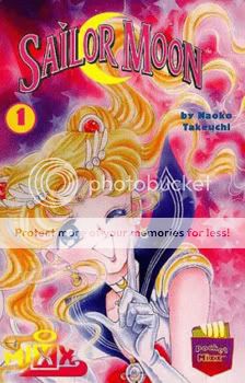
See how her hair fills up the top corner? Or if miss Takeuchi had wanted this to be a wide picture instead of a tall one, she could have drawn the hair flowing off to the side. Or she could have drawn it swirling in a circle around Sailor Moon's face, and had a round composition. Also, notice how the composition conveniently makes room for the title, (using the hair as a good abstract backdrop that doesn't distract from the letters) without just leaving a big blank space. A good composition is very important, and can serve a lot of purposes!
Credits:
Header and example sketches by me
Official anime/manga/game art used for examples belong to their various creators:
Square Enix
Naoko Takeuchi
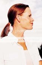
Anatomy photos found on various educational sites:
http://www.oum.ox.ac.uk/thezone/index.htm
http://www.skwigg.com/id73.html
http://www.lhj.com/lhj/
Header and example sketches by me
Official anime/manga/game art used for examples belong to their various creators:
Square Enix
Naoko Takeuchi
Anatomy photos found on various educational sites:
http://www.oum.ox.ac.uk/thezone/index.htm
http://www.skwigg.com/id73.html
http://www.lhj.com/lhj/