|
|
|
|
|
|
|
 Posted: Thu Feb 07, 2008 11:49 pm Posted: Thu Feb 07, 2008 11:49 pm
yeah so for a tshirt contest for langerado music fest ( LLLLLL) its on an indian reserve so i fig my design would be centered around this girl and then ill put like sum other s**t around her like ferns and bromeliads and and animal somewhere idk but i KNOW the left hand is poop actually the whole right side im gonna mess around with it but idk i was gonna ask for crit but the more i look at this the more i hate it and feel like i should just give up and not enter the contest at all i mean i'm really not expecting to win anyways i just thought it would be something fun to do 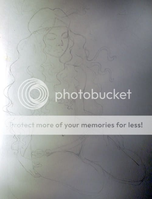  i redid the funky arm/hand tho now (and yeah in this pic the hair is there to cover up that side lmao)
|
 |
|
|
|
|
|
|
|
|
|
|
|
|
|
Posted: Fri Feb 08, 2008 1:36 am
What kind of music is it?
And I like the idea of a fawn with the girl. Cliche, but effective.
|
|
|
|
|
|
|
|
|
|
|
|
|
|
|
|
|
|
Posted: Fri Feb 08, 2008 6:20 am
 She definitely looks like she's at Langerado tripping on some acid. She definitely looks like she's at Langerado tripping on some acid.
I think she is a good start of a slightly psychedelic design. Just make sure its psychedelic inspired instead of cliche. Its a fine line to walk, but I think you can pull it off nicely.
|
|
|
|
|
|
|
|
|
|
|
|
|
|
|
Posted: Fri Feb 08, 2008 10:37 am
heheh i was gonna put a deer in there but im kindof scared as to how i will fit it in there so i think i'll do a raccoon or possum or bobcat or skunk or egret or anhinga and yep im planning on doing like idk sortof mucha style or like anthony yankovic-esque his stuff is beautiful ay
|
|
|
|
|
|
|
|
|
|
|
|
|
|
|
|
|
|
Posted: Fri Feb 08, 2008 10:58 am
Yes! My teachers were always on us to be researching artists and looking at them as we created things.
This is something good to keep in mind while approaching this specific project.
The style fits in wonderfully with Langerado.
|
|
|
|
|
|
|
|
|
|
|
|
|
|
|
Posted: Fri Feb 08, 2008 4:41 pm
I like the lack of any apparent expression on her face in the pencil sketch. There's a hidden smile in the second one, to which I prefer the first. It makes her look more pensive than enjoying an... something. My preference only, mind you, I don't know what you have in mind.
|
|
|
|
|
|
|
|
|
|
|
|
|
|
|
|
|
|
Posted: Fri Feb 08, 2008 5:01 pm
i agree she looks more sombre in the first one.... i'll see how to get it back
thanksss
|
|
|
|
|
|
|
|
|
|
|
|
|
|
|
Posted: Fri Feb 08, 2008 5:12 pm
Try returning the upper lip to its older breadth, and losing the hole thing below the mouth to lose the pout impression.
|
|
|
|
|
|
|
|
|
|
|
|
|
|
|
|
|
|
Posted: Fri Feb 08, 2008 5:25 pm
my only thing is that it's for a music festival, which is supposed to be really upbeat and exciting, but the girl is really calm and serene. i think some kinetic energy is needed in order to connect with the event itself
|
|
|
|
|
|
|
|
|
|
|
|
|
|
|
Posted: Fri Feb 08, 2008 9:01 pm
OMG IM GOING CRAZY HALP I H8 DA BG I STILL HAVE 2 DO TEXT AND I MIGHT USE SOME UNPROTECTED IMAGES FROM MY ART NOVEAU DESIGN BOOKS TO SLAP IN DA BG JUST LIKE A LITTLE BIT OF FANCY STUFF AROUND DA BORDER IDK CRIES 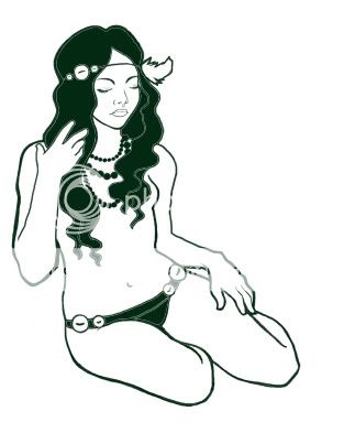 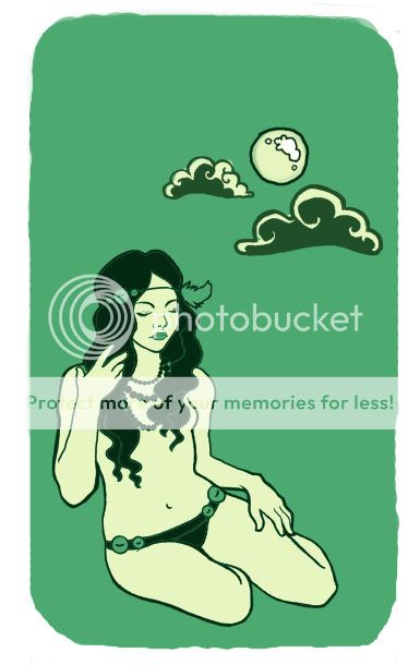
|
|
|
|
|
|
|
|
|
|
|
|
|
|
|
|
|
|
Posted: Sat Feb 09, 2008 1:48 am
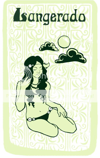 ok i dont have time to do any animals or fancy stuff in the background so this is prettymuch where i've ended up..... just twiddling around now and perfecting little tiny details
|
|
|
|
|
|
|
|
|
|
|
|
|
|
|
Posted: Sat Feb 09, 2008 2:30 am
OR SHOULD I USE A MORE HAND DRAWN letter APPROACH???? 
|
|
|
|
|
|
|
|
|
|
|
|
|
|
|
|
|
|
Posted: Sat Feb 09, 2008 2:38 am
what i ended up sending in lol 
|
|
|
|
|
|
|
|
|
|
|
|
|
|
|
Posted: Sat Feb 09, 2008 8:49 am
She lost the boob, but that's probably a good thing. I like what you did with the background. I'm sure if you had more time, you would have made it look even better.
Drawing the arm over the hair was probably also a good idea for a composition with only the girl, but it looks rough and angled near the shoulder. For a girl with that apparent amount of fat under her skin, the variations, I believe, would look more subtle.
|
|
|
|
|
|
|
|
|
|
|
|
|
|
|
|
|
|
Posted: Sat Feb 09, 2008 7:15 pm
i liked it on the kelly green
|
|
|
|
|
|
|
|
|
|
|
|
|
|