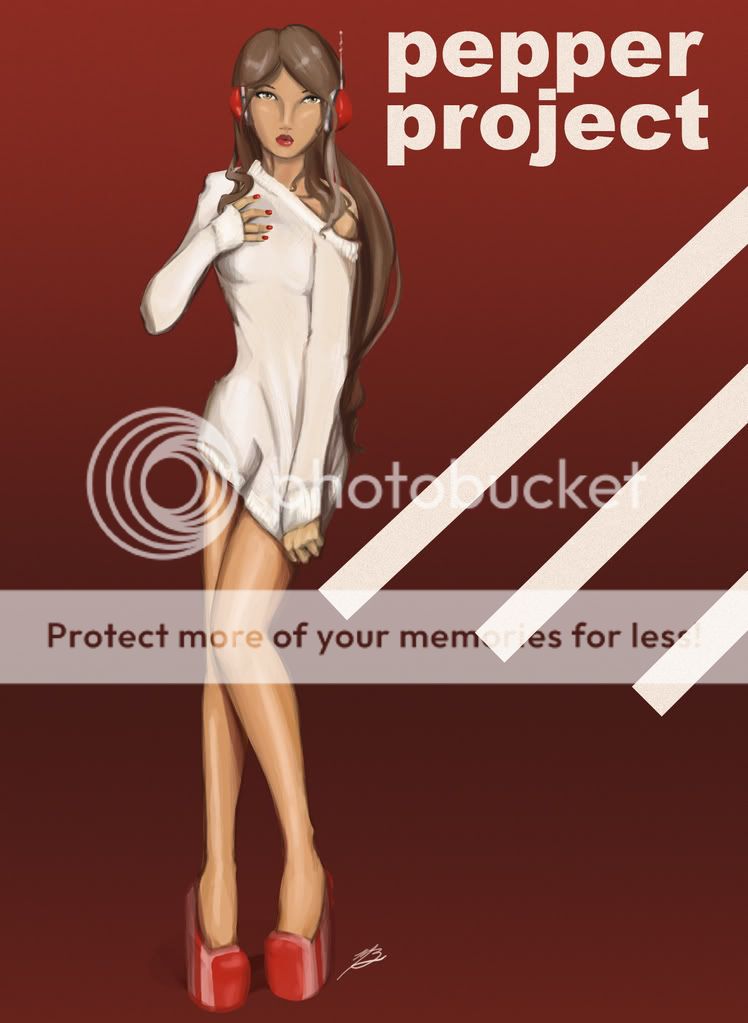
Ya know, Toho....I think you should scrap this and start over and push yourself HARDER, pushing yourself beyond to the next level....if your serious about enterin in that Artgerm mess that is, or serious about your work when you to cut it to the core.
a booging to be taken seriously but not so seriously kinda pointless to do a drawover, but it helps illustrate my thoughts kinda....sorta :B
Push from level head on views of your figures thats nothing but dead and boring, Toho, work on your form...(give em SUBSTANCE, give the illusion of mass despite being confined to the second dimension. a bit of a starter, box and block out your shapes, if that makes any sense), structure and overall anatomy....try to work in and with the flow and forces of the figure (a bit of a starter, take two opposing curves and place em opposite eachother...like the curve of the hip-thigh opposing the curve of the shoulder/upper ribcage/torso)...
color pallet wise, avoid using the same color in your highs and lows (don't go darker or whiter...again dead and boring), try to jazz it up by using contrasting pairs, like for isntance say, green to red, or purple to yellow or deep bluish to yellow....the possibilities are endless given to the whims of mood or theme
Brush stroke wise, I'd advise you to polish it a bit further, make it a bit more smooth-like
Not trying to crush you down Toho, just trying to take what you have now and help you make it better...