|
|
|
|
|
|
|
|
|
 Posted: Thu Jan 03, 2008 4:07 pm Posted: Thu Jan 03, 2008 4:07 pm
Not really sure what to type but I'll try. ^^'
I'm Japy-chan, but most people of course just call me Japy. My real name is Emily, which is what my friends call me most of the time, except when they're feeling too lazy to say 3 syllables(then it's just Em). I'm 13 and I officially started drawing when I was 8 or 9. I usually perfer to draw anime(tis easier and it's fun), but I sometimes like realism with animals, plants, and basic inanimate objects. I just reccently got a tablet and Photoshop for Christmas, and I'd like to get better with those. Especially with coloring. I know I'm a tad young, but I don't think I'll ever stop drawing, which is why I want to learn the right way to do certain things, and not develope lazy habits that will give me trouble in the future. I love tutorials, so if there's any specific one you think I should take a look at, please give me a link!
Please feel free to visit
My Deviant Art
but I would appreciate it if all critique would be in the guild.
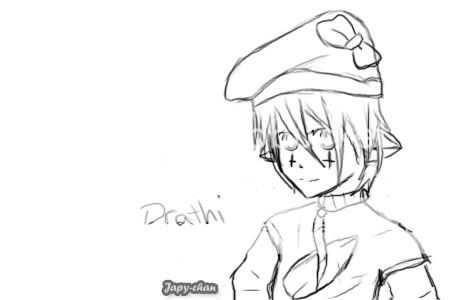
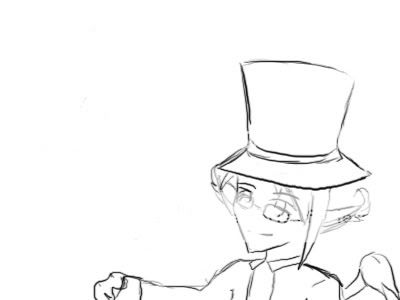
Artwork-


|
 |
|
|
|
|
|
|
|
|
|
|
|
|
|
Posted: Fri Jan 04, 2008 5:14 am
I notice that you're using the same odd pose in just about everything you show here. Is that lean intentional, and if so, why? If they aren't resting that hand on something, they'd all be falling backwards. (scanned from Drawing People: How to Portray the Clothed Figure)   Look at the difference when her weight is centered and when it's shifted. The standing foot will be under the head or centered between the feet when the weight is centered. Here are some real life examples. (Scanned from the insert of Reggae Gold 2002).  The center of gravity is in the pelvis region. That's where you're heaviest. The second heaviest part of your body is your head. Try and make sure they balance each other. The one where she's leaning, they're going in opposite directions to balance, and her foot in front is supporting her head, while her weight is back on the foot supporting her pelvis. (B)
|
|
|
|
|
|
Errol McGillivray Captain
|
|
|
|
|
|
|
|
|
|
|
|
Posted: Fri Jan 04, 2008 10:54 am
Errol McGillivray I notice that you're using the same odd pose in just about everything you show here. Is that lean intentional, and if so, why? If they aren't resting that hand on something, they'd all be falling backwards. (scanned from Drawing People: How to Portray the Clothed Figure) []http://img.photobucket.com/albums/v143/hardcandyvegetto/m2s5b.gif[/img] []http://img.photobucket.com/albums/v143/hardcandyvegetto/m2s4.gif[/img] Look at the difference when her weight is centered and when it's shifted. The standing foot will be under the head or centered between the feet when the weight is centered. Here are some real life examples. (Scanned from the insert of Reggae Gold 2002). []http://img.photobucket.com/albums/v143/hardcandyvegetto/weight.jpg[/img] The center of gravity is in the pelvis region. That's where you're heaviest. The second heaviest part of your body is your head. Try and make sure they balance each other. The one where she's leaning, they're going in opposite directions to balance, and her foot in front is supporting her head, while her weight is back on the foot supporting her pelvis. (B)
That really helps a lot though, thank you!
|
|
|
|
|
|
|
|
|
|
|
|
|
|
|
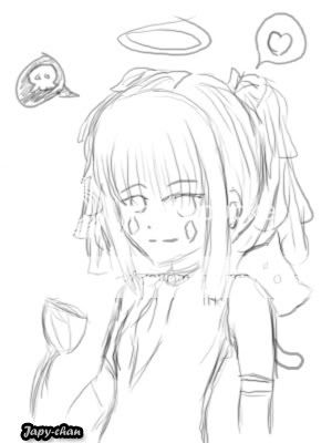
Posted: Thu Jan 10, 2008 7:19 pm
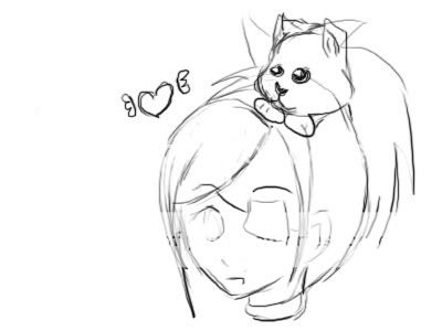
Some freebies. I just want to know if there's any consistant mistakes I should probably know about.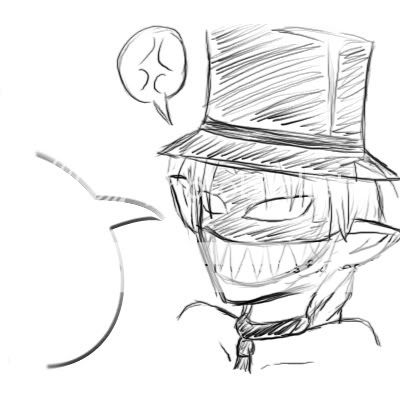
|
|
|
|
|
|
|
|
|
|
|
|
|
|
|
|
|
|
Posted: Thu Jan 10, 2008 7:21 pm
|
|
|
|
|
|
|
|
|
|
Posted: Thu Jan 10, 2008 10:46 pm
Their shoulders are too small (each shoulder should be one head width from the centerline) and the heads are too large. Here is a good proportion guide. I also think that the quality of your work would improve a lot if you cleaned up your lineart. Try not to use multiple strokes in lines, draw with your arm instead of your wrist. Some line variation would also help-- here is a very good lineart tutorial. Your work is very cute, and you have a nice style going.
|
|
|
|
|
|
|
|
|
|
|
|
|
|
|
|
|
|
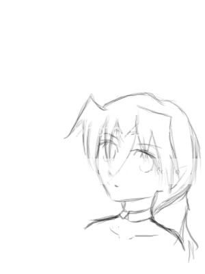
Posted: Fri Jan 11, 2008 9:49 am
Ishrie Their shoulders are too small (each shoulder should be one head width from the centerline) and the heads are too large. Here is a good proportion guide. I also think that the quality of your work would improve a lot if you cleaned up your lineart. Try not to use multiple strokes in lines, draw with your arm instead of your wrist. Some line variation would also help-- here is a very good lineart tutorial. Your work is very cute, and you have a nice style going.
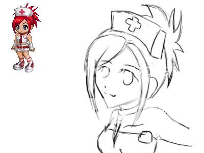
I thought I mentioned it in the post but it must've been somewhere else, cause it is kinda important. So kinda pretend this is part of it. ^^' Almost all the freebies I do are either chibi or younger looking(say, 6, 7 or 8 yrs old?). Which I think call for big heads/eyes, unless I'm doing them wrong. Also, I don't care to draw the lines very cleanly for freebies. That's very intended, if they want quality art then they should probably pay. What I'm really asking for is any mistakes that I keep making with anatomy, shape, and whatnot(now I really wish I would've mentioned the 8yr old thing). Which reminds me, if I could get some help drawing children, I'd like that!
Gah! Lineart tutorial! *tackles* I post in Line Art Jam sometimes, so I can't wait till I can check this out!! 4laugh
This is some actual lineart I've done, if there's anything wrong with this(other than the fact that the pen was dieing), I'd like know.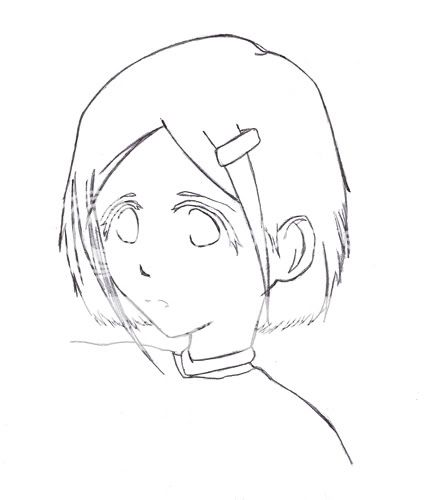
|
|
|
|
|
|
|
|
|
|
|
|
|
|
|
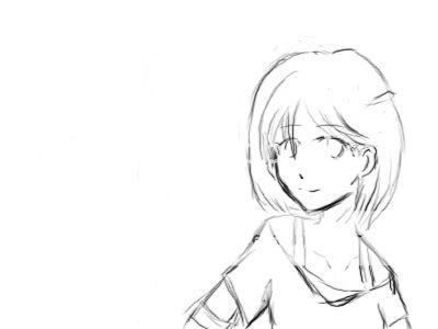
Posted: Fri Jan 11, 2008 3:07 pm
This is after getting about half-way through that tutorial-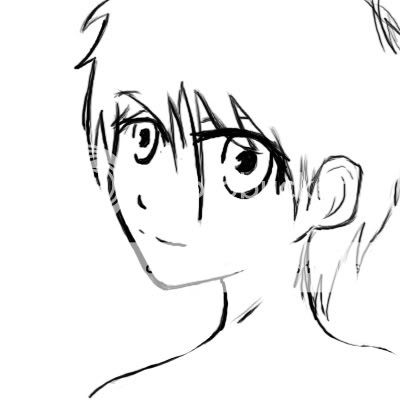
|
|
|
|
|
|
|
|
|
|
|
|
|
|
|
|
|
|
Posted: Sat Jan 12, 2008 7:33 am
To practice my coloring on photoshop, I went to lineart jam. 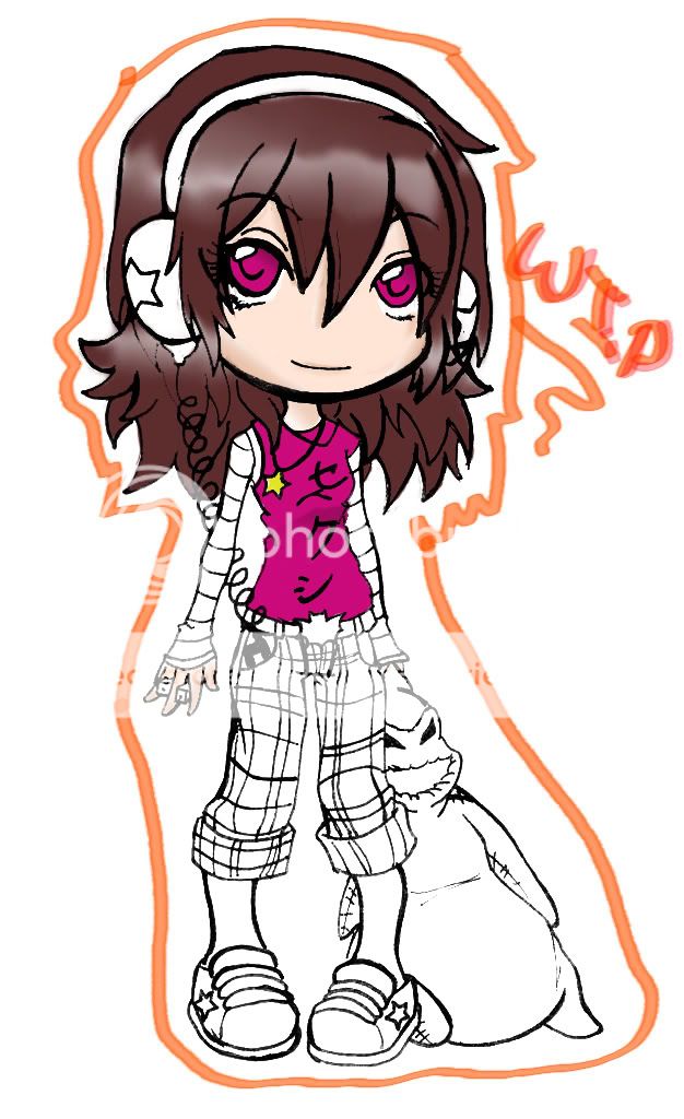
|
|
|
|
|
|
|
|
|
|
|
|
|
|
|
|
|
|