Welcome to Gaia! ::

Art Freebie Land! Artists of All Skill Levels!

Back to Guilds

We allow all artists to improve their skills by drawing users in a friendly atmosphere 

Tags: Arts, Freebies, Art Freebies, Contests, Artists 

Reply TUTORIALS (And Help Threads)
Critic my art. Be merciless!

Quick Reply

Enter both words below, separated by a space:

Can't read the text? Click here

Submit

ghalghej

PostPosted: Wed Dec 19, 2007 5:31 pm


User Image

User Image

User Image


These are 3 of my lamest Linearts (I'm not gonna post my best around here).
Note: All these are my made on my style that is somewhat of a Hybrid between Manga and Ocidental comics. Also these are from a doujinshi of the Jak videogame series that I have in progress.

DONT FORGET! BE MERCILESS!!!

scream
PostPosted: Thu Dec 20, 2007 6:30 am


Dont forget to say what's wrong and what could have been better!

ghalghej


NethRAi

PostPosted: Sun Jan 13, 2008 2:47 pm


Okay, I don't know if was intentional, but it seems like the first two pictures are leaning a bit too much to the right. I really like the third one a lot, but he seems to be also leaning slightly to the right just a smidget too much. Other than that, I really like 'em! I like your style. It's very detailed, but not to the point where I want to gouge my eyes out. The background for the first and third ones aren't really too, too greatly drawn out, but it's not like people are like "Whoa! Are they, like, floating in midair or something?!" I really like it!
PostPosted: Wed Feb 06, 2008 6:09 pm


The first, the eyes are too big. I mean, I could understand enlarging them, but this is freaky huge. hand is unnatural. pose and try to do that. and yeah, the tilt, as well as being a freakin' midget!

Second. Another midget, arm looks too stiff. your arm naturally bends, even if just a bit. also, the tilt again. The funny thing is that his boots are normal, so its like when your skiing and you tilt back but your boots can't.

Third. The best of the pics, it isn't as static. However, you attempt to use foreshortening, but it is mismatched and not at the right angle, so his boot and leg just look weird. hes tilted. XD

MERCILESS! scream

shinyspoon42


EnviousEnvy101

PostPosted: Wed Jul 16, 2008 12:33 pm


User Image
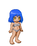
This one isn't so bad! ^_^ All I would say is work on the hands a bit more, perhaps not have her leaning back, and The eyes seem a little large O_O;

Advice: For hands, try to keep them proportional to the head..?
For eyes, Just make them a tad smaller so they're not bigger than the mouth? (Depends on the character!!)
and the hands.. well.. I'm not very good at hands either.. I would just suggest to continue practicing on different sheets of paper while looking at a model version of the pose you'd like.. Once your good at it, enough to not need a model, then put it to the picture. That's what I do..

User Image
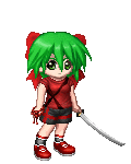
First thing I notice about this one is hands, ears, and pose.
Again, your character seems to be leaning back ( which... isn't good? O_o; *dontknow* ) So just fix that by turning the paper and drawing normally, or set up guidelines before you start sketching.
The hands just take practice, like I said before. It seems his grip on the staff is terribly uncomfortable.. with his wrist being bent upward and all..
Lower the ears a bit more so the very top line of the ear is at line with the center of the eye. That's what I've learned, but that's up to preference.
Otherwise, it's looking good so far! ^__^

User Image
I agree with shinyspoon42 with this one. Use foreshadowing to show that his forward leg is.. well.. forward.. and the back is further from the camera, so shade it!
The hands once more, practice with those!
The front-ward foot though, seems fat ><; Make it a bit smaller and then show off a SMALL part of the bottom of the shoe to show he's steping forward. Shade the ground underneath the back foot to show it's off the ground as well.
For his arms, position the back arm so you can't really see the side of it, to make it look like he's running more? And the front arm more frontward and raised a bit below his face.


That's all I've got ^^; Hope it helps...
PostPosted: Sun Feb 01, 2009 12:17 pm


The main thing I find wrong is the posture of your subjects. It's a bit awkward and unrealistic. A couple seem to be leaning backwards, which isn't a naturally comfortable position. On the wizardish dude, his arms are at rather stiff angles. I would study figure drawings to really master posing to give your characters a more relaxed, natural look.

Saint Upak

Reply
TUTORIALS (And Help Threads)

 
Manage Your Items
Other Stuff
Get GCash
Offers
Get Items
More Items
Where Everyone Hangs Out
Other Community Areas
Virtual Spaces
Fun Stuff
Gaia's Games
Mini-Games
Play with GCash
Play with Platinum