|
|
|
|
|
|
|
|
|
 Posted: Mon Nov 05, 2007 8:15 pm Posted: Mon Nov 05, 2007 8:15 pm
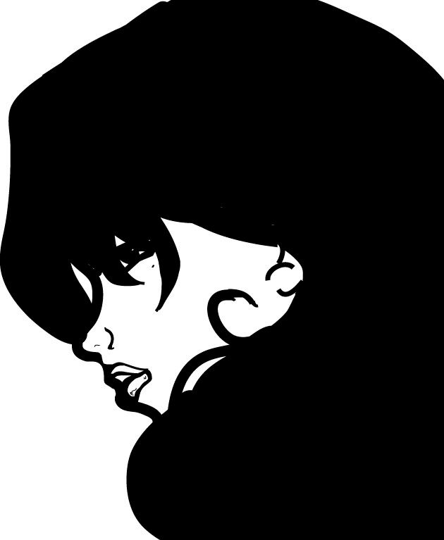
NUMERO UNO.
A little vector black/white piece I did. I do enjoy it. Yep.
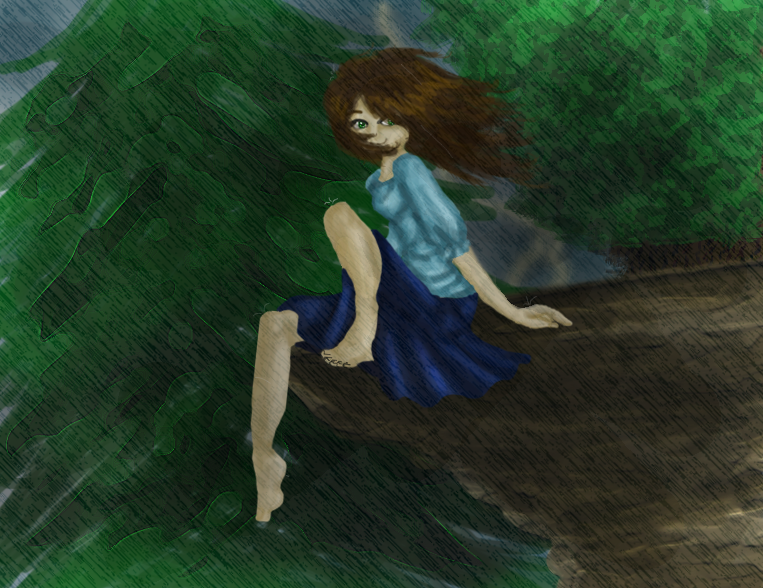
NUMERO DUEEEE.
A (late) present for someone.
It was actually originally going to be a sunny kind of picture, but that didn't happen at all.
Comments/Suggestions on this one?
|
 |
|
|
|
|
|
|
|
|
|
|
|
|
|
Posted: Wed Nov 07, 2007 4:20 pm
Awwz I like them <3
As for suggestions~I suck at those XD Sorry.
|
|
|
|
|
|
|
|
|
|
|
|
|
|
|
|
|
|
Posted: Thu Nov 08, 2007 4:05 pm
Haha thanks, its alright rofl
|
|
|
|
|
|
|
|
|
|
|
|
|
|
|
Posted: Sat Nov 10, 2007 5:54 am
|
|
|
|
|
|
|
|
|
|
|
|
|
Posted: Mon Nov 12, 2007 11:15 am
looking good. I really like the top one. I would suggest trying to sharpen up the edges a bit. Like around the hair and nose. Is that all pen tool?
If so your better than me with it.
|
|
|
|
|
|
|
|
|
|
|
|
|
|
|
Posted: Tue Nov 13, 2007 1:17 pm
Oh hello Blackrose!
Let me tell you what I recognize in those biggrin
I like the first one, nothing to add there. : )
The second one looks all rainy and grey,
- and she wears a skirt but still smiles...? *giggles* She'll catch a cold!
That doesn't match somehow : ))
Okayokay, well back to topic: - the second picture misses some contrast and light & dark.
Adding contrast is even possible in rainy grey pictures. : )
Her legs have clear lines, I like that - even her toes do so, and are thoroughly drawn - buuut her fingers aren't. : )
Also I miss a clearer drawing of her head, a chin or so.
The tree on the left is nice.
I like that some of the tree's branches have bright outlines.
...Is that a lighting right behind her?
Nearly overlooked that fact. Usually lightings are brighter. : )
Nonetheless with this one you're on the best way for a great artpiece! :]
Best of Luck! biggrin
|
|
|
|
|
|
|
|
|
|
|
|
|
|
|
|
|
|
Posted: Thu Nov 15, 2007 3:37 pm
Drasc, some of it is pen tool, and some was pencil tool in illustrator, I don't know what I used what on though P:
And thanks for all that you had to say Kyandara!
When it comes to contrast and light/dark... and basically anything like that, I'd say I'm completely clueless actually. I don't even know where to begin.
I really am terrible at drawing and coloring fingers digitally. They always come out really funny shaped, and just weird looking. Thanks for the comment on the toes though smile
And thanks for all the tips on the backround! I'm still only starting backrounds, so any advice is appreciated.
|
|
|
|
|
|
|
|
|
|
|
|
|
|
|
|
|
|

![[ Blackrose ]'s avatar](https://a1cdn.gaiaonline.com/dress-up/avatar/ava/41/16/7375852a101641_flip.png?t=1437865228_6.00_11)