|
|
|
|
|
|
|
|
|
 Posted: Sun Sep 09, 2007 12:40 pm Posted: Sun Sep 09, 2007 12:40 pm
Hi hi, I'm brand new here, but I figured I'd drop a post in since I'm working on a drawing for my signature for my 4 year Gaiaversary (which has passed but oh wells) I've been drawing since I could hold a pencil and work mostly in dry medium since almost all my training has been self taught. I did do a year at an art school so I do have some formal training. I plan on coloring this piece with watercolor and prisma markers, but didn't want to set it into ink until I got some feedback. Thanks all! 3nodding  This was the first sketch, as you can see it's not terribly dynamic.  This is the second sketch. I've got it fairly clean but I'm thinking something needs to be done with the thumb. Otherwise I'm pretty satisfied with the pose. If there are any major anatomical inconsistencies I'd love them pointed out. Feel free to redline the s**t out of the drawing. I'll ink and rescan after I get some feedback on the sketches, sorry for the quality of the scan, still figuring it all out. xd
|
 |
|
|
|
|
|
|
|
|
|
|
|
|
|
Posted: Sun Sep 09, 2007 1:31 pm
Cute, but it took me a while to figure out what was going on in the picture. Maybe if you add a small part of the arm, like the elbow, it doesn't matter how the hand is positioned, most of the time, you can see a piece of the arm. Maybe under it, in the middle gap?
|
|
|
|
|
|
|
|
|
|
|
|
|
|
|
|
|
|
Posted: Sun Sep 09, 2007 1:32 pm
Chaxy Cute, but it took me a while to figure out what was going on in the picture. Maybe if you add a small part of the arm, like the elbow, it doesn't matter how the hand is positioned, most of the time, you can see a piece of the arm. Maybe under it, in the middle gap? I'll do a pencil of that and see how it goes. Any suggestions for fixing the thumb that's in the foreground?
|
|
|
|
|
|
|
|
|
|
|
|
|
|
|
Posted: Sun Sep 09, 2007 1:34 pm
Chaxy Cute, but it took me a while to figure out what was going on in the picture. Maybe if you add a small part of the arm, like the elbow, it doesn't matter how the hand is positioned, most of the time, you can see a piece of the arm. Maybe under it, in the middle gap? Yeah, but iffen it gets colored, it will be immediately obvious.
|
|
|
|
|
|
|
|
|
|
|
|
|
|
|
|
|
|
Posted: Sun Sep 09, 2007 3:10 pm
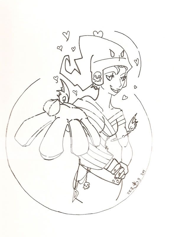 Okay, I think I fixed the thumb. Ker inked!
|
|
|
|
|
|
|
|
|
|
|
|
|
|
|
Posted: Sun Sep 09, 2007 4:27 pm
+3 coy smugness! heart 3nodding
|
|
|
|
|
|
|
|
|
|
|
|
|
|
|
|
Dr. Valentine Vice Captain
|
Posted: Sun Sep 09, 2007 5:58 pm
That is much better.
I think that I might rip you off a bit - it's just past my fourth as well.
|
|
|
|
|
|
|
|
|
|
|
|
|
|
|
Posted: Mon Sep 10, 2007 4:17 pm
Those teeth have really got me confused.
|
|
|
|
|
|
|
|
|
|
|
|
|
|
|
|
|
|
Posted: Mon Sep 10, 2007 8:33 pm
Dr. Valentine That is much better. I think that I might rip you off a bit - it's just past my fourth as well. Hahaha, glad I could inspire I guess. Happy 4th. The Iconoclast Those teeth have really got me confused. How so? Too noticable? Too simple? Too fangy?
|
|
|
|
|
|
|
|
|
|
|
|
|
|
|
Posted: Thu Sep 20, 2007 12:02 am
i think...i think i really want you to close that line on her upper lip. It looks a little bizzare, and doesn't really make sense. There tends to be more shadow towards the sides of the bottom of the lower lip, so if you do leave part of that line open, it should probably be closer to where the center of the mouth it...but seeing how you're drawing it from a 3/4th pov, you'd probably just be better off closing it.
It may seem like nitpicking, but the face is a focal point in this image, so you probably don't want anything looking that off.
|
|
|
|
|
|
|
|
|
|
|
|
|
|
|
|
|
|
Posted: Fri Sep 21, 2007 12:05 pm
Page Boy i think...i think i really want you to close that line on her upper lip. It looks a little bizzare, and doesn't really make sense. There tends to be more shadow towards the sides of the bottom of the lower lip, so if you do leave part of that line open, it should probably be closer to where the center of the mouth it...but seeing how you're drawing it from a 3/4th pov, you'd probably just be better off closing it. It may seem like nitpicking, but the face is a focal point in this image, so you probably don't want anything looking that off. You're not the only one to suggest closing it. I want to color it though and I think it would look funny having the lips completely lined. In retrospect I may have chosen a poor place for the line break. I'll keep it in mind though so that should I color it and it still looks off I can always line it in later. I don't think it's nitpicky, if that's the worst I'm off then I'm not doing half bad. Besides I read the rules and everything, Iconoclast said not to post if I wanted "OMG it's so pretty!" critiques. Thanks for the input.
|
|
|
|
|
|
|
|
|
|
|
|
|
|
|
|
|
|