| Best use of the theme |
| Entry 01 |
|
55% |
[ 10 ] |
| Entry 02 |
|
33% |
[ 6 ] |
| Entry 03 |
|
11% |
[ 2 ] |
|
| Total Votes : 18 |
|
|
|
|
|
|
|
|
 Posted: Sun Aug 26, 2007 11:46 pm Posted: Sun Aug 26, 2007 11:46 pm
|
|
|
|
|
|
|
|
|
|
Posted: Mon Aug 27, 2007 4:29 pm
|
|
|
|
|
|
|
|
|
|
|
|
|
Posted: Tue Aug 28, 2007 6:18 am
sweatdrop For some reason, I keep thinking of fish cause of this contest.
|
 |
|
|
|
|
|
|
|
|
|
|
|
|
|
Posted: Tue Aug 28, 2007 6:27 am
Drowningwaters sweatdrop For some reason, I keep thinking of fish cause of this contest. Put your suggestion in the sticky thread
|
|
|
|
|
|
|
|
|
|
|
|
|
|
|
|
|
|
Posted: Tue Aug 28, 2007 6:29 pm
guess who just got there tablet fixed?..
(that would be me)
more digital art! w00t!!
trying to do something for all the weekly challenges
..may do something within the next couple of days for this one
|
|
|
|
|
|
|
|
|
|
|
|
|
|
|
Posted: Tue Aug 28, 2007 9:47 pm
APS-tan: Yay! xD
Drowningwaters: Maybe because the ying yang symbol resemble waves? xd
t3h b3ast: Ohh cool, looking forward to it ^__^
|
|
|
|
|
|
|
|
|
|
|
|
|
|
|
|
|
|
Posted: Fri Aug 31, 2007 6:07 am
gonk Figures I get a cold and can't draw anything without pausing to sneeze every 5 seconds.
|
|
|
|
|
|
|
|
|
|
|
|
|
|
|
Posted: Sat Sep 01, 2007 6:51 pm

wooooooosh!
so little free time D:!
unfinished~ but i lurves it anyway
|
|
|
|
|
|
|
|
|
|
|
|
|
|
|
|
|
|
Posted: Sat Sep 01, 2007 7:44 pm
with only 1 entry, you should extend the deadline. On another note..this was fun. 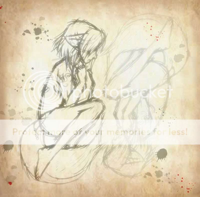
|
|
|
|
|
|
|
|
|
|
|
|
|
|
|
Posted: Sun Sep 02, 2007 6:25 pm
I guess most people are preoccupied with the summer festival events. I'm not sure whether I should extend it though. This theme was a lot more abstract than the others, so maybe that's why less people entered? Its up to Lady Emiri, I don't mind either way 3nodding I can always delete the poll, add up new entries and start voting again. Here's my entry, I got carried away a bit here, and used red and blue instead of black and white xd 
|
|
|
|
|
|
|
|
|
|
|
|
|
|
|
|
|
|
Posted: Mon Sep 03, 2007 9:29 am
Ah, well I say if they're not up to practicing, it's their loss.
They'll just have to wait on the next contest.
I think, it's probably school starting up. Gaia always seems to get a bit slower around that time.
|
|
|
|
|
|
|
|
|
|
|
|
|
|
|
Posted: Thu Sep 06, 2007 4:04 pm
Personally, I think entry 2 is very good. It is a perfect balance even if all you did was change opacity or line color and then flip it in photoshop...
While entry 1 is the most complete looking, it is not a perfect balance as the yin yang represents, Believe me I know what the Yin Yang represents, I've worn one around my neck for the past ten years.
I would have said entry 3 is probably the best, but when I think of the colors, black and white are neutral "complimentary colors" and so when you moved into colors then you should have used red and green rather than red and blue. Green is on the exact opposite side of the color wheel and so you call them complimentary. Likewise, you could have used orange and blue which are also compliments...
|
|
|
|
|
|
|
|
|
|
|
|
|
|
|
|
|
|
Posted: Sat Sep 08, 2007 12:13 am
Thanks for the critique Solidzane! I did think about using green and red, but blue and red represents the male/female aspect more, at least in Asian countries 3nodding
|
|
|
|
|
|
|
|
|
|
|
|
|
|
|
Posted: Sat Sep 08, 2007 12:32 am
Starshine Thanks for the critique Solidzane! I did think about using green and red, but blue and red represents the male/female aspect more, at least in Asian countries 3nodding hmm. I never thought about it that way...
|
|
|
|
|
|
|
|
|
|
|
|
|
|
|


 razz 9BagcoWlDw4eM:https://www.1voyage.com/chine/images/ying-yang.jpg" />