|
|
|
|
|
|
|
|
|
 Posted: Sat Nov 10, 2007 6:09 am Posted: Sat Nov 10, 2007 6:09 am
See title. Redline please D: Crits on non-anatomy stuff are okay too. 
|
 |
|
|
|
|
|
|
|
|
|
|
|
|
|
Posted: Sat Nov 10, 2007 9:43 am
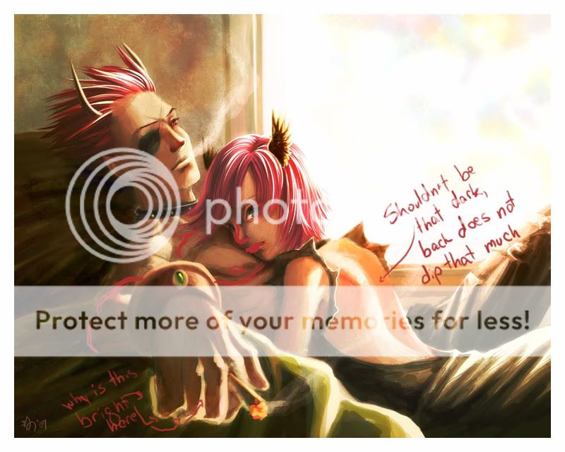
I think I did that right. anyways the girls face looks like it's scrunched away from the guy's chest, which makes her look uncomfortable, I'm assuming you want the couple to look comfortable together(?) I'd actually have the side of her lips lightly pressed against his chest, since it seems like that's where they'd be from the position of her face.
|
|
|
|
|
|
|
|
|
|
|
|
|
|
|
|
|
|
Posted: Sat Nov 10, 2007 10:19 am
I think I like the girl's back the way it is. Her back doesn't have to dip a lot for the shadow to be dark. The shadow is dark simply because the room is?
Not sure if I like your manchest better or mine. (haha, that sounded wrong) But yeah, his forearm probably does need to be bigger...
No, they aren't comfortable -- their relationship is dying and the girl knows it. xd Good catch though, even though it's not applicable to this particular picture.
|
|
|
|
|
|
|
|
|
|
|
|
|
|
|
Posted: Sun Nov 11, 2007 9:10 am
I still think her mouth should be wrapping around her face more, but if that's the case then the position makes more sense
|
|
|
|
|
|
|
|
|
|
|
|
|
|
|
|
|
|
Posted: Mon Nov 26, 2007 10:17 am
To me also the back looks the most obviously odd. Her shoulder blades and the dip where her spin curves seem to join into a large V dent. I think you need to remove that dark bit completely, the hollow of your back is not that deep and the angle of the light would catch all of her back.
Hi face is great, both hair is nice but I agree she looks worried, and her face doesn't seem to be touching his chest.
That hand is nice, I'm not sure the little and wedding finger would catch the light that much tho.
|
|
|
|
|
|
|
|
|
|
|
|
|
|
|
Posted: Tue Nov 27, 2007 12:57 pm
lol i think thats a cigarette
|
|
|
|
|
|
|
|
|
|
|
|
|
|
|
|
|
|
Posted: Tue Nov 27, 2007 3:44 pm
I actually really like everything about this, except the face on the girl.
The placement of the nose I find especially odd.
In contrast to the guys face, which is awesome, hers just looks kinda...goopy.
|
|
|
|
|
|
|
|
|
|
|
|
|
|
|
Posted: Tue Nov 27, 2007 8:13 pm
The faces are what's bugging me on this, just like Groovy Spleen said. There's a lot right with this picture - the mood is nice, the color choice is nice, all that is nice. At first I just thought it was awkward posing but your explanation further down did a lot to dissuade me of that - if it is supposed to be a little awkward, you conveyed that well. This is probably way late but I thought I'd toss it out there.
|
|
|
|
|
|
|
|
|
|
|
|
|
|
|
|
|
|
Posted: Wed Nov 28, 2007 2:24 pm
the girl's nose and mouth are not right, as everybody else has already said XD
|
|
|
|
|
|
|
|
|
|
|
|
|
|
|
|
|
|