|
|
|
|
|
|
|
|
|
 Posted: Tue Apr 13, 2010 11:50 am Posted: Tue Apr 13, 2010 11:50 am
I'm going to have to update tonight. I've been working a lot the past few days and then actually doing stuff for once at night. xD
I'll try to make time to update the front page and do my critiques.
|
 |
|
|
|
|
|
|
|
|
|
|
|
|
|
Posted: Tue Apr 13, 2010 5:19 pm
1st. 4/7. I actually like this one, but not tooooo much. I love the utilization of those dreaded anklets (Seems only noobs use those), so major kudos for that. The spirited dress kinda sticks out, as well as the skin. I think some blue or white skin might have looked better.
2nd. 1/7. I don't see the significance of it. Looks pretty ugly.
3rd. 1/7. It was 'okay'. The shoe bows are headband are actually darker than the other reds, so it kinda stood out. And as she herself stated, over done theme with predictable items. The mask presents a blue-white, and the shoe bows add gold. So she kinda epic failed.
4th. 2/7. It looks really plain. Boring to look at honestly. Also, the orange is too heavy on the head, and too scarce on the bottom. The Luv sleeves are also off shade and kinda fat. (it is an ugly item altogether imo.)
5th. 7/7. I knew this was placing. Even the glitchy green goo came to her advantage. Perfect entry.
6th. 2/7. Not much to innovate on this over used theme. Also, the items are all predictable. Everything is space related.
7th. 3/7. I think it is nice. But this type, style rather, of avi is getting over used, fast.
8th. 1/7. The wings match with each other, but not with the Pico jacket. Bare legs. Ugly face. I hate that hair, it covers too much.
9th. 1/7 Ugly n' cheap. Nuff said.
10th. 1/7 Pirate avatars are getting on my nerves. So is that damn ugly skin.
I felt rather nice this time . =o=
|
|
|
|
|
|
|
|
|
|
|
|
|
|
|
|
|
|
Posted: Tue Apr 13, 2010 10:17 pm
is that a 7/7 I see from you Barbie?
I never thought I'd see the day
I might do some updating if I can't sleep again tonight
which is likely, but I've got some hw to do first
|
|
|
|
|
|
|
|
|
|
|
|
|
|
|
Posted: Wed Apr 14, 2010 5:27 am
John Reese
1.) Sharktooth Gijinka » 4/7
Unique color combo and concept. I like the poem in the description but I hate the face. The whites and blacks can also be removed. It could be made cleaner cut overall it's a unique avi.
2.) The Highwayman » 1/7
The description doesn't fit the avi at all, (there's no lace at his chin and no pistol). The face is a wreck, why does it look like he's kissing the horse??? And she should've used a male base instead of a girl's.
3.) Lady Immolate » 2/7
Overused color combo and she used two Gimpi's. The shade of white in the mask and shoes doesn't match the others. And how come there's no eyes!?
4.) Streamer Fish Gijinka » 5/7
In my opinion, this is better than the first Gijinka. The colors are great and it's very eye catching. She could've used a skin The bottom needs a little orange and the head needs pink but overall it's a great avi.
5.) Televised Poltergeist » 6/7
Definitely my favorite and I think this should have placed first. The only problem I have though is the green on the head.
6.) Creator » 2/7
I'm getting sick of space avi's, I mean this is overdone. And it looks more like the planets are being sucked into a black hole rather than being created by the "creator". neutral
7.) Jackson Pollock's Painting » 6/7
Very unique and clean. She found a good use for that rainbow scarf, whatever its called. However it's a very easy theme to do, just put random colorful stuff in there and voila! a painting -_- so it's a 6 instead of a 7.
8.) Angel of Prostate Cancer » 2/7
The colors she picked are great. The avi is not top 10 worthy. It lacks blue at the feet and it lacks white at the head.
9.) Nevermore » 2/7
Great poem and concept, but the avi stinks. I hate the eyes, belt, cravat, sword and hair. It doesn't even look like a raven.
10.) Lord Nedrick Scurv von Pirate » 1/7
Totally cliche and boring. There's no creativity, nothing new to see, and it's completely pointless.
Just finished my critiques.
|
|
|
|
|
|
|
|
|
|
|
|
|
|
|
|
|
|
Posted: Wed Apr 14, 2010 1:04 pm
Whoever though Angel of Prostate Cancer was a good title needs a writer xD
|
|
|
|
|
|
|
|
|
|
|
|
|
|
|
Posted: Wed Apr 14, 2010 4:37 pm
k.k.razy is that a 7/7 I see from you Barbie? I never thought I'd see the day I might do some updating if I can't sleep again tonight which is likely, but I've got some hw to do first Yeah I know right xD I was surprised myself. But what can I say, there isn't anything to complain about. Besides, anyone that can unintentionally use the green goo to their advantage deserves 7/7 xd
|
|
|
|
|
|
|
|
|
|
|
|
|
|
|
|
|
|
Posted: Wed Apr 14, 2010 6:02 pm
Here it goes:
1: The colors scheme is quite bizarre, and she pulled it off well. Well balanced. The purse feels clunky to me, and a little out of place. Something about it just isn't as pleasing to the eye as some are. Maybe just not complicated enough for me? xD Good to see one that's not a lame joke in first place, though.
5/7
2. Okay, I (apparently) am the only person to ever read this poem (lol) and I love it. Although it's sort of a cosplay, there are no reference images of the character so it wouldn't really work. The expression is just strange, and isn't necessary, and the horse sticks out. Because it is entered as original, it needs to coordinate (it doesn't). Honestly, I think people 5'd it 'cuz they liked the poem. SHAME!
3/7
3. I thought the reds were very well balanced, and done cleverly. The whites are several different shades, but all of Gaia's whites are different shades. The mask especially stands out. I think a little red on the hand (like a ring) would be a nice touch.
4/7
4. I mean, it's nice, I like the colors, but they're all in huge chunks! D: It matches well, but it's not a hard one to make.
3/7
More to come!
|
|
|
|
|
|
|
|
|
|
|
|
|
|
|
Posted: Wed Apr 14, 2010 10:09 pm
I think I won't log into Gaia much in the next week. I'll update everyone's critiques now, but I doubt I'll be doing any myself.
|
|
|
|
|
|
|
|
|
|
|
|
|
|
|
|
|
|
Posted: Wed Apr 14, 2010 10:42 pm
|
|
|
|
|
|
|
|
|
|
Posted: Wed Apr 14, 2010 10:46 pm
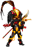
I wish I knew those items better how much of that is a set? I didn't fav it cause it just looks like two sets of armor thrown on idk..
|
|
|
|
|
|
|
|
|
|
|
|
|
|
|
|
|
|
Posted: Wed Apr 14, 2010 10:54 pm
I still need to update the cosplay - aka Tsu's critiques. ^^;
Sorry, Tsu! <3 u.
|
|
|
|
|
|
|
|
|
|
|
|
|
|
|
Posted: Thu Apr 15, 2010 6:15 am
k.k.razy I wish I knew those items better how much of that is a set? I didn't fav it cause it just looks like two sets of armor thrown on idk..
There's a Mythril Armor set and 2 poses from Anima Adamantea. Even if he used a set, I'm still amazed to see a Mecha entry that looks good.
|
|
|
|
|
|
|
|
|
|
|
|
|
|
|
|
|
|
Posted: Thu Apr 15, 2010 1:23 pm
5. Okay, I see it, right? Expecting to be dazzled. But I don't actually love it. And I don't know why. I just... don't even really LIKE it.
3/7
6. Clutter mess. Overdone.
1/7
7. I don't see anything wrong with it. Not one thing.
7/7
8. This avatar pisses me off. Random items of similar colors thrown together with a strange title.
1/7
9. Eh... just like the highway man. I love the poem, but it isn't executed correctly. And the poem was too abstract to create an avatar from anyway. It's altogether too simple.
2/7
10. GTFO.
1/7
I got so much more... mean.
|
|
|
|
|
|
|
|
|
|
|
|
|
|
|
Posted: Sat Apr 17, 2010 10:03 pm
Another cosplay feature
http://www.gaiaonline.com/arena/gaia/cosplay-avatar/vote/?entry_id=102078261#title
|
|
|
|
|
|
|
|
|
|
|
|
|
|
|
|
|
|
Posted: Mon Apr 19, 2010 11:46 am
If I update for this week, it won't be until the end of the week.
Fortunately, the Top 10 super sucked this week. Like, more so than usual. 3rd, 4th, and 10th are the only ones I am going to give any credit too. I threw up in my mouth a little when I saw this week's picks.
Cosplay wasn't awful, but I think with the release of Heart Gold and Soul Silver we keep seeing more and more and more Pokemon cosplays. I love Pokemon, but give it a rest already.
|
|
|
|
|
|
|
|
|
|
|
|
|
|
|
|
|
|