|
|
|
|
|
|
|
 Posted: Thu Apr 23, 2009 8:44 pm Posted: Thu Apr 23, 2009 8:44 pm
Wouldn't we all? It was sort of the impetus to do it. There'd never been one around here, I've been wanting to make a Munny, I knew a person or two who wanted to as well, and so...show time! I'll do another one with more people in a bigger gallery set up.
After I've reconstituted my brain, fingers and sanity.
|
 |
|
|
|
|
|
|
|
|
|
|
|
|
|
Posted: Thu Apr 23, 2009 8:51 pm
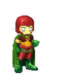
I have to finish my Tony one. D: He's sitting there all half painted, chomping on his cigar, staring at me.
|
|
|
|
|
|
|
|
|
|
|
|
|
|
|
|
|
|
Posted: Thu Apr 23, 2009 9:06 pm
Making it was exhausting but so much fun. Once I got into the swing I couldn't stop unless I was physically unable to continue.
The Zen of Art. heart
That doesn't usually happen when I work in 3D
|
|
|
|
|
|
|
|
|
|
|
|
|
|
|
Posted: Wed May 06, 2009 1:10 am
Anyone familiar with Masters of the Universe? Season 1 of the cartoon had a villainess I fell in love with named Shokoti. This is my take on her; 
|
|
|
|
|
|
|
|
|
|
|
|
|
|
|
|
|
|
Posted: Sat May 09, 2009 9:36 pm
I made a process gallery of my Munny on Flickr. I took a lot of photos at varrying stages of production, so there's a lot more detail than I expected. I actually have process of some others too, but those aren't mine to share. There's detailed commentary on each photo explaining the steps too. This was such a blast though, everyone should make a Munny.
|
|
|
|
|
|
|
|
|
|
|
|
|
|
|
Posted: Fri May 15, 2009 11:01 pm
Here are some Batman pages that I did a few months ago in my Alternative Comics class. I've since fixed it but I don't have those files on my comp at the moment. Basically it's a three page comic done in the style of Constructivism, greatly inspired by the work of Aleksander Rodchenko. I did this all int illustrator. Thought I would share it here. Page 1Page 2Page 3If I can find them, I'll post the updated versions in the near future.
|
|
|
|
|
|
|
|
|
|
|
|
|
|
|
|
|
|
Posted: Mon Jun 01, 2009 3:04 pm
Of course I would happen up a grueling 36 hours draw-a-thon. It's a style I'm totally unfamiliar with working in, but the pencils turned out well. The inks I'm still iffy on, but by the time I did those I was half dead. 
|
|
|
|
|
|
|
|
|
|
|
|
|
|
|
Posted: Sat Jun 06, 2009 11:47 pm
the two people in the middle kind of remind me of Ted Naifeh style art, am I the only one that see that?  If you don't know what comic that is from, Shame one you!
|
|
|
|
|
|
|
|
|
|
|
|
|
|
|
|
|
|
Posted: Sun Jun 07, 2009 3:55 am
Scott Free Here are some Batman pages that I did a few months ago in my Alternative Comics class. I've since fixed it but I don't have those files on my comp at the moment. Basically it's a three page comic done in the style of Constructivism, greatly inspired by the work of Aleksander Rodchenko. I did this all int illustrator. Thought I would share it here. Page 1Page 2Page 3If I can find them, I'll post the updated versions in the near future.
|
|
|
|
|
|
|
|
|
|
|
|
|
|
|
Posted: Sun Jun 07, 2009 8:57 pm
Zachary T Paleozogt the two people in the middle kind of remind me of Ted Naifeh style art, am I the only one that see that? If you don't know what comic that is from, Shame one you! Working off of that for reference would have been a much better idea. I was winging a combination of Naoko Takeuchi chibis with some generalized ideas about tiny feet. I think it's sort of half formed, but considering the huge time constraint, I couldn't push much further with the proportions. These were spots for an academic journal, I'll probably do the ones for the following issue as well since they're similar themes, but that one is much darker and more serious in tone. So I'll get to do something way closer to what I normally work with. ....YAY! ps. You bet your butt I know that. I like Ted Naifeh a lot.
|
|
|
|
|
|
|
|
|
|
|
|
|
|
|
|
|
|
Posted: Mon Jun 08, 2009 9:39 am
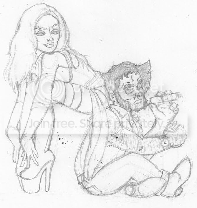 I've never much liked either of these characters, and yet somehow I not only got the idea to draw them, but it came out head and shoulders above my usual. Go figure. Pose ref for Psylocke is a fetish model named Mosh from her DeviantART account. Wolverine is unreferenced. I've never much liked either of these characters, and yet somehow I not only got the idea to draw them, but it came out head and shoulders above my usual. Go figure. Pose ref for Psylocke is a fetish model named Mosh from her DeviantART account. Wolverine is unreferenced.
|
|
|
|
|
|
|
|
|
|
|
|
|
|
|
Posted: Mon Jun 15, 2009 10:08 pm
The resultant inks:  Not my best work, but whipping 'em out was way more important than making 'em perfect. I have a lot more lead time on the next journal, which also works in a vein I'm far more familiar with, so I'm going to pull off something fabulously goth and mechanical and nasty. ...at least I hope I am, it was originally why they picked my in the first place. The gray scale, when unreduced, it actually screen tone. And even if they're not technically my best, I love the emotions they bring forth. These capture the stereotypes of fans for me, and the emotions we associate with them.
|
|
|
|
|
|
|
|
|
|
|
|
|
|
|
|
|
|
Posted: Mon Jun 15, 2009 10:12 pm
Conventions really need a higher class of transvestite...
|
|
|
|
|
|
|
|
|
|
|
|
|
|
|
Posted: Mon Jun 15, 2009 10:15 pm
If I'd had the time, I wanted to do the Pretty Bishy Boy you see once every ten years. They're not crossdressers (aside from the typical gender-bending they do by design), but they are absurdly pretty.
Most of the crossdressers who do well at conventions are women dressed as men.
|
|
|
|
|
|
|
|
|
|
|
|
|
|
|
|
|
|
Posted: Mon Jun 15, 2009 10:19 pm
Too true, but I've seen stubble-no wig-no makeup-no falsies senshi that look just like your drawing there too. Cross dressing is so much more fun when you do it right. God bless Eddie Izzard.
|
|
|
|
|
|
|
|
|
|
|
|
|
|