|
|
|
|
|
|
|
|
|
 Posted: Wed Aug 18, 2010 8:01 pm Posted: Wed Aug 18, 2010 8:01 pm
|
|
|
|
|
|
|
|
|
|
Posted: Sun Aug 22, 2010 1:16 am
|
|
|
|
|
|
|
|
|
|
|
|
|
Posted: Tue Sep 07, 2010 12:34 am
|
|
|
|
|
|
|
|
|
|
Posted: Wed Sep 08, 2010 9:00 am
All of your comfort zone seems to be graphic anatomical,, and graphic children. I was wondering have you tried any other category or styles (organic, anatomical, mix, and heroic, realistic, or animal?)?
|
 |
|
|
|
|
|
|
|
|
|
|
|
|
|
|
|
|
Posted: Mon Sep 13, 2010 8:43 pm
thug to the limit All of your comfort zone seems to be graphic anatomical,, and graphic children. I was wondering have you tried any other category or styles (organic, anatomical, mix, and heroic, realistic, or animal?)? I'm not sure I understand what you mean. Can you explain, or give some examples?
|
|
|
|
|
|
|
|
|
|
|
|
|
|
|
Posted: Thu Oct 21, 2010 3:27 pm
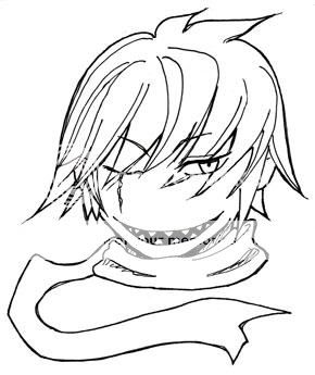
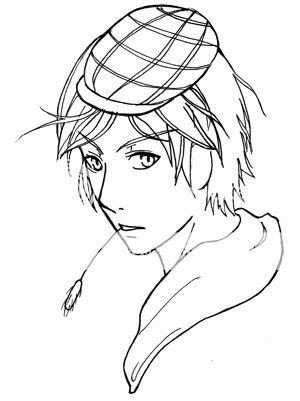
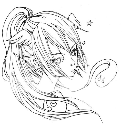
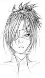
The hair on the freebie one is awesome, very detailed and nice, but the head is a little to long? (I believe that's the word I'm looking for)
This is what I mean;

The face just looks a little far over c:
And of course the neck would need to be a big bigger to compensate~
But other than that, the rest of your headshots look great :]
|
|
|
|
|
|
|
|
|
|
|
|
|
|
|
|
Errol McGillivray Captain
|
Posted: Thu Oct 21, 2010 5:33 pm
Lea Florens thug to the limit All of your comfort zone seems to be graphic anatomical,, and graphic children. I was wondering have you tried any other category or styles (organic, anatomical, mix, and heroic, realistic, or animal?)? I'm not sure I understand what you mean. Can you explain, or give some examples? Pick something you've never drawn and draw it. I agree with him. No one can get very far without leaving home (comfort zone).
|
|
|
|
|
|
|
|
|
|
|
|
|
|
|
Posted: Thu Oct 21, 2010 8:31 pm
Errol McGillivray Lea Florens thug to the limit All of your comfort zone seems to be graphic anatomical,, and graphic children. I was wondering have you tried any other category or styles (organic, anatomical, mix, and heroic, realistic, or animal?)? I'm not sure I understand what you mean. Can you explain, or give some examples? Pick something you've never drawn and draw it. I agree with him. No one can get very far without leaving home (comfort zone). This sums it up without me explaining majority of the aspects of concept art lol XD
|
|
|
|
|
|
|
|
|
|
|
|
|
|
|
|
|
|
Posted: Sat Dec 25, 2010 5:33 am
Woah, lots of replies. Haven't checked back in ages, thanks muchly for the comments! @Errol McGillivray: I understand what you're saying...will think about it. I draw for fun, and would rather prefer the drawing process be relaxing rather than stress-inducing, if you know what I mean. @thug to the limit: Yes, it makes sense now, thank you. @Umbra Tiger: Aha...I see what you're getting at. Thanks for the helpful pic!    
|
|
|
|
|
|
|
|
|
|
|
|
|
|
|
Posted: Thu Jan 06, 2011 8:51 am
d shiny contest entry is just awesome
u shudstep out of ur comfort zone more
|
|
|
|
|
|
|
|
|
|
|
|
|
|
|
|
|
|
Posted: Mon Jan 10, 2011 10:01 am
hinata1618 d shiny contest entry is just awesome
u shudstep out of ur comfort zone moreThanks. Will keep your advice in mind. smile
|
|
|
|
|
|
|
|
|
|
|
|
|
|
|
Posted: Thu Feb 24, 2011 6:07 am
The not-so-daily drawings. 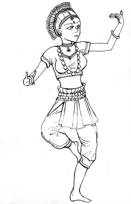 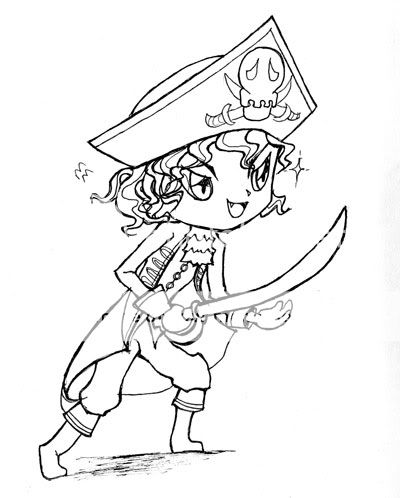
|
|
|
|
|
|
|
|
|
|
|
|
|
|
|
|
Errol McGillivray Captain
|
Posted: Thu Feb 24, 2011 9:33 am
Nice, strong, silhouettes on these. Especially the first one. From the top of her head, draw a line straight down. This is called a "plumb line". Where it hits the floor is where her foot needs to be in order for her to balance herself. The second is cute, but cut the coat back a little where it crosses the sword. When you black it all in, we should see that he's holding the sword. The coat would cover that up. I would also suggest keeping the floor flat in perspective. This will bring him off the page a little.
|
|
|
|
|
|
|
|
|
|
|
|
|
|
|
Posted: Sat Mar 05, 2011 12:13 am
Errol McGillivray Nice, strong, silhouettes on these. Especially the first one. From the top of her head, draw a line straight down. This is called a "plumb line". Where it hits the floor is where her foot needs to be in order for her to balance herself. The second is cute, but cut the coat back a little where it crosses the sword. When you black it all in, we should see that he's holding the sword. The coat would cover that up. I would also suggest keeping the floor flat in perspective. This will bring him off the page a little. Hiya Errol, thanks for the detailed crit! (and explanatory diagrams, too!) I get what you mean by the first - she doesn't look so balanced. The second threw me completely on a loop though...I'm guessing you mean the right foot should be bigger than the left, as it is closer to the 'front'. I could be wrong.
|
|
|
|
|
|
|
|
|
|
|
|
|
|
|
|
|
|
Posted: Sat Mar 05, 2011 12:14 am
  Trying out semi-realism. Click for image.
|
|
|
|
|
|
|
|
|
|
|
|
|
|
|
|
|
|