|
|
|
|
|
|
|
 Posted: Fri Dec 22, 2006 2:44 pm Posted: Fri Dec 22, 2006 2:44 pm
|
|
|
|
|
|
|
|
|
|
Posted: Thu Dec 28, 2006 1:11 pm
|
|
|
|
|
|
|
|
|
|
|
|
|
Posted: Sun Dec 31, 2006 2:13 pm
:O My biggest art contest (and probably my biggest ever unless I ever decide to leave Gaia xd ) which...admittedly isn't that big compared to some, but it's important to me as it's to help with my final essay for my university degree. ^^ I would actually really appreciate any advice anyone might have on this idea. 
|
 |
|
|
|
|
|
|
|
|
|
|
|
|
|
Posted: Sun Dec 31, 2006 4:44 pm
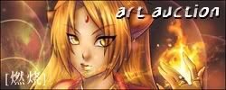
I would suggest either dimming down the contrast in the background, or changing the text colour so it doesn't blend in with it so well.
My eye completely skims over that banner and has no interest in dwelling on it, on account of it's just so busy. The word "ILLUSTRATION" is easy enough to read once I actually look at it, but the rest of it, that states it's an art contest and what the prizes are...
It's good that part is so short, because if it were longer, it would be too annoying to have to read. Like, I really have to focus on the banner to make sense of what it says.
Maybe is just me who has this problem with it, but I think a banner shouldn't be designed that way.
|
|
|
|
|
|
|
|
|
|
|
|
|
|
|
|
|
|
Posted: Sun Dec 31, 2006 5:44 pm
Anetra_Pendragon I would suggest either dimming down the contrast in the background, or changing the text colour so it doesn't blend in with it so well. My eye completely skims over that banner and has no interest in dwelling on it, on account of it's just so busy. The word "ILLUSTRATION" is easy enough to read once I actually look at it, but the rest of it, that states it's an art contest and what the prizes are... It's good that part is so short, because if it were longer, it would be too annoying to have to read. Like, I really have to focus on the banner to make sense of what it says. Maybe is just me who has this problem with it, but I think a banner shouldn't be designed that way. Well, I didn't mean the banner...^^; It was made by kawaiibunneh for me. I was talking about the contest itself.
|
|
|
|
|
|
|
|
|
|
|
|
|
|
|
Posted: Sun Dec 31, 2006 8:28 pm
I am aware of that. However, most people would find out about your contest via a banner, and if the banner is unappealing and difficult to read, nobody is going to click on it because they won't care to read what it is a banner for.
|
|
|
|
|
|
|
|
|
|
|
|
|
|
|
|
|
|
Posted: Sun Dec 31, 2006 9:26 pm
I like the banner....I'd click that. xd
|
|
|
|
|
|
|
|
|
|
|
|
|
|
|
Posted: Mon Jan 01, 2007 3:02 am
^^ I think it comes down to personal tastes what people will and won't click. But I do agree with you about how busy it is, I would have liked a more muted background for it and to see 'art contest' in slightly bigger letters, but given that she made it for free I was hardly going to complain. xd Plus I do like the eye. To be honest, I usually end up getting a few different banners anyway. whee Edit: Okay, I chopped up the banner to try and improve it. 3nodding I think this looks a little easier on the eyes now.
|
|
|
|
|
|
|
|
|
|
|
|
|
|
|
|
|
|
Posted: Mon Jan 01, 2007 7:21 pm
 auction for full CG biggrin
|
|
|
|
|
|
|
|
|
|
|
|
|
|
|
Posted: Mon Jan 01, 2007 7:22 pm
|
|
|
|
|
|
|
|
|
|
|
|
|
Posted: Thu Jan 04, 2007 3:44 pm
 My friend just opened a shop - super cute, super cheap...and she's a very kind and generous person too. xd heart
|
|
|
|
|
|
|
|
|
|
|
|
|
|
|
Posted: Fri Jan 05, 2007 5:50 am
listen, you people you! DevArt's Irulana needs money for school, so she opened commissions! her art is incredible, so go swarm her right now xD! http://irulana.deviantart.com/
|
|
|
|
|
|
|
|
|
|
|
|
|
|
|
|
|
|
Posted: Mon Jan 08, 2007 10:37 am
|
|
|
|
|
|
|
|
|
|
Posted: Wed Jan 10, 2007 6:40 am
|
|
|
|
|
|
|
|
|
|
|
|
|
Posted: Thu Jan 11, 2007 5:26 am
 New request thread. It's not really up and running yet.
|
|
|
|
|
|
|
|
|
|
|
|
|
|