|
|
|
|
|
|
|
 Posted: Tue Apr 22, 2008 9:00 am Posted: Tue Apr 22, 2008 9:00 am
Hmmm, true. I've done a lot of research on big breasted women and usually they well... sag like that (damn gravity! *shakes fist*). I will see how it looks to make them a bit perkier. The one thing I was trying to avoid when making big breasted women is not having them like crazy super anime perky ya know? I have a lot of big breasted friends rofl and I use them as reference to draw from. I noticed also that all breasts are so different! It's hard to find naked large breasts that have that nice full look to them with that perkyness your talking about. gonk
whee But yes the next time I draw Siin I'll give her a bit of 'omf' and less gravity to appease the Bilious god. wink
|
 |
|
|
|
|
|
|
|
|
|
|
|
|
|
Posted: Tue Apr 22, 2008 10:57 am
It just seems to me that if you're going for the big buxom beauty, you can take some artistic license since they dont' seem to have the same buxom fat growth anywhere else on their person but the chest XD If you're going for HOT push the HOT X) OR. Like.... big chicks at the Ren Fair- push those babies up with that corset! etc. X) idk, hot chicks aren't my fortay so I just says it like I sees it.
|
|
|
|
|
|
|
|
|
|
|
|
|
|
|
|
|
|
Posted: Tue Apr 22, 2008 12:58 pm
Hmmm, you do have a point. When sketching Siin in those pictures like in the skimpy outfits I was thinking theoretically since it's such small material it wouldn't have the strength to have her breasts fully pushed and supported. Not unless she was wearing a thicker corset with straps to her shoulders. The last pic with her in that more secretary outfit I was thinking of Siin wearing a loose fitting bra so her breasts have more of an easy access *winkwink* then compared to say having a firmer and supportive bra. My friends with big breasts always have trouble finding bras that fit and keep there breasts up and perky and not sag cause they aren't as supportive as they should be. Plus you have to find specially made bras for those type of women. Since I've been to renfair many times, I know what look you are talking about. I'll post a quick sketch of Siin in an outfit like that. *snicker* That'll be surely entertaining. xD Something like this would totally be hot. 
|
|
|
|
|
|
|
|
|
|
|
|
|
|
|
Posted: Tue Apr 22, 2008 1:15 pm
I also found something else pretty interesting for serving wench garb. "18th Century Serving Wench. If she were selling more than ale, she could remove the scarf around her neck to show her"wares" and use her apron to form a pillow." A to B HAHAHA omg Having Siin in an outfit like that would be downright hilarious. I should try that out and see how that works rofl
|
|
|
|
|
|
|
|
|
|
|
|
|
|
|
|
|
|
Posted: Tue Apr 22, 2008 5:02 pm
I looked at it for a while and had some more crit and comments on it and I finally sat down to fix up the details here and there. I shake my head at saggy breasts. I see where you are getting at though Bilious for sure. I had to move them around a bit because I realized that Duana's messed up hand is on her left and well... when I flipped it I kinda wasn't paying attention. I may just end up inking this?! Hows that? 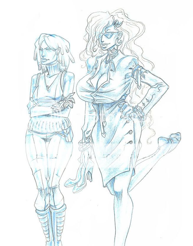 gonk gonk
|
|
|
|
|
|
|
|
|
|
|
|
|
|
|
Posted: Tue Apr 22, 2008 10:42 pm
i like them better "saggy" because thats what big boobs DO o: the perkier breasts do look better with her human clothes though because i imagine shed have a bra underneath to support them. but on the skimpier clothes the way you draw them looks great anatomically - and very sexy ;3
|
|
|
|
|
|
|
|
|
|
|
|
|
|
|
|
|
|
Posted: Tue Apr 22, 2008 11:26 pm
I guess the fact that giant boobs like that remind me of my mother and childhood trauma it makes them less appealing to me too XDD
Perkier in the clothes pic does look better IMO X)
Additionally, I wish their feet weren't cut off!
|
|
|
|
|
|
|
|
|
|
|
|
|
|
|
Posted: Wed Apr 23, 2008 9:24 am
When inked that can be easily fixed with photoshop exclaim
I try to keep my breasts as anitomically correct as possible with all that gravity mess lol.
|
|
|
|
|
|
|
|
|
|
|
|
|
|
|
|
Dr. Valentine Vice Captain
|
Posted: Mon Apr 28, 2008 5:44 am
Siin Adonai Awesome, thanks Dr. V. for the advice. mrgreen No problem, I know a thing or two about punching.
|
|
|
|
|
|
|
|
|
|
|
|
|
|
|
Posted: Mon Apr 28, 2008 11:40 am
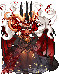
For some reason when you said punching I automatically thought of fisting. Man I really need to get my mind out of the gutter rofl! Anyway, here's a new piece I did yesterday. Watercolors and s**t. Fun stuff! Watercolors, 1 white prisma color and turpentine, 1 60% gray prisma marker, 2 felt tip permanent markers, 1inch tall blue pencil later ~...24" x 17" I think. I'll retake the picture later cause my camera hella ******** it up. ;_; It's way prettier in person. 
|
|
|
|
|
|
|
|
|
|
|
|
|
|
|
|
|
|
Posted: Mon Apr 28, 2008 11:42 am
The process woohoo! The inking took most of the time. She has a very big jaw. Lots of experimenting. I did a funny sketch of Siin as a bar maid hahaha, I'll scan that when I get home. xD 
|
|
|
|
|
|
|
|
|
|
|
|
|
|
|
Posted: Mon Apr 28, 2008 12:36 pm
OKAY I'll start by saying I really really like it, line quality, coloring, design, everything.
But if I were to say something constructive that really stuck out to me and I can hear my dad's voice in my head pointing out at great length is how flat everything feels. Sculpturally, I feel like that awesome twisting horn should have more depth to it. If this could have been achieved through deeper subshadows in the far curls, or something in the lineart, I'm not sure, but even with all it's great shapes to it, it flattens out to me as a zigzaggy sort of thing, same as the chin over the neck of the figure.
I suppose it's something just to think about in the next piece if you do something like this again, for what worth these observations are!
edit: Stared some more and concluded that I think what it is IS the lineart- you thickened the lienart around the outside, but it causes conflicts in where the twirl of the horns- running off the thicker portion to try to help the curves flow a little will help. Just remember that thicker lines=shadow, thinner= light as I'm sure you already know, I just think in this case it needed a little pushing!
|
|
|
|
|
|
|
|
|
|
|
|
|
|
|
|
|
|
Posted: Mon Apr 28, 2008 2:48 pm
that's gorgeous, my only recommendation is that her lip color and tongue color look really close in value in the last pic and it kinda looks like it might be her gums, so if that's still the case when you see it irl I would recommend a slight color tweak
|
|
|
|
|
|
|
|
|
|
|
|
|
|
|
Posted: Mon Apr 28, 2008 7:40 pm
Yeah, I really like how it came out and after it went through the critique in class I saw a lot of minor problems. The horn does not curl right in the first twist from what I realized. Since it's such a large piece ( I never really do big pieces like this lol) it was hard to really grasp that at the time. Then her neck (the sterno cleido mastoid?) The proportions are off anatomically as well as the facial features such as the nose. I see what you mean with the outlines. I wanted them thick so she stood out from the hair behind her. It was suggested from my teacher to add a few thicker lines into the hair so it's not so prominent. The watercolors are much richer in person. Unfortunately my camera sucks and it took a shitty picture. D:
It would have been better of me I imagine if I posted a in progress shot as I worked. Unfortunately it was a last minute project since it was due today. ^^;
The technique I used was definitely fun and I plan on using it again in the future.
As for the lips, I didn't pay much attention to her open mouth. Since if her lips where just slightly parted you'd only see a glimpse of her front teeth. Water colors are very hard to control and they kinda leaked into the mouth when painting the lips. ^^; I'm sure that can also be changed in photoshop but at this point I'm finished with this piece (besides the neck that is) and take what I've learned from this piece and put it onto the next.
I'll post up that bar wench pic real quick. xD
|
|
|
|
|
|
|
|
|
|
|
|
|
|
|
|
|
|
Posted: Mon Apr 28, 2008 8:34 pm
Bwaha~! I might fix this later on. For now it's put on the shelf for later use or whatever. The barmaid pic is fun and might be inked then shelfed later as well. xD ... after looking at this for a long time... man... MAN! Duana's pose looks all funky. *sulks* D': 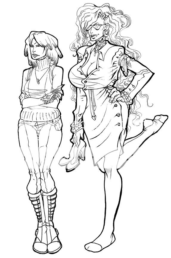 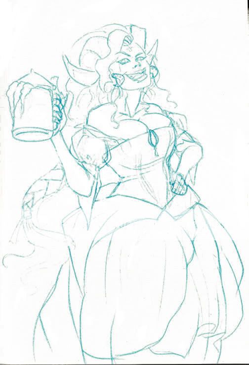
|
|
|
|
|
|
|
|
|
|
|
|
|
|