|
|
|
|
|
|
|
 Posted: Fri Sep 02, 2005 10:38 pm Posted: Fri Sep 02, 2005 10:38 pm
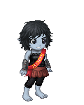
mourning dove Madame Solo: I skimmed over the first page of your thread, couldnt find it. ^^;; But pretty cool, reminds me alot of the star trek uniforms, and yet it stays original. Nice. Saga Dove, you removed her makeup. xd I really like the little petal pattern on her dress. The second ver side of her hair looking good! blaugh oh crap, thats right, she has no eyebrows now! EDIT: fixed Yah, it's actually teh last post >.<
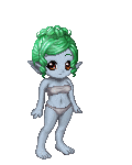
He's from Star Wars expanded universe. 3nodding
|
 |
|
|
|
|
|
|
|
|
|
|
|
|
|
Posted: Fri Sep 02, 2005 11:09 pm
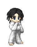
k...not to happy with how this turned out.. it an oc of a friend... 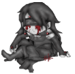 any recommendations...(besides my crappy shading job)?
|
|
|
|
|
|
|
|
|
|
|
|
|
|
|
|
|
|
Posted: Sat Sep 03, 2005 10:14 am
yeah what is it? sweatdrop
|
|
|
|
|
|
|
|
|
|
|
|
|
|
|
Posted: Sat Sep 03, 2005 10:17 am
Its kind of hard to tell where all the body parts are... So I would reccomend more contrast on the edges, that would help alot.
^^;; I'm not yet brave enough to try doing poses.
|
|
|
|
|
|
|
|
|
|
|
|
|
|
|
|
|
|
Posted: Sat Sep 03, 2005 2:18 pm
mourning dove Its kind of hard to tell where all the body parts are... So I would reccomend more contrast on the edges, that would help alot. ^^;; I'm not yet brave enough to try doing poses. yeah... i'm almost considering changing the colors of things...like i said... i really don't like it... but i'll try adding more contrast...
|
|
|
|
|
|
|
|
|
|
|
|
|
|
|
Posted: Sun Sep 04, 2005 12:52 pm
I think I''m to have to come back to this one and fix it up. But for now, here you go. Edit: I have two versions of it now. Um, which one do you like better? 
|
|
|
|
|
|
|
|
|
|
|
|
|
|
|
|
|
|
Posted: Sun Sep 04, 2005 3:27 pm
|
|
|
|
|
|
|
|
|
|
Posted: Sun Sep 04, 2005 4:40 pm
jenru yeah... i'm almost considering changing the colors of things...like i said... i really don't like it... but i'll try adding more contrast...
nice moody pose too... good stuff!
|
|
|
|
|
|
|
|
|
|
|
|
|
|
|
|
|
|
Posted: Sun Sep 04, 2005 4:50 pm
Have to aggree with Lucca, Dove. Backgrounds often detract from the hard work you''ve put into the edit itself. It''s a nice edit too!
|
|
|
|
|
|
|
|
|
|
|
|
|
|
|
Posted: Sun Sep 04, 2005 5:10 pm
Vorty Have to aggree with Lucca, Dove. Backgrounds often detract from the hard work you''ve put into the edit itself. It''s a nice edit too! erm, how about i put them side by side without either one having a backround... edit: okay, you may have to refresh to see them now... but i still dont know which one i like better, the first one has more details, but the second one reveals the skirt better.
|
|
|
|
|
|
|
|
|
|
|
|
|
|
|
|
|
|
Posted: Sun Sep 04, 2005 7:10 pm
Ah! In that case, I guess it's just a matter of preference. I personally like the details in the backgrounded one.
|
|
|
|
|
|
|
|
|
|
|
|
|
|
|
Posted: Sun Sep 04, 2005 7:24 pm
jenru k...not to happy with how this turned out.. it an oc of a friend... any recommendations...(besides my crappy shading job)? maybe just make the outlines stand out more, it's really cute tho, particularly the hand on her left (my right)
|
|
|
|
|
|
|
|
|
|
|
|
|
|
|
|
|
|
Posted: Sun Sep 04, 2005 7:33 pm
Ooh, now that the backgrounded one is de-backgrounded, I do like it very much better!
|
|
|
|
|
|
|
|
|
|
|
|
|
|
|
Posted: Sun Sep 04, 2005 9:09 pm
thanks for all the helpful comments!! ok...i tried to change it...any better? what else still needs work? 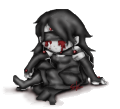 dove.... i didn't see the ones with backgrounds, but i like the one with purple better.. helps break it up more... but if you like simple go with the other...(my own clothing designs are usually really busy...)
|
|
|
|
|
|
|
|
|
|
|
|
|
|
|
|
|
|
Posted: Sun Sep 04, 2005 10:27 pm
*comes in wearing a buret and a long thin mustache* Mah latest work, zee?  Wat do yoo theenk of 'er? Translation from poorly executed stereotypical french accent:My latest work: What do you think?
|
|
|
|
|
|
|
|
|
|
|
|
|
|