|
|
|
|
|
|
|
|
|
 Posted: Fri Jun 24, 2005 6:27 am Posted: Fri Jun 24, 2005 6:27 am
There would have been much more fun if they'd played some actual music instead of just rap.
|
 |
|
|
|
|
|
|
|
|
|
|
|
|
|
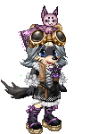
Posted: Fri Jun 24, 2005 5:35 pm
You were quite a vision, Lucca! I'd have to say that is the best prom picture I've seen.
It seems most of the suckers at my school get conned out of too much money with a lame dress and a cheesy pose.
Does it serve them right, or should we pity their gullibility?
Perhaps we should shun their frivilousity....
|
|
|
|
|
|
|
|
|
|
|
|
|
|
|
|
|
|
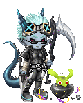
Posted: Sat Jun 25, 2005 4:27 am
 My ULTIMATE Predator type edit... PURPLE ARMOUR! 4laugh 4laugh heart
|
|
|
|
|
|
|
|
|
|
|
|
|
|
|
Posted: Sat Jun 25, 2005 1:17 pm
enigma101 My ULTIMATE Predator type edit... PURPLE ARMOUR! 4laugh 4laugh heart o.O *Poke*
|
|
|
|
|
|
|
|
|
|
|
|
|
|
|
|
|
|
Posted: Mon Jun 27, 2005 8:45 am
After reading the main page of the guild, I came across this: Quote: The Guild is public so you don't need to be a member to enjoy the company, admire the editors work or get hints/tips on improving your own work. So I ask again, what do you think of my edit? 
|
|
|
|
|
|
|
|
|
|
|
|
|
|
|
Posted: Mon Jun 27, 2005 9:19 am
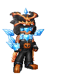
Digital Requiem Hey I just rejoined on my new account, and I've been working on this request I was given.  The background is red because with white you dont really notice all the details, red brings it out the best. What can I do to make it better?
as far as ur whites go, u dont need to keep them stark white.. pure white should b saved for bright highlights or any other shiny spots. take the bone helm im wearing or the angelic scarf in my sig pic as examples, u can shade white with either gray or blue tones, depending of course how luminescent u want ur white. i feel that blueish shading brightens a white more so than grays n such.
i know u want ur whites to stand out from the black suit, but there should still be enough contrast with a little shading added to the whites. with some good shading n coloring, white objects should stand out perfectly even against a bright white background 3nodding
tho in any case, like dragon revenge already told u, theres nothing wrong with using a background on ur final product wink
|
|
|
|
|
|
evil shocktv3 Vice Captain
|
|
|
|
|
|
|
|
|
|
|
|
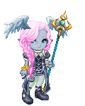
Posted: Mon Jun 27, 2005 5:58 pm
Kopyrite After reading the main page of the guild, I came across this: Quote: The Guild is public so you don't need to be a member to enjoy the company, admire the editors work or get hints/tips on improving your own work. So I ask again, what do you think of my edit?
Great hair! You could stress the highlights even further, should you wish-thus achieving a high gloss effect.
Make your shading more gradual, and carry one of your darker shades over to outline your highlighted side, that's the Gaian way and it sets the edit off from the white backgound.
That is a very nifty tattoo...though I can't make it into an recognizable object.
The belts on the arm are awesome! All you need to do is shade the skin around them and outline the buckles.
Nice work so far! 3nodding
|
|
|
|
|
|
|
|
|
|
|
|
|
|
|
Posted: Wed Jun 29, 2005 8:38 pm
I went all the way to Zeal Kingdom to get the birthday present for Silverstris, and now she probably can't open it unless she's got an Angelic Pendant. Oh well... how's the outfit I got while I was there?  
|
|
|
|
|
|
|
|
|
|
|
|
|
|
|
|
|
|
Posted: Wed Jun 29, 2005 9:42 pm
The flowiness ish pretty, Lucca ^_^ Wunnerful shading on the hat, too ^^
Well, I was cleaning out my folder on this computer and found a random edit I made some time ago..

Gunner Yuna!
|
|
|
|
|
|
|
|
|
|
|
|
|
|
|
Posted: Wed Jun 29, 2005 9:45 pm
I took a shot and now I regret it. 
|
|
|
|
|
|
|
|
|
|
|
|
|
|
|
|
|
|
Posted: Wed Jun 29, 2005 10:02 pm
That looks pretty good, XxNineBallxX ^_^
Instead of a black outline, why don't you try a darker shade of a color instead, so it's a bit more natural..Along with shadows on a cell-shaded pic, there can be highlights to bring out the color and make it a little more real, setting out a source of light..And highlights/shadows are often even more contrasted when it comes to weapons.
Keep up the good work! blaugh
Don't ever regret making edits, the more you practice, the better you get wink
|
|
|
|
|
|
|
|
|
|
|
|
|
|
|
Posted: Wed Jun 29, 2005 10:07 pm
da freaky 1 That looks pretty good, XxNineBallxX ^_^
Instead of a black outline, why don't you try a darker shade of a color instead, so it's a bit more natural..Along with shadows on a cell-shaded pic, there can be highlights to bring out the color and make it a little more real, setting out a source of light..And highlights/shadows are often even more contrasted when it comes to weapons.
Keep up the good work! blaugh
Don't ever regret making edits, the more you practice, the better you get wink ^^ Thank you, what really threw me off was the picture I based me Avatar... I think the artist could of help ME and save the picture in a PNG so I could steal the colors better. ^.-
|
|
|
|
|
|
|
|
|
|
|
|
|
|
|
|
Assimilated Businesswoman
|
Posted: Fri Jul 01, 2005 10:47 am
Gyeah, I haven't been on in forever. D:
I've had doctors appointments and been moving and stuff. >
BUUT So I'm online real quick before I move completely (computer last thing to be moved. xD!!) and am trying to make an avi edit I promised my friend forever ago.
Tell me honestly, which dress sucks less? D:
I honestly can't tell which I want to use, and I can't ask my friend which she likes more, as it's a surprise. ><
... and Lucca, the fold on that purple-y dress are gorgeooous. D: <333333
And the hat is awesome too.
::edits pic::
Man you guys are great. I just walk in here and the creative vibes flow like crazy and I feel the urge to edit. :O <33
|
|
|
|
|
|
|
|
|
|
|
|
|
|
|
Posted: Fri Jul 01, 2005 9:07 pm
This reply is apologetically wishy-washy, but could you blend the two? Keep the white design to the side, but make the space it takes up a little wider, and then have the general lovely purple colour be a bit lighter?
If you want to keep the dress shade the same I suggest a little more attention to the shade between the legs. It looks a little awkward how most of the shadows just kinda spill right there. smile
(Just spread it out a little more across the top of the thigh. wink )
Oh! And the all-over white design makes the breasts look larger, if that weighs any in your final decision. whee
|
|
|
|
|
|
|
|
|
|
|
|
|
|
|
|
|
|
Posted: Sat Jul 02, 2005 5:32 am
Here's another boktai one I got to, thank god I made Django the week before or I would never of gotten this one down. I should use my photoimpression's blend tool to smudge some of the lines more huh?
|
|
|
|
|
|
|
|
|
|
|
|
|
|
|
|
|
|