|
|
|
|
|
|
|
|
|
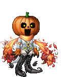
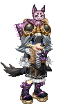
 Posted: Mon Apr 18, 2005 11:52 am Posted: Mon Apr 18, 2005 11:52 am
Very sweet Saikano!
Might I suggest you put her under the umbrella rather than behind it?
Either that or put shadows on her face so the umbrella doesn't fade into her skin tone so much.
I love the shapes-very nice!
|
 |
|
|
|
|
|
|
|
|
|
|
|
|
|
Posted: Mon Apr 18, 2005 12:08 pm
TheQualityofMercy Very sweet Saikano!
Might I suggest you put her under the umbrella rather than behind it?
Either that or put shadows on her face so the umbrella doesn't fade into her skin tone so much.
I love the shapes-very nice! thanks. i was having trouble with the umbrella...it mocks me ever so much..-evil eyes the umbrella- and yah, ill try adding in some shading to the face.
|
|
|
|
|
|
|
|
|
|
|
|
|
|
|
|
|
|
Posted: Mon Apr 18, 2005 12:10 pm
here we go! it has shading on the face now! 
|
|
|
|
|
|
|
|
|
|
|
|
|
|
|
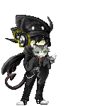
Posted: Mon Apr 18, 2005 7:21 pm
^^ thought i would ask what you guys would think of these 2 edits and any pointers and critisesm is welcomed  
|
|
|
|
|
|
|
|
|
|
|
|
|
|
|
|
|
|
Posted: Mon Apr 18, 2005 8:54 pm
*squeals* Naruto n Sasuke!!!!!
I've read the first 4 volumes, now, my friend lent em to me biggrin
So I'll C&C on it since I can't help...eur...staring at it ^^
Anyways....
For comments... you've got excellent colors, and did pretty well on the accessories..The way you placed your shadows is also reallllly good smile
As for crits...you need to sharpen a little bit, on both...adding a slightly harsher outline helps [points to gaian clothes for example], and Naruto's hair's outline should be a deep yellow, instead of a dark blue so that it doesn't contrast quite as much with the rest of his hair...a bit more shadow could be added to Sasuke's hair, too, I might add, for depth ^^
|
|
|
|
|
|
|
|
|
|
|
|
|
|
|
Posted: Tue Apr 19, 2005 6:01 am
Saikano thanks. i was having trouble with the umbrella...it mocks me ever so much..-evil eyes the umbrella- and yah, ill try adding in some shading to the face.

Now I know yours is on a slant, so it'll be a bit trickier for you, but I have faith in you 3nodding
|
|
|
|
|
|
|
|
|
|
|
|
|
|
|
|
|
|
Posted: Tue Apr 19, 2005 6:07 am
Nice work samus, you got their style down. Try not to scribble your large areas of colour (shirt and hair). Instead, make good use of the paint bucket tool, which will give you a much more solid finish.
I'd also follow freaky's suggestion, bold shading and heavier outlines NEVER looks wrong. Unless you overdo it of course...*prods some of gaia's less proud items* >>;
|
|
|
|
|
|
|
|
|
|
|
|
|
|
|
Posted: Tue Apr 19, 2005 6:37 am
xd
its been too long since ive seen a naruto edit! pretty good stuff samus x, n i agree with whats been said so far by freaky n vorty so theres no more need to elaborate.
wait, one thing about naruto tho.. with the direction u have him facing, u forgot to add in the swirl patch on his upper left arm. wink
|
|
|
|
|
|
|
|
|
|
|
|
|
|
|
|
|
|
Posted: Tue Apr 19, 2005 6:41 am
oh, n i still highly approve of ur subject matter whee
ninja
kage bunshin no jutsu!!
ninja ninja ninja ninja
|
|
|
|
|
|
|
|
|
|
|
|
|
|
|
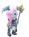
Posted: Tue Apr 19, 2005 9:32 pm
 My newest and the first where the hair was 100% my own pixeling. Comments and critisism are welcome.
|
|
|
|
|
|
|
|
|
|
|
|
|
|
|
|
|
|
Posted: Wed Apr 20, 2005 12:47 am
Your white areas are too white. Give them a darker outline and they'll be much more visible, so she won't look like she's got no hands/feet.
The Skirt looks quite flat, try to make the left side (our left) lighter than the right side.
I like the hair, the curls are cute, it could use a halo highlight (you know, the lighter circlet on anime hair which makes it look shiny)
You did a pretty good job there dragon! Keep up the good work.
|
|
|
|
|
|
|
|
|
|
|
|
|
|
|
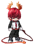
Posted: Wed Apr 20, 2005 10:30 am
 Another commission for AllianceSJR. I am very, very proud of this one.
|
|
|
|
|
|
|
|
|
|
|
|
|
|
|
|
|
|
Posted: Wed Apr 20, 2005 10:43 am
Vorty Your white areas are too white. Give them a darker outline and they'll be much more visible, so she won't look like she's got no hands/feet.
The Skirt looks quite flat, try to make the left side (our left) lighter than the right side.
I like the hair, the curls are cute, it could use a halo highlight (you know, the lighter circlet on anime hair which makes it look shiny)
You did a pretty good job there dragon! Keep up the good work. I know, I have such a horrible time with white. Will do. I knew I was forgetting something with her hair. Maybe after I add it I won't hate the hair so much. Thank you for looking at her and giving me your advice. *Runs off to fix her*
|
|
|
|
|
|
|
|
|
|
|
|
|
|
|
Posted: Wed Apr 20, 2005 10:54 am
Ok I fixed her, I hope.  Again comments and critisism are appreciated.
|
|
|
|
|
|
|
|
|
|
|
|
|
|
|
|
|
|
Posted: Wed Apr 20, 2005 11:49 am
Lighten the skirt just a little more...and let the light-area extend closer to her arm.
The highlight on the hair looks pretty good, I would make her curls two or three pixels thicker. That way you can have more fun practicing to shade them! whee
Did you give her a smaller chest? Perhaps it's your white being evil again.
Feel free to go just a titch darker around the very edges. The grey you've got right now looks awesome!
(Nice work on the bow-you may want to shade it as well. wink )
|
|
|
|
|
|
|
|
|
|
|
|
|
|
|
|
|
|