|
|
|
|
|
|
|
 Posted: Mon Apr 11, 2005 4:32 pm Posted: Mon Apr 11, 2005 4:32 pm
Thank you, thank you!
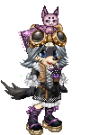
The duck doesn't feel finished to me...should I add more shades? More...somethings??
|
 |
|
|
|
|
|
|
|
|
|
|
|
|
|
Posted: Mon Apr 11, 2005 5:08 pm
TheQualityofMercy Whee! Here's my addition to the Gulid-Slumber Party.
(Too bad Tyran isn't here!)
I wanted to put a design on the shirt, but it proved too complicated a design. It was the plaid skirt all over again! Any suggestions for adding some simple details?
 I know you were trying for 'sleepy,' but with that grin, you look kinda stoned...
|
|
|
|
|
|
|
|
|
|
|
|
|
|
|
|
|
|
Posted: Mon Apr 11, 2005 5:10 pm
Lucca Ashtear TheQualityofMercy Whee! Here's my addition to the Gulid-Slumber Party.
(Too bad Tyran isn't here!)
I wanted to put a design on the shirt, but it proved too complicated a design. It was the plaid skirt all over again! Any suggestions for adding some simple details?
I know you were trying for 'sleepy,' but with that grin, you look kinda stoned... Is it just me or do I hear the "you look stoned" remark a lot? (No fence Lucca) I think it looks fine ^ ^
|
|
|
|
|
|
|
|
|
|
|
|
|
|
|
Posted: Mon Apr 11, 2005 5:14 pm
TheQualityofMercy Thank you, thank you!
The duck doesn't feel finished to me...should I add more shades? More...somethings??
|
|
|
|
|
|
|
|
|
|
|
|
|
|
|
|
|
|
Posted: Mon Apr 11, 2005 5:20 pm
Thanks Lucca, I love you too!
xp
I was a little worried about that, but if I changed the smile any more, then it leaves no option other than looking stoned.
Ah! The arm is too low!!
And too light...bugger...
|
|
|
|
|
|
|
|
|
|
|
|
|
|
|
Posted: Mon Apr 11, 2005 6:56 pm
Shock's Suggestion:

Vorty's Suggestion:

Eh? Eh?
|
|
|
|
|
|
|
|
|
|
|
|
|
|
|
|
|
|
Posted: Mon Apr 11, 2005 7:03 pm
the duckie n ur sox need more of an outline... lookit the sides of ur avi's legz, dont b afraid to darken the edges like that. itll make the pieces pop out from the background 3nodding
|
|
|
|
|
|
|
|
|
|
|
|
|
|
|
Posted: Mon Apr 11, 2005 7:07 pm
But...I'm not very fond of the harsh Gaia-outline!
I do need to buck up my lines though. Perhaps I'll feel braver after I give my lily-liver something to chew on.
|
|
|
|
|
|
|
|
|
|
|
|
|
|
|
|
|
|
Posted: Mon Apr 11, 2005 11:46 pm
|
|
|
|
|
|
|
|
|
|
Posted: Tue Apr 12, 2005 3:20 am
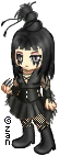
If you sharpen up the highlights, you get a glossy effect, which would help you better portray the latex in her outfit.
also notice that the shirt she's wearing (and the top of the boot) is banded and has some linear details on it. I suggest staring hard at the images, trying to pick out as much texture as you can and implement it then in your avatar.
|
|
|
|
|
|
|
|
|
|
|
|
|
|
|
|
|
|
Posted: Tue Apr 12, 2005 10:30 am
The gathered hair is a little bit poofier. If you could add more stray strands, that would look spectacular.
Give the pleats in her skirt more variation in size and length, and make her skin a bit lighter. xd
|
|
|
|
|
|
|
|
|
|
|
|
|
|
|
Posted: Tue Apr 12, 2005 2:44 pm
Thanks guys! I will try those now. =D
|
|
|
|
|
|
|
|
|
|
|
|
|
|
|
|
|
|
Posted: Tue Apr 12, 2005 4:50 pm
Woot woot! *does a little dance*
My duck looks too small now...
Yeay! Let's go find some more faults!
|
|
|
|
|
|
|
|
|
|
|
|
|
|
|
Posted: Tue Apr 12, 2005 5:33 pm
Awmigawsh awesome edits. D:
I love all the PJ edits. xD
And thanks mercy for ze comment on my last posted edit...
And Zanmato that edit rawks. @___@!
... Gawd, everyone in here is so talented... xDD
Erm, can ask for help again? >>!! ... for an edit for an auction winner.

(can't decide which hair color is closer)
ref picture
I can't get the damn hair to look right... was fighting horribly with whether to make it in the style of the pic or in a more gaian-like style and then in a more me-like style... xDD
Any suggestions? ^____^
|
|
|
|
|
|
Assimilated Businesswoman
|
|
|
|
|
|
|
|
|
|
|
|
Posted: Tue Apr 12, 2005 6:10 pm
With avatars I find it helps to keep it as close to gaia as possible, that's why most of us try to have no antialiassing or blurring on the edges. It also makes the edits loook cleaner and clearer, due to the constraints of the small-scale image. Hair's trickier tho, 'cause not even the gaian pixel artists know what style they're aiming for. One moment they kee[ it really simple, the next they overdo it, like the long, straight female hair. (I think it's called "silk")
Personally I think simple works well, as it does in the two images you posted.
I'd keep the hair purple, as it contrasts from the outfit, making it a little less plain. It also sticks closer to the reference, as I think the commissioner will be expecting.
|
|
|
|
|
|
|
|
|
|
|
|
|
|