|
|
|
|
|
|
|
|
|
 Posted: Mon Jan 18, 2010 7:27 pm Posted: Mon Jan 18, 2010 7:27 pm
Welcome to my sketchbook OF DOOM. Just kidding. No doom here.
- I'm a 17 year old Psychology student at -insertuniversitynamehere-. I'm somewhere between 1st and 2nd year, as I"m taking all 2nd year classes.
- I have no art training whatsoever, I'm jsut herpderping my way through self-teaching.
- Right now my main goal is to work on anatomy and movement and stuff like that.
- I work with many mediums, but the ones you will mostly see are quick graphite sketches or digital works.
-Rarer sights are Acrylics/Watercolors/Oils, and colored pencil/Charcoal.
My dA is MarianasLlama
Thanks <3
|
 |
|
|
|
|
|
|
|
|
|
|
|
|
|
Posted: Mon Jan 18, 2010 8:32 pm
Psst, last I checked, dA doesn't allow hotlinking. You have to post links to your deviations, or upload the images to sites like photobucket if you want to directly post the images.
I like your range of values (darks and lights). For example, in the first picture, there are some extremely dark parts, and they contrast nicely against the lighter parts. 3nodding
The main thing that I think you need to work on is the alignment and the overall balance. I can do some redlines if you'd like. You do a good job getting the details down, like the subtle curves of the nose in the first picture, or the lips and the eyes in the third picture. But you should be getting the overall balance down before adding details like those.
Lastly, it looks like you're relying very heavily on reference photos. If replicating photos is your main goal, then that's perfectly fine, but it would be a shame to limit yourself to such a limited part of the vast world of art. I'd like to see some pictures from you that are not based on existing photos.
|
|
|
|
|
|
|
|
|
|
|
|
|
|
|
|
|
|
Posted: Mon Jan 18, 2010 10:03 pm
Uh, I don't think you need watermarks. No one here will steal your art, and it just makes it annoying to look at.
Everything looks a bit lop sided. I think you need to do a light sketch in pencil before detailing, just the stick figure or a graph of the face.
This way you can see if they are lop sided, before drawing a perfect eye/hand/leg/nostril that you don't want to loose because you know you'll ruin it.
Your contrast is better than most, but I suggest pushing the shadows and highlights even further.
The whites of the eyes aren't totally white so go over them lightly with another colour.
Good luck!
|
|
|
|
|
|
|
|
|
|
|
|
|
|
|
Posted: Tue Jan 19, 2010 7:35 am
keiiii Psst, last I checked, dA doesn't allow hotlinking. You have to post links to your deviations, or upload the images to sites like photobucket if you want to directly post the images. I like your range of values (darks and lights). For example, in the first picture, there are some extremely dark parts, and they contrast nicely against the lighter parts. 3nodding The main thing that I think you need to work on is the alignment and the overall balance. I can do some redlines if you'd like. You do a good job getting the details down, like the subtle curves of the nose in the first picture, or the lips and the eyes in the third picture. But you should be getting the overall balance down before adding details like those. Lastly, it looks like you're relying very heavily on reference photos. If replicating photos is your main goal, then that's perfectly fine, but it would be a shame to limit yourself to such a limited part of the vast world of art. I'd like to see some pictures from you that are not based on existing photos.
The words I want are out of reach, but they've never been so loud...
oh, didn't know that :b
I just dont' ahve them uploaded anywhere else- I'll just link to my deviations instead.
To the other poster- the watermarks are only because of the above reason, i don't have them uploaded anywhere else.
Redlines would be nice =o Not sure exactly what you mean by overall balance, but I can see how my work is definitely lopsided at times (Especially second picture, ugh xD)
& I'm also trying something without reference right now, but I have to say it's taking a lot longer, but I'll post it eventually.
No surrender: I -did- have a light sketch before detailing them, but between sketch and details, I somehow manage to ruin it xDD
|
|
|
|
|
|
|
|
|
|
|
|
|
|
|
|
|
|
Posted: Fri Jan 22, 2010 8:20 pm
PM'd to OP; posting here since other people may benefit from it too. 
|
|
|
|
|
|
|
|
|
|
|
|
|
|
|
Posted: Wed Feb 03, 2010 6:02 pm
The words I want are out of reach, but they've never been so loud...
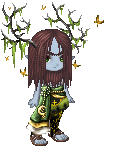
Update with a new WIP (:
|
|
|
|
|
|
|
|
|
|
|
|
|
|
|
|
|
|
Posted: Wed Feb 03, 2010 9:14 pm
Hi hi ^_^
On you new WIP: Just want to say that I really can't say much on this... except-- Is she supposed to be looking at the butterfly? If she is, it doesn't appear to be that way to me. It doesn't look like she is looking at it. I guess that is all for now. Good luck ^_^
|
|
|
|
|
|
|
|
|
|
|
|
|
|
|
Posted: Thu Feb 04, 2010 7:28 am
lalamariana Hi hi ^_^
On you new WIP: Just want to say that I really can't say much on this... except-- Is she supposed to be looking at the butterfly? If she is, it doesn't appear to be that way to me. It doesn't look like she is looking at it. I guess that is all for now. Good luck ^_^
The words I want are out of reach, but they've never been so loud...
Hm. I think I agree. It looks more like she's looking at it when on paper...
But I have done more with the eye now....
Hopefully I've fixed it (:
Thanks for pointing that out ^^
|
|
|
|
|
|
|
|
|
|
|
|
|
|
|
|
|
|
Posted: Thu Feb 04, 2010 4:43 pm
The words I want are out of reach, but they've never been so loud...
New WIP up again (:
|
|
|
|
|
|
|
|
|
|
|
|
|
|
|
Posted: Thu Feb 04, 2010 10:01 pm
Is the butterfly supposed to be realistic? If so, you should look up references. I know you've been trying to stop using references as a crutch, but you can't draw something if you're not familiar with what it looks like. With new subject matters, using a reference is necessary unless you have the opportunity to observe it in real life. redlines for the girl - the silhouette of her profile was off, and since the subject seems to be a Caucasian, I moved the eye further back.
|
|
|
|
|
|
|
|
|
|
|
|
|
|
|
|
|
|
Posted: Sat Feb 06, 2010 5:46 pm
keiiii Is the butterfly supposed to be realistic? If so, you should look up references. I know you've been trying to stop using references as a crutch, but you can't draw something if you're not familiar with what it looks like. With new subject matters, using a reference is necessary unless you have the opportunity to observe it in real life. redlines for the girl - the silhouette of her profile was off, and since the subject seems to be a Caucasian, I moved the eye further back.
The words I want are out of reach, but they've never been so loud...
Thanks, I've been trying to figure out how exactly to fix her chin. ^^
&I've been going back and forth between realistic and not, because it's supposed to look kindof mystical and such, so I have no idea where I'm going with the butterfly at this point xD
|
|
|
|
|
|
|
|
|
|
|
|
|
|
|
Posted: Sat Feb 06, 2010 6:15 pm
If it helps the butterfly you have is similar to a swallowtail.
|
|
|
|
|
|
|
|
|
|
|
|
|
|
|
|
|
|
Posted: Sun Feb 07, 2010 11:21 am
lalamariana If it helps the butterfly you have is similar to a swallowtail.
The words I want are out of reach, but they've never been so loud...
The words I want are out of reach, but they've never been so loud...
=o That does help. Gives me a great idea of how to make the wings look better. Thanks (:
New version uploaded.
Being really thorough with all the crits on this one, so hopefully next time I won't make as many mistakes.
|
|
|
|
|
|
|
|
|
|
|
|
|
|
|
Posted: Tue Apr 27, 2010 8:57 pm
Kiss me goodbye, I'm defying gravity.
New WIP
 ----- Angelic Minis: 500k/80mil---- ----- Angelic Minis: 500k/80mil----
|
|
|
|
|
|
|
|
|
|
|
|
|
|
|
|
|
|
|