|
|
|
|
|
|
|
|
|
 Posted: Fri Aug 22, 2008 8:27 am Posted: Fri Aug 22, 2008 8:27 am
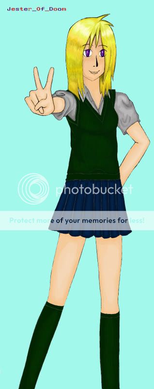 A simple picture of a schoolgirl. Coloured in photoshop. Where can i improve? Any tips on how to shade and colour better?
|
 |
|
|
|
|
|
|
|
|
|
|
|
|
|
Posted: Sat Aug 23, 2008 12:37 pm
Main thing is lighting source and brightness difference. You have shading, yes, but it's really close to the initial color's shade. Try making it a bit more harsh. (That's possibly an opinion. It just doesn't look shaded on parts like the skin and socks to me. The shirt and hair is fine for the difference in shade.)
As far as the light source goes, The hair shows light from the top, as well is the shading on the face but after that, the light source seems to be coming from our viewpoint.
As well, though most of the lines are clean, places like the skirt and overshirt have fuzzy gray lines. Might want to try making them like the lines on the hands to make it flow better. I find the pen tool in photoshop really useful for doing lineart stuff. You just have to know how to do the lines. (I generally stroke the paths with a 1-2 pixel brush with a soft edge, then stroke again with a 3-5 pixel brush with simulated pen pressure. Not a perfect way of doing it, no, but it is pretty decent, and you can clean up the lines to look better afterwards, and saves a bit of effort.)
This is what I see, and there is nothing to state that how I see it is accurate to how everyone sees it. Just some suggestions on what I would do. It's good overall, skin tone is a realistic tone (That was the hardest for me to figure out.) Keep working at it ^_^!
|
|
|
|
|
|
|
|
|
|
|
|
|
|
|
|
|
|
Posted: Sun Aug 24, 2008 9:40 pm
I agree with Caliber Mensk on pretty much everything. Although, if you use Photoshop Elements (like me) then there isn't a cool liney pen tool (at least I don't think and if there is then it would be really helpful if someone would point it out) then you should just do it by hand and not be afraid of your lines. For shading, don't be afraid to use the "dodge" and "multiply" features. Just adjust opacities to your liking. I find that with most colors (especially skin tones) if you just use the main color you want (like just the general color you're going for without the shading) then you can use that to color all of the skin (in this case) and then you can use the "dodge" feature for that brush and you can do all the light parts (I suggest not going all the way to 100% on dodge because it's fairly powerful but for some styles it may work) and then using the "multiply" feature on the brush you want to paint the darker areas. Works for me at least. Also, for the skirt, try not to make them totally smooth. You could use the smudge ( the finger ) to smudge your lines around a little so that you can form more natural-looking wrinkles in the clothes. It also helps for the skin to help smooth out some shading and such if it continues to come out too dramatic or single-cell for ya. mrgreen You get to the finger too when you right click on either the band-aid button or the dodge/burn/smudge button. I don't really remember which one. But that's all I can say. Oh. And watch the yellow tones. The hair on this person has a green tint to it like the girl went swimming in the pool the day before and forgot to wash it out. But the girl is drawn quite well and you've done an exceptionally good job on coloring! Very Good Job! mrgreen
|
|
|
|
|
|
|
|
|
|
|
|
|
|
|
Posted: Tue Aug 26, 2008 3:53 pm
Its pretty good, you got the shading down & everything.
|
|
|
|
|
|
|
|
|
|
|
|
|
|
|
|
|
|
Posted: Thu Aug 28, 2008 6:43 am
yup its pretty good but its really bright you need to look really close to see the shading. but its really good!
|
|
|
|
|
|
|
|
|
|
|
|
|
|
|
|
|
|