Welcome to Gaia! ::

Reply Art Fags
Pepper Project

Quick Reply

Enter both words below, separated by a space:

Can't read the text? Click here

Submit

otimohoT

PostPosted: Fri Feb 01, 2008 9:37 pm


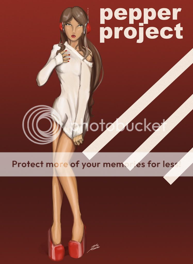
Help me with my submission by critiquing etc.
I'd really appreciate it
User Image
alsooooo if you don't know what the pepper project is, it's an art-book project revolving around a central subject or subjects, two characters of artgerm's
PostPosted: Fri Feb 01, 2008 11:53 pm


Ya know, Toho....I think you should scrap this and start over and push yourself HARDER, pushing yourself beyond to the next level....if your serious about enterin in that Artgerm mess that is, or serious about your work when you to cut it to the core.


a booging to be taken seriously but not so seriously kinda pointless to do a drawover, but it helps illustrate my thoughts kinda....sorta :B

Push from level head on views of your figures thats nothing but dead and boring, Toho, work on your form...(give em SUBSTANCE, give the illusion of mass despite being confined to the second dimension. a bit of a starter, box and block out your shapes, if that makes any sense), structure and overall anatomy....try to work in and with the flow and forces of the figure (a bit of a starter, take two opposing curves and place em opposite eachother...like the curve of the hip-thigh opposing the curve of the shoulder/upper ribcage/torso)...

color pallet wise, avoid using the same color in your highs and lows (don't go darker or whiter...again dead and boring), try to jazz it up by using contrasting pairs, like for isntance say, green to red, or purple to yellow or deep bluish to yellow....the possibilities are endless given to the whims of mood or theme

Brush stroke wise, I'd advise you to polish it a bit further, make it a bit more smooth-like


Not trying to crush you down Toho, just trying to take what you have now and help you make it better...
warrior_of_boognish

Destructive Lunatic


otimohoT

PostPosted: Sat Feb 02, 2008 12:03 am


boog you art so hard crying
PostPosted: Sat Feb 02, 2008 9:17 am


warrior_of_boognish
Ya know, Toho....I think you should scrap this and start over and push yourself HARDER, pushing yourself beyond to the next level....if your serious about enterin in that Artgerm mess that is, or serious about your work when you to cut it to the core.


a booging to be taken seriously but not so seriously kinda pointless to do a drawover, but it helps illustrate my thoughts kinda....sorta :B

Push from level head on views of your figures thats nothing but dead and boring, Toho, work on your form...(give em SUBSTANCE, give the illusion of mass despite being confined to the second dimension. a bit of a starter, box and block out your shapes, if that makes any sense), structure and overall anatomy....try to work in and with the flow and forces of the figure (a bit of a starter, take two opposing curves and place em opposite eachother...like the curve of the hip-thigh opposing the curve of the shoulder/upper ribcage/torso)...

color pallet wise, avoid using the same color in your highs and lows (don't go darker or whiter...again dead and boring), try to jazz it up by using contrasting pairs, like for isntance say, green to red, or purple to yellow or deep bluish to yellow....the possibilities are endless given to the whims of mood or theme

Brush stroke wise, I'd advise you to polish it a bit further, make it a bit more smooth-like


Not trying to crush you down Toho, just trying to take what you have now and help you make it better...

Although
For the pose idk I was trying to make it look like a magazine cover confused
I mean I get pushing it from the vertical but I kinda like her pose, I think it's cute
Also my highs are yellow and my darks are red-orange so...wut
I mean I tried super contrast but I thought it looked weird/altered the feel of the skintone too much, maybe it's just me?
I also uh...don't want to polish the brush strokes? I like the way they look and I'm not really working towards super-realistic illustration

otimohoT


SNAKES ON A PLANE!

PostPosted: Sat Feb 02, 2008 9:32 am


The issue with the brushstrokes isn't so much that it should be super realistic looking, but that it makes the piece look unfinished in many parts.
My personal issue with it, is that the face and torso both look extraordinary flat. All of the curves of the body, or the folds in the sweater should be visible but it's basically just a big slab of white with very little actual shading. The face, also looks a bit like a disc, and the nose especially is really undefined and kind of mushy.
The legs also are lacking in definition.
i feel like it would help you a lot to find some photorefrences to help you with the details like the knees, ankles and the folds in the sweater.

I'm also wondering at how logical it would be to put "PEPPER PROJECT" on the submission. If it's in the book people will already know what it's for.
PostPosted: Sat Feb 02, 2008 10:57 am


Hey, a friend of mine is doing this same thing n_n

One thing that is really bugging me is the way the foot and the shoe connect...it looks very...sausagey.

I imagine you'd see some nice bone and tendon bits.

Groovy Spleen


METAPHOR FISTS
Captain

PostPosted: Sat Feb 02, 2008 11:24 am


LOL, photoreference.

You should try to capture some of the nuances of the human body when you use photographic reference - after all, it's available to you in that format moreso than it would be if you were just pulling it out of your a**, like I usually do.

That said, the thing that stood out to me the most is the hair. The hair is unfinished. Go look at some hair.
PostPosted: Sat Feb 02, 2008 11:36 am


im not going to repeat the obvious or what people have said

instead ill ask you to pay more attention to the overall composition
as it is, its very boring to look at

the backround and the weird placement of the words
and those diagonal lines make the figure look extra long

when she already looks really long
and theres like this big awkward space by her legs and


i just think you should consider what would look the most pleasing
in terms of filling up a space.

because this is pretty drab and really novice looking :{

BUT the good news is i can tell by your shading
and anatomy that you are infact getting better so, good for you keep at it!

M56667


otimohoT

PostPosted: Sat Feb 02, 2008 10:00 pm


I was kinda just messing around with the bg stuff but I appreciate all the comments
I did use photo reference but I didn't want it to be like super obvious, I kinda wanted to deviate and go out on my own with it a little, I guess I didn't do too well :C
I'll remake it around the same theme
Reply
Art Fags

 
Manage Your Items
Other Stuff
Get GCash
Offers
Get Items
More Items
Where Everyone Hangs Out
Other Community Areas
Virtual Spaces
Fun Stuff
Gaia's Games
Mini-Games
Play with GCash
Play with Platinum