|
|
|
|
|
|
|
|
|
 Posted: Sun Oct 21, 2007 2:47 pm Posted: Sun Oct 21, 2007 2:47 pm
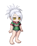
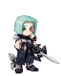
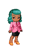
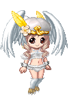
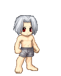
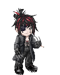
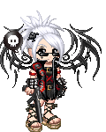
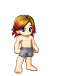
Meh picccsss..... 4laugh I don't know what I should do to make them look better, but tell me what I should add or do to make it better. But, it's anime, so it'll be hard to make it look better. lol 3nodding =]]   Old pic. =PP   Sorry the pics are big... Resizing is ridiculous and makes me mad.
|
 |
|
|
|
|
|
|
|
|
|
|
|
|
|
Posted: Sun Oct 21, 2007 2:54 pm
lol they are really nice, here are some tips that I'm sure u will enjoy. You have to consider anime is made for animation, so it has a technical build. Mainly because the characters have to be redrawn by many other artists, so consider this, the face is the shape of an egg upside down. Special from the front, the eyes are exactly in the center of the face, unless its a small child. The ears are lined up with the eyes unless he is looking down in which case the ears would be higher, if he is looking up the ears are lower. The body is a little harder to describe but also treat it as shapes. Like the face you can draw it by making a circle and then drawing out the bottom jaw. But really keep practicing and find your own ways too cause thats what its all about. Btw i like your drawings they are really nice and original
|
|
|
|
|
|
|
|
|
|
|
|
|
|
|
|
|
|
Posted: Sun Oct 21, 2007 3:00 pm
Yeah, drawing sometimes irritates me, so when I get mad at something, when I try to draw I forgot how to draw something and get it all f'd up.
Also, I have a really difficult time coloring solidcolors with colored pencils. Like, I don't want to make it to dark, but the colors don't seem as solid as they should..
Thats why most of the pics look funny. Cause of the coloring.
But, anyways, anime is kinda weird to draw, and like I said, when you draw anime, it needs to look a certain way otherwise it looks funny.
But, thax for the advise =DD
And thx for the nice comment on them.
<33
|
|
|
|
|
|
|
|
|
|
|
|
|
|
|
Posted: Sun Oct 21, 2007 3:15 pm
My main and strongest suggestion for you is to stop copying (yes copying) anime and start to draw from life most of the time and then study anime styles and take what you learned from real life and incorporate it with the anime style you're studying.
|
|
|
|
|
|
|
|
|
|
|
|
|
|
|
|
|
|
Posted: Sun Oct 21, 2007 3:18 pm
+++Amour-Fonce+++ My main and strongest suggestion for you is to stop copying (yes copying) anime and start to draw from life most of the time and then study anime styles and take what you learned from real life and incorporate it with the anime style you're studying. I have to be in complete agreement with this, nothing helps you gain more information than studying the real human figure, by drawing it, the best way is to consider all the mass and direction of 3-d space. Don't treat it as something you have to draw the contour of, treat it as something in 3d space. Its will help you gain so much information, and you will be very very happy with yourself. smile Keep up the good work
|
|
|
|
|
|
|
|
|
|
|
|
|
|
|
Posted: Sun Oct 21, 2007 3:43 pm
davidart84 +++Amour-Fonce+++ My main and strongest suggestion for you is to stop copying (yes copying) anime and start to draw from life most of the time and then study anime styles and take what you learned from real life and incorporate it with the anime style you're studying. I have to be in complete agreement with this, nothing helps you gain more information than studying the real human figure, by drawing it, the best way is to consider all the mass and direction of 3-d space. Don't treat it as something you have to draw the contour of, treat it as something in 3d space. Its will help you gain so much information, and you will be very very happy with yourself. smile Keep up the good work Welll, they where old, and at that time, I didn't really know what to do. And to improve my skills (and my friends and my cousin, who's going to collage for art school agreed) I like to start out with stuff that seems easy, so I go on google or anime stuff, and draw it... Then I move on to other stuff. Those pics were like two years ago. Exept for the first one with the gaian dude. I rarely do stuff like that and copy stuff from other anime pics. And now I come up with my own ideas and ask people what I should draw. Most people ask me to draw their gaia characters or something. I kinda stopped using other ideas. I use my own. 4laugh
|
|
|
|
|
|
|
|
|
|
|
|
|
|
|
|
|
|
Posted: Sun Oct 21, 2007 3:44 pm
xXxWickedxStarxXx davidart84 +++Amour-Fonce+++ My main and strongest suggestion for you is to stop copying (yes copying) anime and start to draw from life most of the time and then study anime styles and take what you learned from real life and incorporate it with the anime style you're studying. I have to be in complete agreement with this, nothing helps you gain more information than studying the real human figure, by drawing it, the best way is to consider all the mass and direction of 3-d space. Don't treat it as something you have to draw the contour of, treat it as something in 3d space. Its will help you gain so much information, and you will be very very happy with yourself. smile Keep up the good work Welll, they where old, and at that time, I didn't really know what to do. And to improve my skills (and my friends and my cousin, who's going to collage for art school agreed) I like to start out with stuff that seems easy, so I go on google or anime stuff, and draw it... Then I move on to other stuff. Those pics were like two years ago. Exept for the first one with the gaian dude. I rarely do stuff like that and copy stuff from other anime pics. And now I come up with my own ideas and ask people what I should draw. Most people ask me to draw their gaia characters or something. I kinda stopped using other ideas. I use my own. 4laugh Btw its still awesome, and its extremely important to have things you like and be passionate about it. So go for it, work hard and have fun with it.
|
|
|
|
|
|
|
|
|
|
|
|
|
|
|
Posted: Sun Oct 21, 2007 8:07 pm
The main thing I can suggest is trying to make the colouring more... solid.
Also, if you need lineart, go ahead and sketch in pencil first but go over it then with something that won't smudge (I use just a regular ballpoint pen as I'm cheap but most people would probably suggest an actual inking pen) 'cause it'll affect how the colours will come out when you're colouring.
Anatomy could use some tweaking as well.
|
|
|
|
|
|
|
|
|
|
|
|
|
|
|
|
|
|
Posted: Wed Oct 24, 2007 3:48 pm
ooh~ wow; I think I saw your haru picture somewhere before...~;;
Bold lineart can help :3 and try to eliminate as much as white as you can when colouring; ?
|
|
|
|
|
|
|
|
|
|
|
|
|
|
|
Posted: Thu Oct 25, 2007 12:13 pm
ya he right just stop copying everything ealse look's good thought
|
|
|
|
|
|
|
|
|
|
|
|
|
|
|
|
|
|
Posted: Thu Oct 25, 2007 9:04 pm
nice choice of colors. I'm never good with coloring... so I sometimes leave half of my work uncolored.
let's see... It's ok not to darken your outlines, however, as I see it, you seem to be doing the cel-shade (anime style)...wherein the lineart must be really evident because it divides the flat colors from each other.
also, don't be afraid to fill out the entire area. your coloring is too light.. if you adjust its contrast in softwares, you wouldn't see the colors anymore. fill out the whole area, and color with a heavier hand. try it. ^_^ practice practice~ that's the secret
[+]
|
|
|
|
|
|
|
|
|
|
|
|
|
|
|
Posted: Fri Oct 26, 2007 5:09 pm
By the way, the first one is the new one. The other ones are the older ones I did a while ago. And the first one was supposed to look like that. It makes it look more sketched than so solid.
|
|
|
|
|
|
|
|
|
|
|
|
|
|
|
|
|
|
Posted: Sat Oct 27, 2007 2:05 pm
OMG!!!!!!!!!!!!!!!!!!!!!!!!!!!!!!!!!!!!!!!!!!!!!!!!!!!!!
They are amazing!!! I love the one with yuki and hatsuharu.
Just add some shadow lines and they will be fantastic.
I like drawing Furuba pictures too but you are way better than me.
Add some more I would love to see them.
|
|
|
|
|
|
|
|
|
|
|
|
|
|
|
Posted: Fri Nov 02, 2007 7:49 pm
I think for your first picture you need to make the outline darker. You can barely see where parts end. Like for you hair. I can tell where it starts but not where it ends. The wings could be darker and well a lot of other things could be too. You have the facial structure down which it really good but the arms need a little work. The amount of asseries, I do not like it overcrowds the picture. Your basic designs are great, expeshially for the animals but work on the pumpkin. Now your coloring. You need to stay withing the lines and be careful how much you choose to blend, like th outfit. I can tell most of the colors you have used for it. You need to work on your blending skills. The yellow/orange by the wings, went to far in and went into the wings. You could work on that too. This one needs a lot of work. (4/10)
For second picture. The facial structer is great and your basic shapes great. You need to make outline darker expeshially in the eyes and plus more if you have hair over them. The eyes are a little lopsided to me and they could be made evener. The neck and shirt are great. The rat looks like it is leaning against something. So you could work on its pose. The tail needs to be done skinner and to a point at the end. They picture overall is good. (7/10)
Thrid picture. Really small but I can make out most of the things. Just darken the outlines and you will be great. Take the purple marks on his face and make them skinner and smaller.(8/10)
The outlines need to be like this one!!! They are great I can see it! The hair great all I can say. You need to work on the wink. His neck seems crooked and the coller is not right. The cows head looks like an owl twisiting his head around so make that more straight. This is a really good picture. (7/10)
|
|
|
|
|
|
|
|
|
|
|
|
|
|
|
|
|
|
Posted: Mon Nov 12, 2007 5:42 pm
xXxWickedxStarxXx Meh picccsss..... 4laugh I don't know what I should do to make them look better, but tell me what I should add or do to make it better. But, it's anime, so it'll be hard to make it look better. lol 3nodding =]] Old pic. =PP Sorry the pics are big... Resizing is ridiculous and makes me mad. ok the 1st one is the only full body shot so i'll start there the limbs are very bendly and curved which doesnt make a whole lotta sence we only bend at the joints the pencil crayon is very smudgy and grainulated making it hard to reconze at 1st the face shape is very basic you should try to avoid making the chin such a hard angle makes it look like ur going to poke an eye out (i no thats te style it looks better if u work out the point tho) the arms are ultra thin and have no mucle at all and lastly u should reoutline everything so u see it better n its no so blended. yuki pic ok same thing with the chin as the 1st pic the hair should be hanging since his head is bent also his backis straight if u feel dwn ur neck ur back comes out just a lil and the lighting on the hair makes no sence i can bearly see the small 1 enough to judge and the last pic is very good just the chin again and the necks a lil too long ok now i am being very judgmental here there all good and i am only eing nit picky cause u wanted to no flaws so dont get mad at me oky :p good work n theres sum sugestions
|
|
|
|
|
|
|
|
|
|
|
|
|
|
|
|
|
|