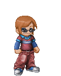
I must be seeing things, because it looks like an explosion
on my screen. (maybe because I use I.E. and you used F.F. ?)
-------------------------------------------------------
On I.E.
x Everything is jumbled and completely out of place. The
guy has no head and only one leg, ya killed the poor guy!
x I would post screenies but that would take far too long.
The comments come out of his head, the hand has a gray
box around it, the right leg is missing, the bottom section
of writing is tossed off to the right and cut off a great deal,
it auto starts (big no no), and the sections are all tossed
together making there to be a big section of the top part
that isn't even filled in due to it all mashed up at the top.
-------------------------------------------------------
On F.F.
x Far too large, things don't seem to flow right. I checked it out
on firefox and it looks like you need to adjust the width on how far
your comments are allowed to stretch out. They just keep going!
x I agree, the sections are just there, just placed where they'd fit.
x For a self-portrait, there's little information about your self on it.
x The background of the orange and pink coming out of his head is
cut off on the left and right. This makes the flow of things shatter.
x The hand is disfigured even on fire fox. Placing your avi there can
make it interesting for a random out there type but doesn't feel right.
-------------------------------------------------------
Overall
Keep trying. You've obviously came up with a creative idea, now
find ways to make it work and be put together to make it that much
more impressive. To have a good idea isn't enough, you have to go
bring it to life to represent it well =D. Keep tinkering, you'll get it!


 250
250
 200
200
 200
200