Er...

If this offends you, you may feel free to hit me over the head. It's just that my English vocabulary is rather limited, and I also prefer to show people what I mean instead of just telling.
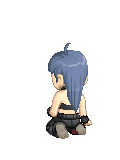
Anyhow, as you can see the neck should be moved a little forward and the shoulder more on the left hand side should poke out slightly more.
With that kind of perspective change (and mind you, that would be the correct change) you'd have the boobs be lowered perspective wise, as well.
Both hands are different sizes from each other, but both also don't have a large enough palm (the hand on the ground, there I drew a red line across where the knuckles should be).
The right hand side eye is too close to the center of the face; you'd only have to move it a little closer to the edge of the face to fix that.
Right where the leg bends, it's a little too pointy. Round the knee up a tad bit more, and slim down the arms, wrists and ankles a bit more (keeping in mind her overall thin body).
Also, for the way she's sitting, her back wouldn't necessarily bend out that way, but simply be curved as if she'd be standing. He toes aren't bent enough, either, for having her foot in such a position.
And lastly, her other leg (the one mostly hidden from view) should be slightly longer (as long as I've drawn), and her bum is slightly too small for the rest of her body.
Remember though that besides a few anatomical errors, it's actually quite a well-drawn picture. It's just that when you fix one thing (both anatomically correct and perspective wise), you will have to adjust pretty much everything else accordingly.
Edit: Oh yeah and the split in her hair (don't know what you'd call that) on the top of her head is slightly off in perspective, and the forehead is slightly too large (sticks out too much). ^^