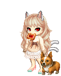
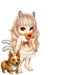
You really don't have to tone down the hair, honestly. Just raise the notch elsewhere.
biggrin On Felicia, for example: the fruit and watermelon are VERY smooth in comparison to the hat and the hair. It distracts. So, pop a little subtle texture in and voila!
I took the liberty of making a little
collage. The large pic on the left is your original of Felicia, the top right is with the texture added to the fruits. The last pic is a little more complicated.
Basically, I fooled around with the saturation and the colors.
The saturation warmed the picture and brought out her bathing suit.
The reds and greens on the fruit and watermelon were much more on the blue range, and stood out when I blurred my eyes. I changed the colors so that they fit the color scheme a bit more.
On her hair, I used a purple brush to darken some of the shadows and set that layer to "multiply" mode. That keeps the purple in the shadows.
I added some darker shading to her jacket/shirt. I did not focus on this part too much, but hopefully it will serve as a decent example of how the shading can really affect the overall look.
Mind, changing the saturation caused the cup to disappear, so that's a downside to my method.
These really were not big fixes, so I'd say you're still on the right track. I do hope I helped in general.


 200
200
 50
50
 100
100