Welcome to Gaia! ::

Reply Art Fags
heeellllllooooooo

Quick Reply

Enter both words below, separated by a space:

Can't read the text? Click here

Submit

poll
.
100%
 100%  [ 5 ]
Total Votes : 5


Athelius

PostPosted: Mon Aug 13, 2007 8:20 pm


hi! its been awhile since i posted here (dont get me wrong, it's not because your crit is too harsh or anything. i love this guild and i'm so happy that there's a place like this on gaia heart ) anyways... i would like some advice on this drawing that i'm currently working on. it's the eyes and hair thats got me. mostly the eyes. for the life of me, i can't seem to get it right, no matter which way i draw it. the character is supposed to look real bitchy, but im not sure how far i've been able to achieve that look. so can you please advise me? this one is note the final drawing because it was just a rough sketch that i coloured out of boredom, so i can fix anything that out of place in this drawing^_^ the real sketch that i'm about to finish has the rest of her body, a more detailed hand and athenas enlightened cape (thing with birds on my avi) so i have to scan that in soon. did i overdo anything (shadows, stars, moon, sparkles)? cg tips from you more experienced artists are also appreciated since i'm newbie blaugh
User Image
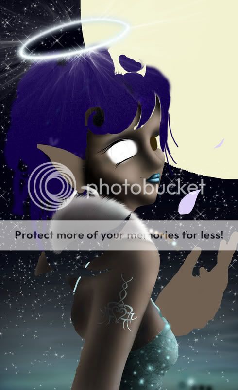
forgot her eyebrows, sorry sweatdrop
PostPosted: Tue Aug 14, 2007 8:11 pm


It's hard to provide real crits on this because I'm not really sure which bits are incomplete and which bits are finished...

Dr. Valentine
Vice Captain


SNAKES ON A PLANE!

PostPosted: Tue Aug 14, 2007 10:17 pm


I agree with dr v

though, I can say that I think you're being really detail-oriented and you should probably be saving that for the end.
PostPosted: Wed Aug 15, 2007 4:22 pm


i'm curious to know what program you're using for this piece. i think it'd be best to try and utilize layers, so then you can color areas like the skin and have it be underneath the hair so you don't have negative space between every object (like where the bangs and forehead meet i can see part of the sky). i would also try and use a hard brush to get the main form and shadows down before using a softer brush. using only the airbrush like that gives you very vague and ambiguous shading and form, and it looks smudgy and blurred. a good middle ground would be to use both hard and soft shadows, but even hard shadows are better than overall soft ones unless the lighting calls for it (like a cloudy day or something).

i think that you should work from general to specific, so the details and objects are cohesive with one another. right now it feels that everything is vying for attention and it makes your illustration look very cluttered and confusing for the viewer, especially at what you want the main focus to be. i would probably tone down all the special effects and sparkles until you're almost done with everything, so then the placement for them will make more sense. the stars look real contrasty and they're fighting with your character, especially since the main focus is so low key and blurry.

the skin is a little too contrasty and it might be good to blend in other colors to give it more life. reds and oranges are good for the lighter areas while blues and purples are good for the darker areas and shadows, with a little bit of blending from both warm and colors in where they meet. a rim light on the side that is in shadow will also help in making your character pop out from the background without making it too obvious (especially if it's opposite color of the main light, like if the main light is warm then go for a cool rim light). use other colors when you pick your hues, instead of just moving the color picker down the color square when you pick shadows and highlights.

beware of tangents (another thing that tends to happen when one doesn't work from general to specific). right now it looks like the hand(?) is emerging from the chest, not to mention it's pretty big in relation to the character. it's also touching the edge which makes for an uncomfortable composition. i would probably put more space over on the right since that's the side the character is looking, not to mention it'll give you more room to work.

the lips feel a little skewed and doesn't match up with the perspective of the face. and the shapes of the eyes feel a little too much like anime eye decals, there's no roundness or form to them. i would probably try and work out how they will be by sketching them out before trying to paint them, since you said that's where you're having a lot of trouble.

crazy spork i am


Dr. Valentine
Vice Captain

PostPosted: Thu Aug 16, 2007 10:17 pm


That hand also seems a bit large for a girl...
Reply
Art Fags

 
Manage Your Items
Other Stuff
Get GCash
Offers
Get Items
More Items
Where Everyone Hangs Out
Other Community Areas
Virtual Spaces
Fun Stuff
Gaia's Games
Mini-Games
Play with GCash
Play with Platinum