|
|
|
|
|
|
|
|
|
 Posted: Fri Jul 13, 2007 9:06 pm Posted: Fri Jul 13, 2007 9:06 pm
Alright peeps, I want to sorta just make a gallery, for critiquing, for viewing, for making fun of, for flaunting, WHATEVER. Oh and feel FREE to comment as you wish, I'm not easily offended and find hard-core, professional critiquing quite entertaining and wholesome (I get it all the time from my dad)...so without further ado, I have but two subtopic-galleries:
eek 1. Completed Works
sweatdrop 2. Uncompleted Works....or scraps if you will
enjoy and please mind your manners.....I will do my best to keep up ninja until next time..... STAY AMAZING!
*~Diamond~*
|
 |
|
|
|
|
|
|
|
|
|
|
|
|
|
Posted: Fri Jul 13, 2007 9:11 pm
eek Works Completed eek *sigh* egad most of my finished pieces are....CG!!!! *dies* 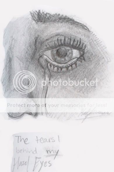 I titled it "Broken". I really have no explanation for this that would suit it well....it's too...well.....far from an explanation worthy of it. Though I do apologize it's supposed to say "cry" after "I" but I accidentally did something to it while it was being scanned gonk It is perhaps one of my more 'inspired' or 'emotional' pieces you may say.... critique please???
|
|
|
|
|
|
|
|
|
|
|
|
|
|
|
|
|
|
Posted: Fri Jul 13, 2007 9:15 pm
By the way am I allowed to post links of non-traditional CG artwork? I mean if you must put it so harshly....ba humbug, CG non-traditional....whatever you are allowed to think the way you think no matter how screwed up it is. I say as long as you created the piece by your hand using solely tools and not montaged, edited photos, then it's traditional. I mean really, all it is is just a different canvas evil anyways done ranting. But really though are CG links permitted?
|
|
|
|
|
|
|
|
|
|
|
|
|
|
|
Posted: Fri Jul 13, 2007 9:34 pm
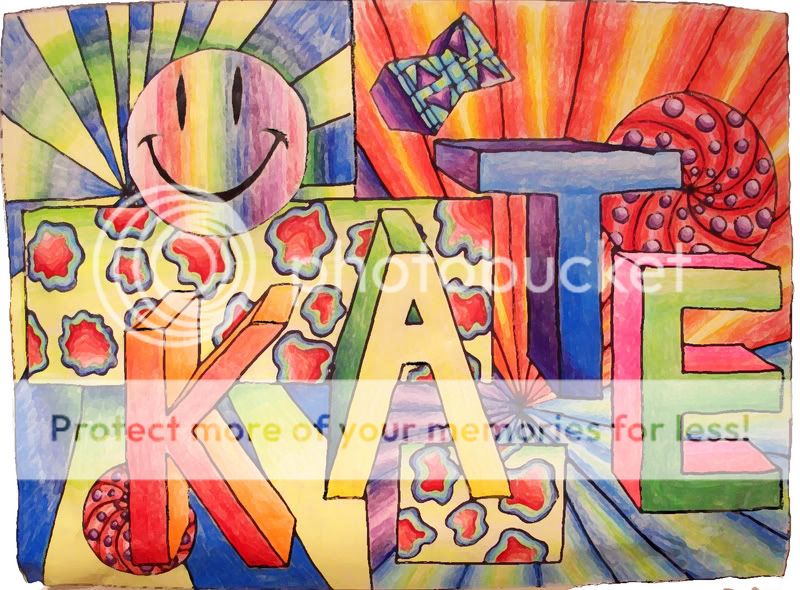 A GIANT portfolio cover I did with colored pencil, watercolor, and sharpie in the 7th grade. I had to use photoshop to fix it unfortunately because beneath the "E" there was a giant rip. Yes it's my name in unstylish font that the teacher made us use xp
|
|
|
|
|
|
|
|
|
|
|
|
|
|
|
|
|
|
Posted: Fri Jul 13, 2007 10:06 pm
And another- 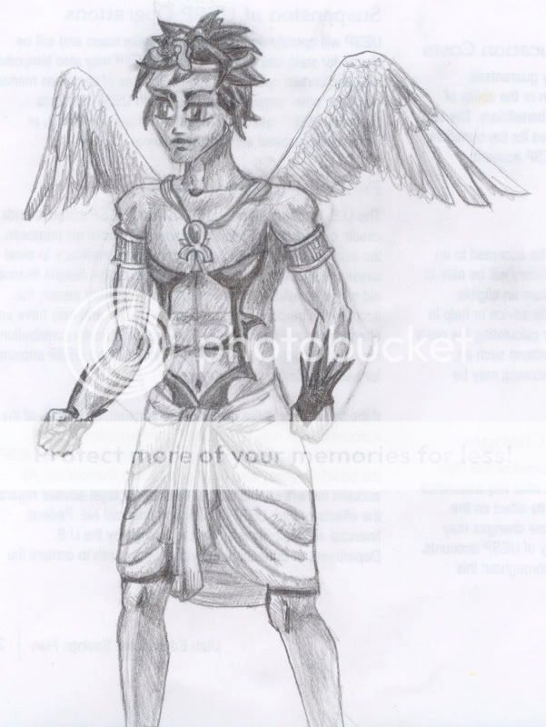 I must say I'm ashamed of this one sweatdrop I kinda just drew it today on the back of recycled paper....supposed to be a character named Kaleb of this weird book I'm writing and the drawing is sorta modeled after the tektek I did of him.....I normally don't dabble in anime either. I have REAL problems with getting pencil to blend and look natural, so my crosshatch isn't even intentionally stylistic. Not to mention I acknowledge his pose and anatomical proportion is awkward too...I guess it would've helped if I had a reference. I would more than LOVE critiques and suggestions on this!
|
|
|
|
|
|
|
|
|
|
|
|
|
|
|
Posted: Sun Jul 15, 2007 11:47 am
this is your friendly neighborhood mod, welcoming you to the guild.
your works are really nice. i like your style: it's emerging and realistic. and your portfolio cover is pretty trippy--i'm lovin it.
as for suggestions on your Kaleb peice, i think it's mostly minor technical things holding this back. i am not, as a viewer, convinced that his crown is level and/or that it would stay on his head. i'm not sure about his necklace either--it looks very flowy, but not exactly natural. i think the wings are very good (i'm always working for that last feather to come out just the right amount, you know?). but i also think that you should spend more time on this. i think that more time would improve this picture vastly. your lines are messy in many areas, as well as your shading, and i don't think it works very well with the subject.
|
|
|
|
|
|
|
|
|
|
|
|
|
|
|
|
|
|
Posted: Sun Jul 15, 2007 5:00 pm
Thank you VERY much. It is nice to have someone to confirm my discrepencies and also suggest how to purge myself of them. I hope to try putting more work into Kaleb....except for perhaps get a reference and shoot for semi-realistic you know? Thank you again, I do love a kind compliment about my 7th grade artwork as well smile Anyways more stuff: http://i102.photobucket.com/albums/m85/bunnyluvrartist/KatesCougarpartialsize.jpgThis particular file is just a bit bigger than the others and I don't want to take up too much space so I'll just put a link. It is 8 1/2 X 11" (minimized in this copy though) on plain ole paper with pencil and a light use of smudge stick. He's my fav kinda kitty 4laugh
|
|
|
|
|
|
|
|
|
|
|
|
|
|
|
Posted: Mon Jul 16, 2007 12:41 pm
you make me feel lazy, Diamond.
i like this picture. i think it might look very nice with extreme darks and lights done with ink, actually.
unfortunately, i cannot give you any advice for fur, because i haven't found a good way to to it myself sweatdrop
i like the detail that you've put into the face, but i think it would benefit from darker values in some areas (like the pupils, some of the areas around the eyes, nose and mouth, just some other small areas).
overall, this is pretty amazing. i just think that you could do a few little things to it to really make it super amazing, lol.
i'm really excited that we've got another active member here; it makes me want to draw, or at least doodle.
out of curiosity, do you like to work with ballpoint? judging from the scruffiness of your pencil works, i think it might work really well for you (and it's friggen great, can't forget that!)
|
|
|
|
|
|
|
|
|
|
|
|
|
|
|
|
|
|
Posted: Mon Jul 16, 2007 5:17 pm
Yeah I know what you mean. I just see lame websites with art on it and it gives me this irresistable urge to doodle something of no worth for the heck of it. lazy? I beg to differ I procrastinate WAAAY too much. I haven't posted any of my half done works....probably cuz there are so many and cuz they are scary gonk
I haven't had the chance to try any real ballpoint...mostly due to the lack of a pen good enough to write my stories with. I have this impediment that if I can't fix it or erase it I have a heart attack. That's why I don't paint much either, or why I love CG painting. I'd probably still be sloppy. Another good excuse for me to become a modern impressionist.
Heck I wanna see your gallery stare
|
|
|
|
|
|
|
|
|
|
|
|
|
|
|
Posted: Mon Jul 16, 2007 6:40 pm
that portfolio cover is flippin' sweet. haha. we made our own portfolio cover in 7th grade, too, but none as amazing as yours. we kind of just wrote our names in markers then drew random doodles around it.
as for the other drawings, i think you can still improve on your shading. you have the midtones just about right. and probably because of the scan, the dark and the highlights are missing. just something to keep in mind.
as for Kaleb, he looks just fine. i don't know why you'd be ashamed of it. i think crosshatching is one of the most important techniques in pencil drawing, so practicing is definitely worth your time. and what i find helpful for characters is keep a small sketch book just for your characters. don't just draw in it. as you develop your characters, write things about them too, and not just the physical descriptions.
|
|
|
|
|
|
|
|
|
|
|
|
|
|
|
|
|
|
Posted: Tue Jul 17, 2007 10:03 am
yeah good point journaling about my characters too is a way good idea.
doodles are fun, especially when they have not meaning whatsoever. I do that all the time to my class folders.
tones, got it. haha I'm trying that in one of my paintings right now (it's greyscale....well, partially that is) but something got into me and the hand in the pic turned almost black....it adds lovely contrast to everything else but it's atrociously dark and flat looking.
|
|
|
|
|
|
|
|
|
|
|
|
|
|
|
Posted: Tue Jul 17, 2007 3:57 pm
Dirty_sox3 that portfolio cover is flippin' sweet. haha. we made our own portfolio cover in 7th grade, too, but none as amazing as yours. we kind of just wrote our names in markers then drew random doodles around it. that's exactly what WE did!!! rofl Diamond in the Night Sky Heck i wanna see your gallery if you really want to see it, i have a thread here (i think it's under "kirio"). but i also have a deviantart gallery at www.kirio26.deviantart.com . the reason why my thread is so far down is because...i'm lazy and haven't drawn anything in a while. well, in my defense, i've also been on vacation (still am) in Ireland since last tuesday. but...my gallery hasn't been updated in like 3 weeks sweatdrop ballpoint is a fun medium because it's sloppy. i've seen artists take ballpoint and make it very smooth and pretty (which, to give credit where it's due, is very hard to do), but i don't think that's the point of the medium. i think the reason the use ballpoint is because it's permanent, it's expressive, and it's sloppy.
|
|
|
|
|
|
|
|
|
|
|
|
|
|
|
|
|
|
Posted: Wed Jul 18, 2007 4:34 pm
ballpoint.....expressive....I shall try-once I can find a pen. We are pen deficit and pencil-with-eraser deficit in my house.
|
|
|
|
|
|
|
|
|
|
|
|
|
|
|
|
|
|