|
|
|
|
|
|
|
|
|
 Posted: Sat Jun 16, 2007 5:47 pm Posted: Sat Jun 16, 2007 5:47 pm
 Yeah, I know it's shitty :] Yeah, I know it's shitty :]
I'll make a better one, when a better idea comes too mind, and about the larger one, I'll probally draw something out on paper first, but that might take a couple of days, because I need to make my dad his father's day card, and my G-mom is getting a poetry book published and she want's my art for it.
xPP;;
Anywho, tell me what you'd like diffrent on it.
Kthx <33
|
 |
|
|
|
|
|
|
|
|
|
|
|
|
|
Posted: Sat Jun 16, 2007 6:31 pm
It looks good to me 3nodding Cant wait to see the big one to. ^^ I put it on.
|
|
|
|
|
|
|
|
|
|
|
|
|
|
|
|
|
|
Posted: Sat Jun 16, 2007 7:18 pm
Well, it's okay for a starting banner I think.
What kind of layout would you like for the larger one?
Any ideas come too mind?
|
|
|
|
|
|
|
|
|
|
|
|
|
|
|
Posted: Sat Jun 16, 2007 9:20 pm
I like it, it looks nice.
Maybe a light silver background with gold coins and the words "The Vending Union" in the middle. Similar to the one you have already made but just slightly different.
|
|
|
|
|
|
|
|
|
|
|
|
|
|
|
|
|
|
Posted: Mon Jun 18, 2007 6:31 am
This 1 my friend made talk2hand ...  ' or..! 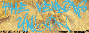
|
|
|
|
|
|
|
|
|
|
|
|
|
|
|
Posted: Mon Jun 18, 2007 12:01 pm
 [IMG]http://i89.photobucket.com/albums/k202/astromankind/TheVendorsunion.jpg[/IMG] Blah Plain and simple
|
|
|
|
|
|
|
|
|
|
|
|
|
|
|
|
|
|
|