gdfan4
why wont anyone critic my pic????
crying It just takes time sometimes. I know I'm rarely on because I feel like... if I'm not working on something or posting something in my own thread, work-wise, I don't come in. =P
Anyway... your pic is good, but it could stand to be more dynamic, for lack of a better word.
Break-down~
--------------
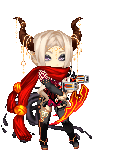
Figure: He looks like he could be relatively attractive, but it's difficult to tell since the picture is kind of small. His face, though, seems to lack feeling, as though he's not really connected to his situation, whatever his current situation may be. His hair could use more definition and some shine, even if it's minimal. I like the muscle definition on his torso and the upper arm on the left. The forearms look a bit off though. The one on the left is too long in comparison to his upper arm, the one on the right is hard to say just because it's partially covered by his cape. His hands seem small; his right hand is too minimalistic considering the detail you've given him and his left just looks awkward in the way he's holding his scythe. His legs look fine from what I can see and I like those boots. =D The wings seem awkward to me, though since he's not moving at all there's really nothing else you could really do with them that would make sense.
Colour and shading: Your colouring looks fine, though a little pale. But that's fine; I know that scanning in pencil colour and expecting it to stay true to what it looks like on paper is a pain in the butt. As for shading, like I mentioned before all this, it needs more than what has been given. With more dynamic shading, more colour and deeper colour for the parts of the picture and the figure that are in shadow.
It's a good pic overall, just needs a bit more for that extra 'oomph' to really bring it to life. =3