|
|
|
|
|
|
|
|
|
 Posted: Fri Nov 24, 2006 2:12 pm Posted: Fri Nov 24, 2006 2:12 pm
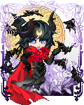
^_^; Im kinda tired of seeing just "Good job" in art post. So umm, here are some of my most recent/best pieces and I'd would love for someone to tear them to shreads:  (Best IMO - Yes I know her left *our right* leg is too far foward sweatdrop ) (Second IMO - yes I know her hair shine is rediculously too big) (Third IMO)
|
 |
|
|
|
|
|
|
|
|
|
|
|
|
|
Posted: Fri Nov 24, 2006 2:20 pm
it would be helpful if you posted images instead of links.
The Iconoclast is a BIG SCARY MEANFACE. and the rest of us are bitches.
|
|
|
|
|
|
|
|
|
|
|
|
|
|
|
|
|
|
Posted: Fri Nov 24, 2006 2:28 pm
3nodding Alrighty, I'll edit that right now. Sorry <3
[edit] Thats exactly why I like this guild. Everyone else always replies:
Ohh! Good job!
Omg! u r lyke so gewd!11
etc.... x_x;;; stressed
|
|
|
|
|
|
|
|
|
|
|
|
|
|
|
Posted: Fri Nov 24, 2006 3:29 pm
In general, I'm seeing that you have a decent grasp on proportions and anatomy, but not so much on form. It may just be the way you've colored these, because the coloring isn't very smooth or consistent - In some places it's too soft and in other places it's scribbly. It looks rushed, and it makes your shapes look really lumpy and awkward.
I guess this is more personal preference, but simply writing the character's name on the image isn't helping it look any nicer. I see it as somewhat unnecessary because you could just as easily tell people who the image is for (or of). If you can find a way to incorporate the name into the overall image without it being distracting, go for it.
I'd be careful with the more design-oriented backgrounds, as well. Like adding a name, it's easy to add borders or repeat the character's image, but it needs to be visually appealing in order to work. I think it works in the third drawing, but you can tell that the repeated image has been stretched out too wide. I like the idea of a border on the first image, but I don't like how bright the blue is or the weird scribbles around the outside. You're heading in the right direction, but your ideas could be executed better.
Basically I think that you need to make your finished drawings look more like finished drawings and less like well thought out sketches.
|
|
|
|
|
|
|
|
|
|
|
|
|
|
|
|
|
|
Posted: Fri Nov 24, 2006 3:43 pm
whee 3nodding Alrighty, I will seriously keep that in mind the next time I work on my picture. Thank you ^^
|
|
|
|
|
|
|
|
|
|
|
|
|
|
|
Posted: Fri Nov 24, 2006 10:31 pm
I absolutely hate the way you draw eyes. They look dead, fake and emotionless. I'm guessing that you learned to draw eyes from seeing drawings of eyes; I'd suggest that you find some photos of really beautiful eyes and try to study what gives them their life and form.
|
|
|
|
|
|
Dr. Valentine Vice Captain
|
|
|
|
|
|
|
|
|
|
|
|
Posted: Sat Nov 25, 2006 4:57 am
I'd like to see you practise your colouring by going the opposite way- really, really simple. Try to get the right shadows and highlights in there with only 3 shades, but learn to put them in the right place. I think it would looks alot snappier than all this blending that's going on.
|
|
|
|
|
|
|
|
|
|
|
|
|
|
|
Posted: Sat Nov 25, 2006 7:09 am
3nodding Alrighty I'll keep that in mind, thank you...
The next picture I'll try the 3 shade thing / and I'll study eyes in the mean time.
|
|
|
|
|
|
|
|
|
|
|
|
|
|
|
|
|
|
Posted: Sat Nov 25, 2006 1:50 pm
I don't really like the colouring style... don't get me wrong, I can see you put a lot of work into your CGing, but way too much is going on. You need to find one style and apply it to the whole picture.
For the first picture, the background totally clashes with the rest of the picture. The thick blue lines and scribbly bits are quite strange, and don't really match.
Because of the lack of lineart, the colouring looks a bit scribbly and sloppy. Not say that you have to use lineart, but having a nice crisp outline is a must. The shading (especially on the girl's shirt in the second picture) could use some work too.
The highlights you use on hair are quite awful, to be honest. They just go straight across, rather than curving across the shape of the hair. Plus they're too white... so tone 'em down, and make them more curved.
If you keep working at your CGing and trying new things, I'm sure you'll improve a lot. 3nodding
|
|
|
|
|
|
|
|
|
|
|
|
|
|
|
Posted: Sat Nov 25, 2006 2:51 pm
You make a really good point about the highlighting in my hair. Thank you, I never really thought about it that way before ^_^
I think I'm going to go back to using line art again as well, >_< Everyone is right, the colors get a bit too sloppy when I try to go over my lines~
|
|
|
|
|
|
|
|
|
|
|
|
|
|
|
|
|
|
|