|
|
|
|
|
|
|
|
|
 Posted: Mon Aug 28, 2006 10:08 am Posted: Mon Aug 28, 2006 10:08 am
wahmbulance UPDATE wahmbulance
hey everyone thanx so much for all of your comments, critiques etc.
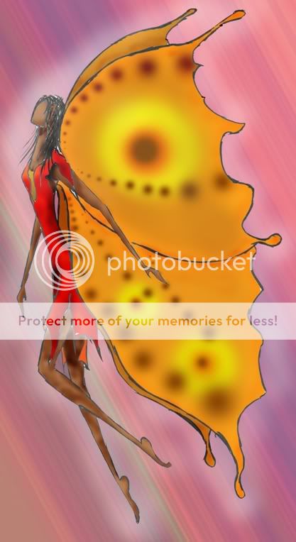
i re-did the same butterfly person using some different techniques, so now i'm putting this one up for speculation.

let me know what ya'll think!
i'd also like to know like what your opinions of the first one versus the second one. which you like better, etc.
thanx all!
- heart Watson
--------------------------------------------------------------------------------------
ok...here is a picture that drew, scanned and colored yesterday.
It's probably not one of my best ones stare . but it's decent. But there's something about it, that doesn't seem quite right. SO if anyone has any ideas or advice or comments. shoot 'em! and i have no problem with critiques. just be civil that's all. smile
another thing. i trust all of you, that you won't mess with my art. i'm extremely protective of it, and rarely do i post one unwatermarked...so savor it. lol.
ok hurr it is:

btw i used photoshop to color it.
let me know what you think!
|
 |
 |
|
|
|
|
|
|
|
|
|
|
|
|
 Posted: Mon Aug 28, 2006 10:13 am Posted: Mon Aug 28, 2006 10:13 am
ALSO....i'm looking for some ideas, as to what to draw. crying I've kind of had an explosion in my inspiration box. lol. there's a million things flying around and i can't quite seem to pin them down. neutral
So if anyone has any suggestions...i'm open.
|
 |
 |
|
|
|
|
|
|
|
|
|
|
|
|
|
|
|
 Posted: Mon Aug 28, 2006 5:21 pm Posted: Mon Aug 28, 2006 5:21 pm
With the style you drew it in, I see nothing wrong with the person, or the lines, or... anything, really.
Except...
The colors!
I dunno if it's just me, but the colors clash slightly. That's probably the only thing I can suggest you fixing. *nodnod*
I turn to chocolate, poetry, and reliving emotional experiences for my inspiration. You should try it sometime. Or even meditation, really...
|
 |
 |
|
|
|
|
|
|
|
|
|
|
|
|
 Posted: Tue Aug 29, 2006 5:18 pm Posted: Tue Aug 29, 2006 5:18 pm
The only thing that I can see on this is that maybe it would look nicer if you smoothed out the lines. Like made them striaght and not so broken up
:]
Love the colors. they look nice together to me.
<3
|
 |
 |
|
|
|
|
|
|
|
|
|
|
|
|
|
|
|
 Posted: Tue Aug 29, 2006 5:42 pm Posted: Tue Aug 29, 2006 5:42 pm
♥My critique♥
Well, at first I noticed that the figure is anorexicly skinny, and then that she has huuuge wings, make her seem even more.. lacking.
If it's your style then I'd say go for it!! But otherwise.. yea.
Other things I noticed:
It kinda seems like you're new to using layers (and to shading and coloring..)
If you know how to use layers well, There will be no real white spots that you can't fill in for fear of ruining the drawing.
I'll try to find a tutorial on how to use layering for ya.
As well as a good shading one.
I'm really sorry if this came out harsh.. It was not meant to be.
|
 |
 |
|
|
|
|
|
|
|
|
|
|
|
|
 Posted: Tue Aug 29, 2006 7:47 pm Posted: Tue Aug 29, 2006 7:47 pm
|
|
|
|
|
|
|
|
|
|
|
|
|
 Posted: Tue Aug 29, 2006 8:11 pm Posted: Tue Aug 29, 2006 8:11 pm
thanks all! heart
klakie...the reason for the lines, is that i have an art marker that i go over my sketches with before i scan them in, SO...it gets that 'sketchy' look. i'm not like attached to it or anything. that's just how i've done it so far.
anyhow thanks for your opinon! i appreciate it!!!! blaugh
Ichigo, lol no prob, wasn't harsh...at all! xd as far as the actual figure goes yes she is freakishly skinny. BUUUT....it is my current style, if you look at my art shop there are some samples there.
yeeaah, i just got photoshop like last week, and for whatever reason the way this particular one scanned in i had some issues coloring it, though i didn't spend a WHOLE lot of time on it. again in my art shop are some better examples. biggrin
thanx for the tutorial link!!!!!!!!!! i've been lookin' for some, but havn't been able to find any good ones. i'll def check it out!
heart thanks all!!!!! heart
|
 |
 |
|
|
|
|
|
|
|
|
|
|
|
|
 Posted: Tue Aug 29, 2006 8:17 pm Posted: Tue Aug 29, 2006 8:17 pm
your welcome.♥
I found that tutorial of big help myself, and it's pretty easy to follow.
i'll find one that goes more into detail about how to use layers soon. :3
|
 |
 |
|
|
|
|
|
|
|
|
|
|
|
|
|
|
|
 Posted: Tue Aug 29, 2006 9:07 pm Posted: Tue Aug 29, 2006 9:07 pm
4laugh yay! thank you! 4laugh
|
 |
 |
|
|
|
|
|
|
|
|
|
|
|
|
 Posted: Sat Sep 02, 2006 9:01 am Posted: Sat Sep 02, 2006 9:01 am
I'd say get rid of the white spots in the corners of the lines. Just leaving them there looks lazy.
I also think it would benefit from slightly smoother and darker lines.
|
 |
 |
|
|
|
|
|
|
|
|
|
|
|
|
|
|
|
 Posted: Wed Sep 06, 2006 5:23 pm Posted: Wed Sep 06, 2006 5:23 pm
I like the colors a lot, they help each other stand out (and I must say, the background is beautiful), but I'd suggest smoothing out the colors of the wings, especially on the yellow/orange circles; try adding a couple more smaller ones, and blending the circles into the rest of the wings, since rarely do wings have perfect circles on them. Nice job though, it looks pretty good, you have a nice handle on anatomy (with the exception of the skinniness, but that's your choice biggrin )
|
 |
 |
|
|
|
|
|
|
|
|
|
|
|
|
 Posted: Thu Sep 07, 2006 1:44 pm Posted: Thu Sep 07, 2006 1:44 pm
The lines are blocky! And te colours dont quite seem right....? Try actually shading, it'll come out nicer (If you are shading, make it visible, looks mushed in). Try making her more... flowing, like flying! More graceful. Make fairies too, and angels, or maybe an elf! You look the type to draw fantasy.
|
 |
 |
|
|
|
|
|
|
|
|
|
|
|
|
|
|
|
 Posted: Sat Sep 09, 2006 4:00 pm Posted: Sat Sep 09, 2006 4:00 pm
ficklefiend I'd say get rid of the white spots in the corners of the lines. Just leaving them there looks lazy. I also think it would benefit from slightly smoother and darker lines. yeah well i was pretty lazy with this one...kind of whipped it up in about an hour....... sweatdrop i've got better ones...they're in my art shop if ur interested.
|
 |
 |
|
|
|
|
|
|
|
|
|
|
|
|
 Posted: Sat Sep 09, 2006 4:03 pm Posted: Sat Sep 09, 2006 4:03 pm
Reinfire I like the colors a lot, they help each other stand out (and I must say, the background is beautiful), but I'd suggest smoothing out the colors of the wings, especially on the yellow/orange circles; try adding a couple more smaller ones, and blending the circles into the rest of the wings, since rarely do wings have perfect circles on them. Nice job though, it looks pretty good, you have a nice handle on anatomy (with the exception of the skinniness, but that's your choice biggrin )
thanx for the tips on the wings! that's a good point!
ya anatomy.....i spend lots of time lookin at the lines on people. and ya the skinniness is just part of my style.
|
 |
 |
|
|
|
|
|
|
|
|
|
 |
|
|
|
|
|
|


