|
|
|
|
|
|
|
|
|
 Posted: Sun Aug 06, 2006 12:57 pm Posted: Sun Aug 06, 2006 12:57 pm
I just have these two I wish to be critiqued. Just click on the image if you want the larger version (takes you to deviantart.com).   Also, if anyone knows of any really good tutorials for doing clothing with graphite, that would help me plenty.
|
 |
|
|
|
|
|
|
|
|
|
|
|
|
|
Posted: Sun Aug 06, 2006 1:07 pm
THey both look very good (better than I could do, by any means.) But there are a few things I notice that are off.... (but I'm no expert on realism, so yeah) On the first drawing, looking at the larger picture, her nose looks a little awkward.... perhaps lopsides might be the term? And she's supposed to be sticking her tongue out... I think? Looking at the small version, it looks like she just has a much larger bottom lip, and even in the normal size, it's still hard to tell. The hair on both of them has a very sketchy feel to it, and thus looks rather straw-like. While I don't have a tutorial for the clothing that I can give you a link to, I have found one for hair that I find rather helpful... http://www.rebekahlynn.com/free/tutorial/hair_tutorial.html The hair does still look good, though. -^^-
|
|
|
|
|
|
|
|
|
|
|
|
|
|
|
|
|
|
Posted: Sun Aug 06, 2006 1:47 pm
Unseen pointed out everything that I saw2 so there's no need to repeat it again.
I really like your point of veiw on these two drawings, especially the second one. I could never do realism that well and I still think I could never do anything with it because I'm kind of stuck on the anime/manga-y style for a long time xDDD
|
|
|
|
|
|
|
|
|
|
|
|
|
|
|
Posted: Sun Aug 06, 2006 4:44 pm
First of all, I'd like to say that I like your pieces very much but I did notice a couple of things that were a bit off.
1) In your first picture, her head is way too small for her body. And her neck a bit too short.
2) The second picture is great, although I think in this one her neck is a bit too long. But other than that both pieces are very nice, you did a good job on them.
|
|
|
|
|
|
|
|
|
|
|
|
|
|
|
|
|
|
Posted: Mon Aug 07, 2006 11:26 am
I really like the second one.. The first one is good, just looks kind of out of proportion.
|
|
|
|
|
|
|
|
|
|
|
|
|
|
|
Posted: Mon Aug 07, 2006 3:14 pm
Xaforn324
1) In your first picture, her head is way too small for her body. And her neck a bit too short.I have noticed her head being too small. Her head is suppose to be leaning down, so not a lot of her neck is suppose to be showing, but I'm no good. ='D
|
|
|
|
|
|
|
|
|
|
|
|
|
|
|
|
|
|
Posted: Tue Aug 08, 2006 1:01 pm
The b***h D Xaforn324
1) In your first picture, her head is way too small for her body. And her neck a bit too short.I have noticed her head being too small. Her head is suppose to be leaning down, so not a lot of her neck is suppose to be showing, but I'm no good. ='D then her eyes should be more down and the back of her head should be jsut peeking, and her hair line also should be visble. like so (sorry for hte crappy paint image.) 'casue right now it jsut looks liker her head is jutting forward. 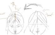 meh, id ot know if that is actually correct but it works for me! the other picture is very good! i liek the skull bit , eye and nose!
|
|
|
|
|
|
|
|
|
|
|
|
|
|
|
Posted: Wed Aug 09, 2006 1:26 pm
Oi, I'm no good with angles, but I see how it should be positioned. Thank you Freiflug.
|
|
|
|
|
|
|
|
|
|
|
|
|
|
|
|
|
|
Posted: Thu Aug 10, 2006 10:44 am
I think it kind looks good (the content), but it also looks flat (Like you collaged images from photographs in your head). It's kind of tilted too. But one way I get rid of that problem is by doing a rough sketch first, then I go reverse my drawing in a mirror. If the drawing looks funny, then it's not right, I fix it. After it looks right in a mirror, I add details.
Now it's your turn to critique my critique: Was I any help? Was I offending? (Sorry, I'm new at this) sweatdrop
|
|
|
|
|
|
|
|
|
|
|
|
|
|
|
Posted: Thu Aug 10, 2006 6:15 pm
Spanky the Moose I think it kind looks good (the content), but it also looks flat (Like you collaged images from photographs in your head). It's kind of tilted too. But one way I get rid of that problem is by doing a rough sketch first, then I go reverse my drawing in a mirror. If the drawing looks funny, then it's not right, I fix it. After it looks right in a mirror, I add details. Now it's your turn to critique my critique: Was I any help? Was I offending? (Sorry, I'm new at this) sweatdrop It does look flat (I'm thinking you mean the second one?) but I never added the fact that we have muscles in our face an such. . . Even though I know this. D,x I also do the reverse thing, but I just hold the paper up to a light and look through the other side, but I get so frustrated; move things to the right, up higher, OH NOES moved it too much!!! and such. Soon I just put it down and next time I work on it don't even check the leveling or things and whatnot. *LAZY* Well, I think being more specific in your critiques would be nice~. I don't offend easily, usually never, so no. Getting mor into detail might help also, I love details I can't usually get into a lot of detail for lack of wording and such, but lots of details are always nice, maybe references too (like Freiflug did). Were you any help? . . .To an extent I guess. Not a lot of help can come from someone over the internet, thats why pictures are always nice. I do appriciate your critique though.
|
|
|
|
|
|
|
|
|
|
|
|
|
|
|
|
|
|
Posted: Thu Aug 10, 2006 9:52 pm
This specific enough? xd 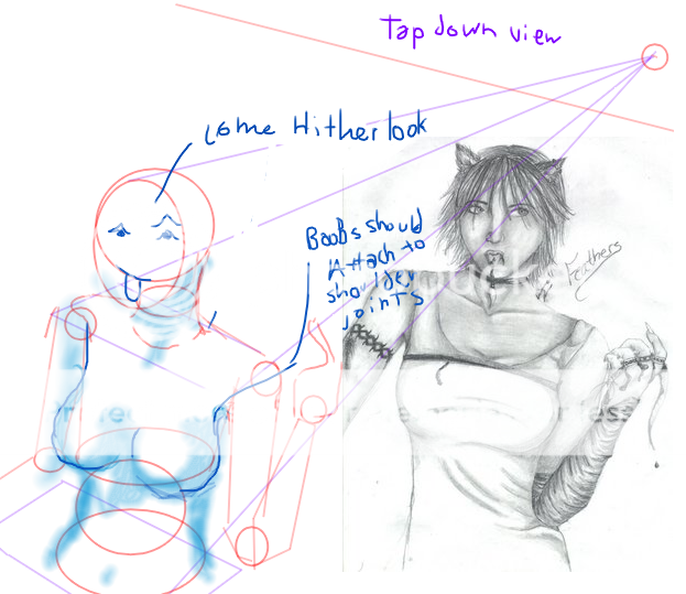 I hope your okay with this, but I really cant think of any other way to explain it. Anyhoo, What I meant by rough sketch, I meant this^. A basic drawing of a the shapes and the structure of the body. In realism, the first step is ALWAYS to draw the horizon line, like here for example (a top down view I'm assuming, because thats what the "come hither look" in your drawing was kind of suggesting) Then get the BASIC structure, line of movement>gesture>shapes>outline> and details. Heres another tip, when you are referencing, NEVER, EVER, NEVER reference from a photograph. Reference instead to the human skeletal figure, and muscle chart. As for the detail thing, I know it feels good to get into "the zone" and just add details as you go, but remember, it's the WHOLE that makes the picture, not the details. I hope to see more of your pictures after this! wink
|
|
|
|
|
|
|
|
|
|
|
|
|
|
|
|
|
|


![[Unseen]'s avatar](https://a1cdn.gaiaonline.com/dress-up/avatar/ava/ca/5d/2947949df5dca_flip.png?t=1357268746_6.00_00)