|
|
|
|
|
|
|
|
|
 Posted: Wed Jul 19, 2006 9:18 pm Posted: Wed Jul 19, 2006 9:18 pm
color my world mineby eyedea&abilities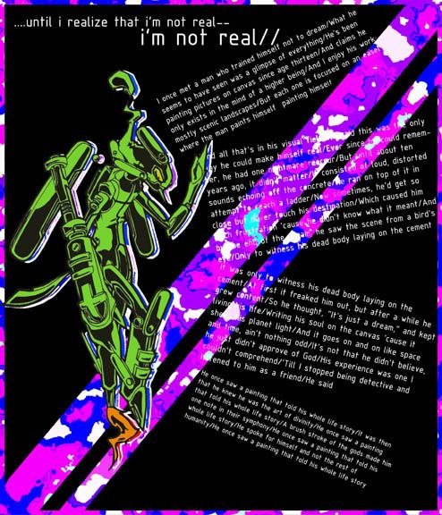
|
 |
|
|
|
|
|
|
|
|
|
|
|
|
|
Posted: Fri Jul 21, 2006 2:41 pm
Its okay, I'm not really sure what I think about it though. The camo border and lines running across it doesn't seem to match with the robot there. The text, is a little hard to read when it goes over the camo part; but because its so small, I doubt I'm even supposed to try to read it. Right?
Hope I wasn't to harsh, Its good. You have a nice center of visual interest (CVI) and although the heading didn't make that much sense to me at first, personally I think that makes it stand out more. All around, you did a good job.
And welcome to the guild.
|
|
|
|
|
|
|
|
|
|
|
|
|
|
|
|
|
|
Posted: Fri Aug 11, 2006 6:31 pm
|
|
|
|
|
|
|
|
|
|
Posted: Wed Aug 30, 2006 6:38 am
I like the robot! But the purple border draws attention off of the robot and the writing. A different colored border would do. And the text is kind of hard to read as well.
|
|
|
|
|
|
|
|
|
|
|
|
|
|
|
|
|
|
|