Welcome to Gaia! ::

Reply Art Fags
I need a teensy bit of help here..

Quick Reply

Enter both words below, separated by a space:

Can't read the text? Click here

Submit

Progidus

PostPosted: Sun Jul 02, 2006 11:35 pm


A thousand and ten apologies for the page stretch!
User Image

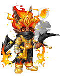
domokun His face makes me so mad.. it just doesn't catch the eye, for some reason, and I can't figure out what to change. There's lots of other stuff, too (his clothes, obviously, which are pathetic).
So maybe I can get a little advice on this?
PostPosted: Mon Jul 03, 2006 4:45 am


Whether you're going for an anime style or not, the chin really needs to jut out a little more - even just a tiny bit, if you want to keep the face slim-looking. The nose also looks ever so slightly on the short side for the length of the face that it's in. I think you need to watch where you're attaching the ear to the head, it seems a little too high up, even for an elfy-sort of ear.

If you want the face to stand out a little more, you could try sharpening up the contrast between the neck and head, like make the shadows under the neck a little darker and adding some slightly brighter highlights to the face. I quite enjoy the faded look you've got going here though, the colours are very dream-like. Excellent work on the hair, also. smile

television


The Dred Pirate Gossy

PostPosted: Mon Jul 03, 2006 7:53 pm


I unno if it's they way you plan to do the final version but it looks soft, like you're afraid to say where the surfaces are and where the light hits, and where things belong. I think the reason nothing catches your eye is because his features are undefined

I don't think there is anything wrong with his clothes, you can't really see them and the focus looks like it's supposed to be his face. The coloring makes him look delicate. I don't think you'll lose that if you take television's suggestions
PostPosted: Mon Jul 03, 2006 9:38 pm


I am with TV.

The chin is a steady slope back, and needs some dimention.

Sorry, thats all I can think of :S

THIS NAME IS QUITE SMART

6,550 Points
  • First step to fame 200
  • Megathread 100
  • Mark Twain 100

Zahir
Crew

Original Gaian

PostPosted: Thu Jul 06, 2006 2:39 am


A slightly stronger or more dramatic lightsource would help, I think - as it is the highlights look kind of soft and without more variation between light and dark on the face, it looks kind of flat.
Reply
Art Fags

 
Manage Your Items
Other Stuff
Get GCash
Offers
Get Items
More Items
Where Everyone Hangs Out
Other Community Areas
Virtual Spaces
Fun Stuff
Gaia's Games
Mini-Games
Play with GCash
Play with Platinum