|
|
|
|
|
|
|
|
|
 Posted: Sun Jun 11, 2006 5:48 pm Posted: Sun Jun 11, 2006 5:48 pm
UPDATE! Well, I submitted this at the end of August, and it's been ages since August, but art fags is entitled to see what the finished product actually turned out like. Now, it keeled over to the left, and I was trying to make a kind of stalactite/stalagmite thing. But then I had to mount it on foamcore, so having seperate peaks would have made it BREAK during any form of transportation. Then it was cut out from the foamcore, and displayed in the rec-room in the gallery thingie, brilliant fun. So that was funtimes. Anyway, I must say, thanks for the criticism from last time, it was a great help! 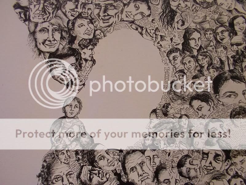 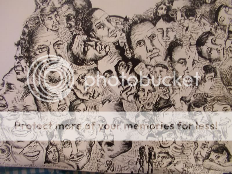 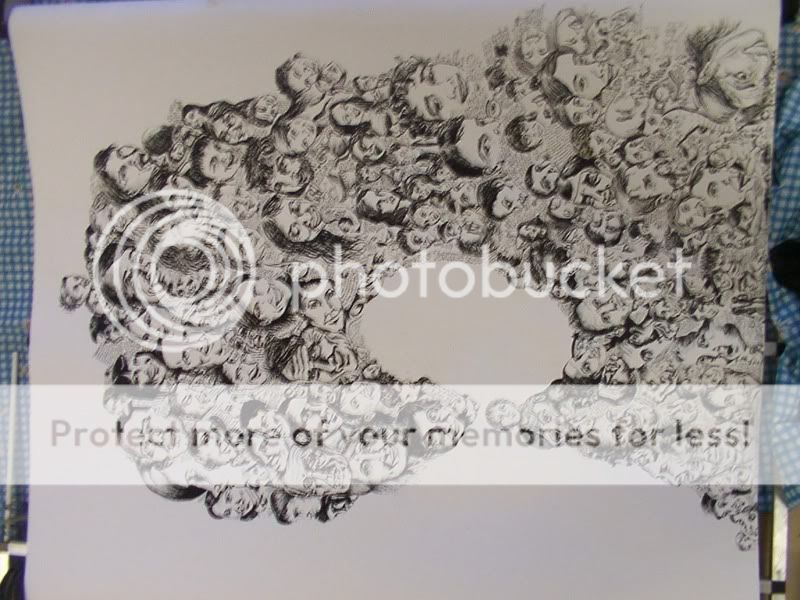 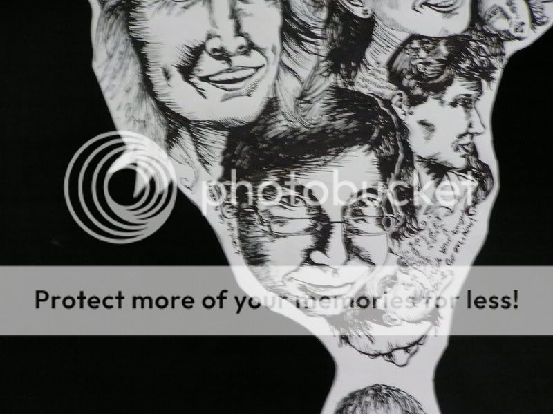 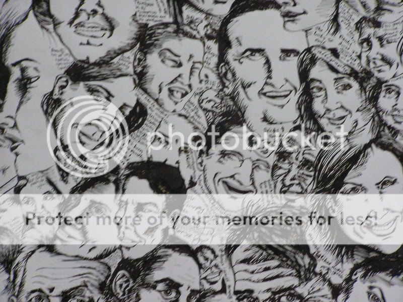 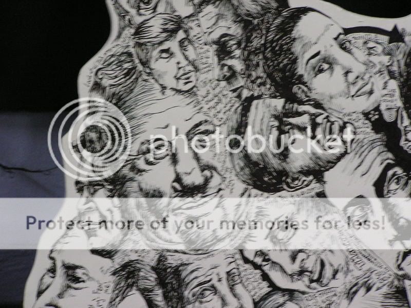 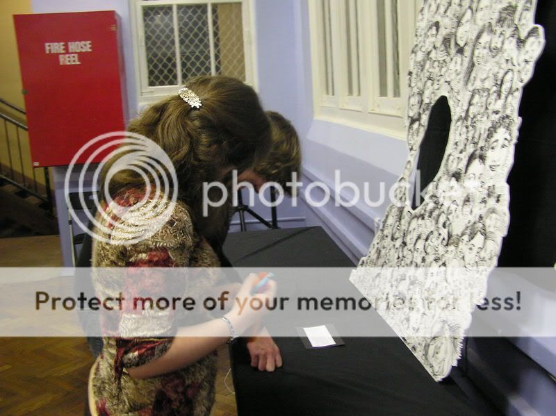 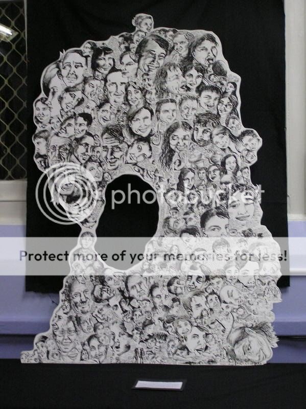 ORIGINAL MESSAGE Quote: Well, I was referred over here from Picture Post, because I wasn't getting any useful feedback. I tried applying for membership, but the application wouldn't send because of "Array". Since I've no idea what that means, and this is a public guild anyway, I'd like to ask for feedback regardless. See, this is my final year of high school body of work. I started with drawing people I knew, then it progressed into people who just wanted to be in it, then to people who just gave me photos or newspaper clippings. Intermittant is commentary; sometimes relevant to the pictures, mostly only relevant to whatever was passing though my head that I thought was worth recording. As it is, i have a roll of paper 10 metres by 1.5 metres. It's on a scrolling base so i can work on (relatively) small sections at any one time. At the moment, there's a definate progression in quality of drawing. This presents a problem. I want to fill up as much paper as I can, but the qualitative progression will show the order in which I draw things. I'm hesitant to start a new column, for fear it would present too much of a contrast. I could go from top to bottom, but that would bring problems in order of overlap, and the difference in the bottom sections would be even greater. Overall, it currently looks like this (remember, 1.5 metres tall) 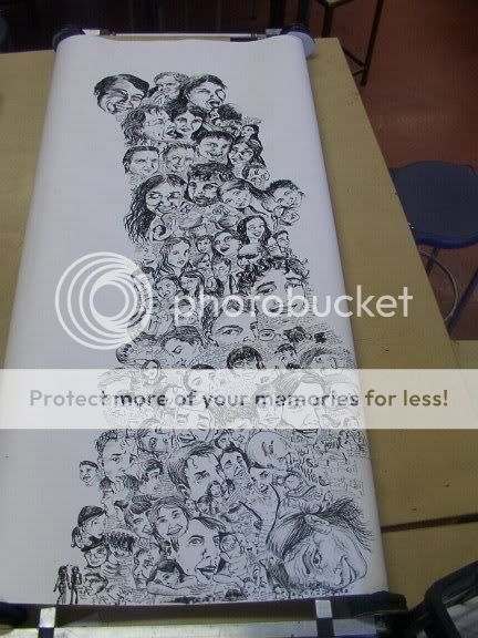 and a few closeups 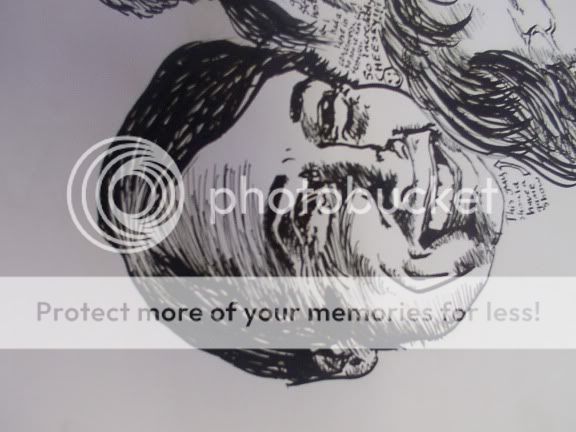 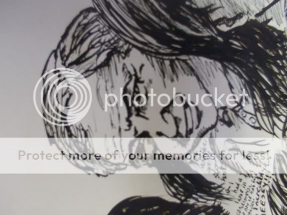 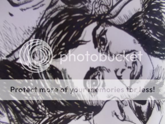  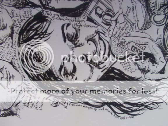 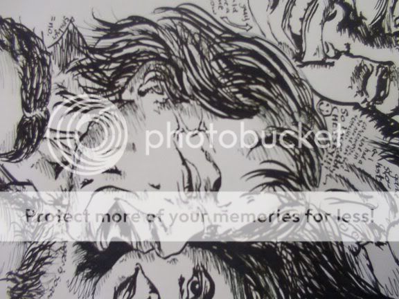 Anyone have any ideas what i should do next? i've spent about a quarter of a year's classtime on this, and I have until August 27th to finish it xd
|
 |
|
|
|
|
|
|
|
|
|
|
|
|
|
Posted: Mon Jun 12, 2006 9:39 pm
wtf why hasn't anyone commented on this yet.
EPIC.
i like the towering look it has right now. maybe you could add some animals. i dunno. i'm not creative. Dx
|
|
|
|
|
|
|
|
|
|
|
|
|
|
|
|
|
|
Posted: Mon Jun 12, 2006 10:29 pm
yeah, this is very awesome, it looks like a door poster.
i like the hill-feel and how it's tipping over a little to the left
to fill the entire sheet would be too much clutter imo
maybe if you added some smaller heads to the top tip of the mountain - the top man's smilling head [this one] seems like an awkward way of topping it off since it's so large
and maybe if you had smaller heads falling down off the pile or something
i personally, [from what i can tell] like the bottom portion of the hill best bc the heads are all laying in different directions, you can tell one is on piled top of the other. once you move up, since they're all in the same upright position you kind of lose it.
|
|
|
|
|
|
|
|
|
|
|
|
|
|
|
Posted: Wed Jun 14, 2006 9:25 am
Wow, I mean, that's going to take you a long time to fill the rest of the space we can see anyway.
Maybe you should make it part of something..the shape is sort of like one side of a girl's hair, or some sort of liquid. (could be a waterfall, could be wine, could be vomit..)
Some of those close ups are really nice. They look alot better than the top photo, although that's probably to do with the progression you were speaking of.
|
|
|
|
|
|
|
|
|
|
|
|
|
|
|
|
|
|
Posted: Sun Jun 18, 2006 11:20 am
I see a waterfall or the leaning tower of piza. Maybe if you thought of that area as a positive space object (ie.. a waterfall or shape it into a sofa) you could put it into a scene but make it out of context? I have no clue what im saying. XDDD
|
|
|
|
|
|
|
|
|
|
|
|
|
|
|
Posted: Wed Jun 21, 2006 3:33 pm
Lovely 3nodding
I would just either continue into the very top of the top left hand corner or leave it. You could grade it further into the bottom left corner too. Covering the entire sheet might make it look a little crowded.
You could put some washes of colour at the sides but its a bit risky doing it afterwards. Wrinkling the paper would be a shame and its a bit late to stretch it now, you run the risk of making the ink run.
Depending on the thickness of the paper, you could do something on another piece of paper and then stick it onto the back.
Otherwise you could always leave this as it is and start another one. Your drawing's been improving while doing this one so if you do another it should look fantastic by the end.
|
|
|
|
|
|
|
|
|
|
|
|
|
|
|
|
|
|
Posted: Sun Nov 05, 2006 10:01 pm
|
|
|
|
|
|
|
|
|
|
Posted: Mon Nov 06, 2006 12:37 am
I really like the finished look, especially that white on black thang. Real sweet.
|
|
|
|
|
|
|
|
|
|
|
|
|
|
|
|
Dr. Valentine Vice Captain
|
Posted: Tue Nov 07, 2006 3:08 am
That is right nifty. Pity it's too big for a scan.
|
|
|
|
|
|
|
|
|
|
|
|
|
|
|
Posted: Tue Nov 07, 2006 12:09 pm
i agree, very impressive.
is there a purpose for the hole in the center? just curious.
|
|
|
|
|
|
|
|
|
|
|
|
|
|
|
|
|
|
Posted: Tue Nov 07, 2006 3:04 pm
Dr. Valentine That is right nifty. Pity it's too big for a scan. yeah, so much bloody detail, but too huge for scan. i tried photographing detail bits and layer-stitching them together, but the photos were often just too fuzzy. pity though
|
|
|
|
|
|
|
|
|
|
|
|
|
|
|
Posted: Tue Nov 07, 2006 3:15 pm
Page Boy i agree, very impressive. is there a purpose for the hole in the center? just curious. Well, when I did it, I wanted it to be an organic accumulation form. So as it reached the top of the page, it curved over. I tried to make it organic, and hence, it kinda resembled those caves that have stalactites and stalactites. And the order I drew them in actually corresponded to how such residues would accumulate in drips and drabs. So, that was MY rationalisation for the shape. And when I mounted it, I couldn't seperate the stalactite and stalagmite lest the whole thing would just crack across the middle during transportation. So my reason is because of practicalities. But after people saw it at the school exhibition and during packing, etc, i grew to hear a number of other explanations for the hole. * It is a hole for a person to put THEIR head through, letting the audience participate with the artwork, and putting their own "portrait" in amongst the rest * It is a blank where the artist's own portrait lies. In absence, creating a kind of personal void in amongst the portraits of everyone they see * It's a hole, symbolising an absense of social description * It is a degrading influence, decaying the world of smiling faces, eating away like an acid They're all nice explanations, and trump my reasoning for there beign a hole. Great fun anyway
|
|
|
|
|
|
|
|
|
|
|
|
|
|
|
|
|
|
Posted: Wed Nov 08, 2006 1:21 pm
I think for me the first purpose is the most interesting.
cool.
|
|
|
|
|
|
|
|
|
|
|
|
|
|
|
Posted: Tue Nov 21, 2006 11:07 am
Ooho! Very cool! I love the result. Have you ever heard of Judy Glantzman? This reminds me a little of her work. She does a lot of paintings and drawings where she builds up portraits around and on top of each other. You should check out her work! A few things come up when you google search her. smile If you're interested at all in seeing more I have a few photos of more of her stuff, including sketches. So contact me if you wanna see them biggrin
But yes! Lovely lovely work. I love stuff like this. Mmm portraits.
|
|
|
|
|
|
|
|
|
|
|
|
|
|
|
|
|
|
Posted: Sat Nov 25, 2006 10:58 pm
Zebee Ooho! Very cool! I love the result. Have you ever heard of Judy Glantzman? This reminds me a little of her work. She does a lot of paintings and drawings where she builds up portraits around and on top of each other. You should check out her work! A few things come up when you google search her. smile If you're interested at all in seeing more I have a few photos of more of her stuff, including sketches. So contact me if you wanna see them biggrin But yes! Lovely lovely work. I love stuff like this. Mmm portraits. wow! looks like i subliminally referenced a new york artist! AWESOME! thanks for pointing that out, her works are amazing. Wow, just wow
|
|
|
|
|
|
|
|
|
|
|
|
|
|
|
|
|
|