|
|
|
|
|
|
|
|
|
 Posted: Mon Feb 20, 2006 8:50 pm Posted: Mon Feb 20, 2006 8:50 pm
I think i've been critting a lot lately, so I thought I'd better give something to crit for others. Yeaaa... >:3 Bash me.
For the last week I've done just sprites and played ffxi, so I'll skip those.
After the crits I got last time i changed this pic a bit.
(Also i changed the outfit and made the anatomy better on another picture, but atm I can't find more than few progress-pictures of 'em. Not sure where i hid them. n_n; My comp is messy as hell.
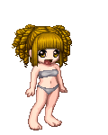
some from-the-photo practising, mostly trying to practise light and shadow. Need more practise for human heads. neutral
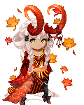
One of my first concept arts. n__n For a sprite, still a sketch, but looks good so far?
Photo referance. Found the star crush from open canvas. xD; It's actually pretty good, though humorous.
____
Chosen from about 50-60 pictures, soooo. Saved you from the crap. Kind of. ninja
|
 |
|
|
|
|
|
|
|
|
|
|
|
|
|
Posted: Mon Feb 20, 2006 9:35 pm
Are these finished? I like them, but they look about half done. like the colors aren't set in yet, and the background's not drawn or colored yet, or the details aren't worked out yet, etc.
It would almost be impressionist if there were more going on X3
|
|
|
|
|
|
|
|
|
|
|
|
|
|
|
|
|
|
Posted: Mon Feb 20, 2006 9:50 pm
The Dred Pirate Gossy Are these finished? I like them, but they look about half done. like the colors aren't set in yet, and the background's not drawn or colored yet, or the details aren't worked out yet, etc. It would almost be impressionist if there were more going on X3 More like... practises. :3 I have almost not at all interest in making finished pictures polished and pretty. I love drawing sketches. <3 ( Though I'll point out that my sketches is usually only for the purpose of improving and might take hours to make if it seems interesting enough, so it's not like I'm just lazy hobo. Well, I am, but not because of that. )
|
|
|
|
|
|
|
|
|
|
|
|
|
|
|
Posted: Mon Feb 20, 2006 10:13 pm
i do admit that they do look a little unfinished, but if you like sketching maybe you can delve into different brushes? the rounded brush makes everything look blurry, which detracts from your gestures and linework. maybe also put things at a higher opacity so they don't look so wishy-washy (the last two looks blurry because of it). probably adding some bright areas it'll give it more detail and still leave your gesture and impression on it. especially the wings on your last piece, even if it's just a sketch it'd be nice to see some form with the wings instead of line scribble placement. - example Ibeing a little bolder with the colors can really push your drawings even further. the work was done quickly but you can tell the artist really knows the landmarks of the body and can use minimal strokes to achieve what they want. - example II- example III
|
|
|
|
|
|
|
|
|
|
|
|
|
|
|
|
|
|
Posted: Mon Feb 20, 2006 10:33 pm
crazy spork i am i do admit that they do look a little unfinished, but if you like sketching maybe you can delve into different brushes? the rounded brush makes everything look blurry, which detracts from your gestures and linework. maybe also put things at a higher opacity so they don't look so wishy-washy (the last two looks blurry because of it). probably adding some bright areas it'll give it more detail and still leave your gesture and impression on it. especially the wings on your last piece, even if it's just a sketch it'd be nice to see some form with the wings instead of line scribble placement. - example Ibeing a little bolder with the colors can really push your drawings even further. the work was done quickly but you can tell the artist really knows the landmarks of the body and can use minimal strokes to achieve what they want. - example II- example IIIActually, that is a really good suggestion. <3 Sounds interesting and would be a really good practise. Also i think it would make many people happy. Though... the problem is that open canvas has only two brushes - the main brush and watercolor (and, technically, pretty star). All my coloring are based on the watercolor system of oc. I'll givit a try though. Thanks. <3
|
|
|
|
|
|
|
|
|
|
|
|
|
|
|
Posted: Tue Feb 21, 2006 10:23 am
[(-Onis-)] Actually, that is a really good suggestion. <3 Sounds interesting and would be a really good practise. Also i think it would make many people happy. Though... the problem is that open canvas has only two brushes - the main brush and watercolor (and, technically, pretty star). All my coloring are based on the watercolor system of oc. I'll givit a try though. Thanks. <3 Now, I know you're a good bit better than I am (pardon the flattery plz), but this was colored with Open Canvas. I only do this to point out that a richer array of colors can be achieved with the tools given.
|
|
|
|
|
|
|
|
|
|
|
|
|
|
|
|
|
|
Posted: Tue Feb 21, 2006 12:21 pm
[(-Onis-)] crazy spork i am i do admit that they do look a little unfinished, but if you like sketching maybe you can delve into different brushes? the rounded brush makes everything look blurry, which detracts from your gestures and linework. maybe also put things at a higher opacity so they don't look so wishy-washy (the last two looks blurry because of it). probably adding some bright areas it'll give it more detail and still leave your gesture and impression on it. especially the wings on your last piece, even if it's just a sketch it'd be nice to see some form with the wings instead of line scribble placement. - example Ibeing a little bolder with the colors can really push your drawings even further. the work was done quickly but you can tell the artist really knows the landmarks of the body and can use minimal strokes to achieve what they want. - example II- example IIIActually, that is a really good suggestion. <3 Sounds interesting and would be a really good practise. Also i think it would make many people happy. Though... the problem is that open canvas has only two brushes - the main brush and watercolor (and, technically, pretty star). All my coloring are based on the watercolor system of oc. I'll givit a try though. Thanks. <3 open canvas has only two DEFAULT brushes... you can customize them by playing around with their settings. You can get your brushes to emulate from the look from diluted markers to Oil paint. and the intensity of your colour has little to none relations with the type of brush you use, it's the choice of colours you use that sets the low contrast/hue look of your sketches.
|
|
|
|
|
|
|
|
|
|
|
|
|
|
|
Posted: Tue Feb 21, 2006 11:24 pm
ohh... <3 Thank you for clearing that up. I thought crazy spork i am meant special kinds of brushes which photoshop has.
and and. >_< Sorry for misreading. My fault, I should have read it more carefully.
Actually I'm quite relieved, since I really don't like working with photoshop. ninja Not a bad program, just hard for me to use.
As for the opacity... mm. I agree with that. Actually my first coloring were like the shiniest and most mysteriously neon colors ever, so I've been all time trying to color with boring/quite dim colors. I think I went overboard with it.
Thanks. :3 (Though I think I'll start playing with a lot of brushes too. ninja It is a good idea...)
Edit:
Homm. I might leave this place for a little time. I noticed that I'm starting to be emotionally attached into this guild and I hate being so. Not your fault at all, you're all cool and have great personalities and art, which makes me like this place.
Emotions create drama. I dislike drama.
Excuse me if I was too harsh from time to time, it wasn't intentional. Usually I give crits if I can, it's my way to say that I appreciate what you're doing.
Cheers. n_n
(I'll read the comments made for me, but won't write anything unless I see that it's necessary.)
|
|
|
|
|
|
|
|
|
|
|
|
|
|
|
|
|
|
Posted: Thu Feb 23, 2006 1:15 am
[(-Onis-)] As for the opacity... mm. I agree with that. Actually my first coloring were like the shiniest and most mysteriously neon colors ever, so I've been all time trying to color with boring/quite dim colors. I think I went overboard with it. Thanks. :3 (Though I think I'll start playing with a lot of brushes too. ninja It is a good idea...) i guess if you want to, you can always variate on the brush sizes so it doesn't look all the same. a good way to add extra bits of detail without having to switch brushes (i myself stick to the round hard brush 99% of the time, with the 1% using a soft brush to make things look...well, soft). i think it's good that you're trying out different color schemes and working out what works and what doesn't. using low contrast stuff is good, but you can still have bright colors in your piece if you want like rim light and things like that. those are handy for making your objects have more form and to also have them go with the background (like if you use a color similar to your background color).
|
|
|
|
|
|
|
|
|
|
|
|
|
|
|
Posted: Thu Feb 23, 2006 3:04 am
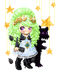
I really hope you finish making the three ladies at the top. I especially like the style, pose, and clothing of the sprite lady - would be awesome to see as a completed image. I also like the direction of the nude woman, where it's going - keep playing with the lighting. I really like how her face is turning out. As for the elfish lady, it'd be nice to see much more contrasting, bright lighting on her skin - though that's just personal opinion.
|
|
|
|
|
|
|
|
|
|
|
|
|
|
|
|
|
|
|