


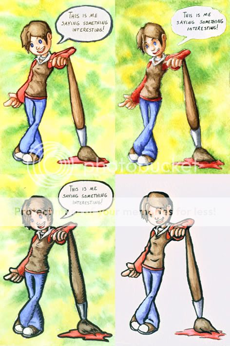
I've done a quick study on the character I'll be featuring using various possible techniques. While I personally prefer the top left (sans lineart), I don't expect it to work out very well once it comes time to write in the text for the speech bubbles. I think the colored lines (top right) might have the best potential, or would the classic black lines (either style) work best?
Update: I've added a quick speech bubble and simple background to most of them. I decided not to worry about the bottom right since I have yet to get positive feedback regarding that one.
Sketches of the actual comics soon to come.
Suggestions/feedback?

