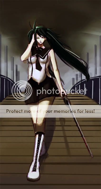
I really like the perspective of the bridge and the overall atmosphere of the piece--you did really good there--but there are quite a few anatomy/proportion issues and the shading on the knee doesn't make sense to me. Knees pop out further than shins do so it wouldn't be so dark. I've redlined the anatomy for you. =O Don't look at em if you don't want to because I'm also going to do my best to describe what I think needs fixin.
[x] [x]First of all, like people have mentioned the head looks too small. In my redlines I made it so that her head wasn't angled downward, but I did realize that the head was proportionate to the shoulders, however the hair is what makes it look so small. The hair is positioned on her head for someone who is looking right at you. Bring the bangs down a little and that should do it.
The arm reaching up to her head is too long. Remember foreshortening =] but also her shoulders are slightly angled at a slant so her breasts would be too. Her right side (our left) was too straight and needed to be curved in towards her suspenders (which by the way are pressed too close to her beneath her breasts. The shading doesn't look like her boobs are squished down by it so it wouldn't hug her figure quite so much.) I do see what you were going for (an arched spine) but it didn't seem to fit with her chest and shoulders.
The legs are the most disproportionate of the drawing, they're too long and too thick to fit the rest of her body. Like wise if you choose to shorten them, you'll have to shorten the arm holding the sword too.
I think that about covers it. I hope I wasn't too harsh, I didn't mean to be, and I hope I helped =]