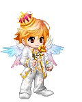
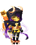
Hmm...There's colour in it....but there's no shading. I can see where you tried, but it's not really all that obvious...
If you want your drawings you pop a bit more, use some more shading, and not just darker...Like...if you want a rich, dark blue, use a darker violet to shade overtop of the original blue.
Also, some of the proportions are a little wonky. Like on the Temari one, her neck is skinny
sweatdrop You should look at a picture of someone in the position you're trying to draw a character in, practice it a few times. You'll get it right (:
And with the hair, instead of lots of short lines, you should use a handful of longer ones.
It makes it a little more realistic, I guess, you don't look at someone's hair and see a bunch of little tiny lines all over their head xD
Try mixing different shades into the hair. Make a few lines in the pencil, but then when you colour it, use the pencil crayons to make lines in different shades of the hair.

what I'm trying to say is to colour it a base colour, and then put lines through it in different shades of the same colour, but don't press too hard.
The best advice my art teacher ever gave me was "Draw what you see, not what you think you see."
It doesn't really apply to you, but if you look at a picture of someone in the position you're trying to draw something in, it helps a lot to get it just right.
Hopefully you don't take this too personally, I just wanted to help and you wanted honest opinions
sweatdrop I do like your art, though, don't get me wrong, it is very good, but I just thought I'd give you a few tips I learned as I drew. I think you are very good despite the things I've pointed out
redface