|
|
|
|
|
|
|
|
|
 Posted: Tue Jan 10, 2006 2:38 pm Posted: Tue Jan 10, 2006 2:38 pm
It's finally done. Sort of. If you spot any mistakes/things that need touching up, please tell me. I still have a copy saved with all the layers so small modifications shouldn't be difficult. Anyway. I worked very hard on this, and had a lot of trouble deciding on colours. So don't complain about the colouring scheme. I did my best. >:[ This being my longest CG project, I'm very proud of it. ^____^ Without delay, here it is. 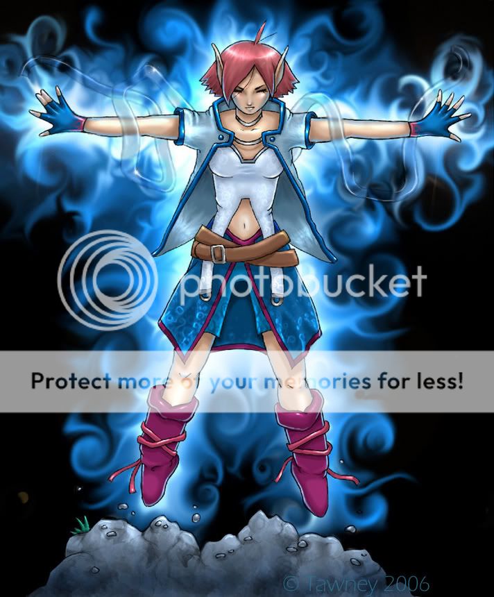 I really like how the rocks and lower skirt-thing turned out. Wheeeee. biggrin
|
 |
|
|
|
|
|
|
|
|
|
|
|
|
|
Posted: Wed Jan 11, 2006 4:32 am
i think i might have gone for an off black bg.
but wow...this picture did really just get better with colors.
those are VERY nice rocks.
|
|
|
|
|
|
|
|
|
|
|
|
|
|
|
|
|
|
Posted: Wed Jan 11, 2006 5:56 am
The rocks look watercoloured. I do like the lower skirt too, the light blue pattern is very nice.
I think the shadows on her could maybe be a little darker and the black lines look pixelated in places. That is something that I can never do though, so I can't suggest anything.
I like the background by the way, I know how long it takes to get all the swirlies just right!
|
|
|
|
|
|
|
|
|
|
|
|
|
|
|
Posted: Wed Jan 11, 2006 1:09 pm
ficklefiend The rocks look watercoloured. I do like the lower skirt too, the light blue pattern is very nice. I think the shadows on her could maybe be a little darker and the black lines look pixelated in places. That is something that I can never do though, so I can't suggest anything. I like the background by the way, I know how long it takes to get all the swirlies just right! Thanks! Actually, I found the background was the easiest part. XD Just swirling the colours in circles got the right effect the first time. Only took about 20 minutes. I was surprised at how nice it turned out. The lineart drove me crazy because it was so pixellated, but I really don't know how to fix it either. I was going to adjust the colours from black to a lighter colour to mask the harshness of the lines, but it just didn't want to cooperate. D: I'm guessing the shadows do look a bit too light, considering my monitor is just so dark it makes shading hard. I really need a new one. -_-;
|
|
|
|
|
|
|
|
|
|
|
|
|
|
|
|
|
|
Posted: Wed Jan 11, 2006 1:10 pm
Page Boy i think i might have gone for an off black bg. but wow...this picture did really just get better with colors. those are VERY nice rocks. Thank you. I figured I'd just stick with black for more drama. Do you think putting a border around it would look better?
|
|
|
|
|
|
|
|
|
|
|
|
|
|
|
Posted: Wed Jan 11, 2006 2:25 pm
The swirlies look too smooth, they scream 'cg magic effect' to me and sort of take away from the overall effectiveness of the image for me.
Also the linework looks a bit shakey, possibly as though this is the image in its original size?
Overall fairly effective and certainly not bad.
|
|
|
|
|
|
Dr. Valentine Vice Captain
|
|
|
|
|
|
|
|
|
|
|
|
Posted: Wed Jan 11, 2006 2:36 pm
Dr. Valentine The swirlies look too smooth, they scream 'cg magic effect' to me and sort of take away from the overall effectiveness of the image for me. Also the linework looks a bit shakey, possibly as though this is the image in its original size? Overall fairly effective and certainly not bad. The original size is slightly bigger, but the lineart looks pretty much the same. The lineart looks so shakey because I scanned it as a sketch, rather than drawing the lineart directly on Photoshop. That's about as clean as I could get it, and it wouldn't seem to smooth out. Too late to do anything about it, really. The swirlies do kind of look like a Photoshop filter or something, but I did do them all by hand. I don't really know how I could make them.. less smooth. o-o
|
|
|
|
|
|
|
|
|
|
|
|
|
|
|
Posted: Wed Jan 11, 2006 10:45 pm
Tawney Dr. Valentine The swirlies look too smooth, they scream 'cg magic effect' to me and sort of take away from the overall effectiveness of the image for me. Also the linework looks a bit shakey, possibly as though this is the image in its original size? Overall fairly effective and certainly not bad. The original size is slightly bigger, but the lineart looks pretty much the same. The lineart looks so shakey because I scanned it as a sketch, rather than drawing the lineart directly on Photoshop. That's about as clean as I could get it, and it wouldn't seem to smooth out. Too late to do anything about it, really. The swirlies do kind of look like a Photoshop filter or something, but I did do them all by hand. I don't really know how I could make them.. less smooth. o-o I'd reccommend some kind of texturing, or at least noise. They are just too smooth.
|
|
|
|
|
|
Dr. Valentine Vice Captain
|
|
|
|
|
|
|
|
|
|
|
|
Posted: Thu Jan 12, 2006 5:01 am
Dr. Valentine Tawney Dr. Valentine The swirlies look too smooth, they scream 'cg magic effect' to me and sort of take away from the overall effectiveness of the image for me. Also the linework looks a bit shakey, possibly as though this is the image in its original size? Overall fairly effective and certainly not bad. The original size is slightly bigger, but the lineart looks pretty much the same. The lineart looks so shakey because I scanned it as a sketch, rather than drawing the lineart directly on Photoshop. That's about as clean as I could get it, and it wouldn't seem to smooth out. Too late to do anything about it, really. The swirlies do kind of look like a Photoshop filter or something, but I did do them all by hand. I don't really know how I could make them.. less smooth. o-o I'd reccommend some kind of texturing, or at least noise. They are just too smooth. Okay. I'll test that out.
|
|
|
|
|
|
|
|
|
|
|
|
|
|
|
Posted: Thu Jan 12, 2006 2:50 pm
Tawney Page Boy i think i might have gone for an off black bg. but wow...this picture did really just get better with colors. those are VERY nice rocks. Thank you. I figured I'd just stick with black for more drama. Do you think putting a border around it would look better? i'm not quite sure what you'd be trying to accomplish with the border. I mentioned the black because i dont like the way it looks with neon colors like that. it's tooooo....we'll it reminds me of those ugly shirts they make for adolescent boys..with flames and s**t on them. i can't remember now what i thought would have been better. it could just be i'm hypersensitive.
|
|
|
|
|
|
|
|
|
|
|
|
|
|
|
|
|
|
Posted: Fri Jan 13, 2006 12:59 pm
Page Boy Tawney Page Boy i think i might have gone for an off black bg. but wow...this picture did really just get better with colors. those are VERY nice rocks. Thank you. I figured I'd just stick with black for more drama. Do you think putting a border around it would look better? i'm not quite sure what you'd be trying to accomplish with the border. I mentioned the black because i dont like the way it looks with neon colors like that. it's tooooo....we'll it reminds me of those ugly shirts they make for adolescent boys..with flames and s**t on them. i can't remember now what i thought would have been better. it could just be i'm hypersensitive. Well I figured a border would break up the blackness and whatnot. *shrug* I get what you mean.
|
|
|
|
|
|
|
|
|
|
|
|
|
|
|
Posted: Sat Jan 14, 2006 2:52 pm
I'm actually pretty okay with the swirls but they look a bit rushed.
|
|
|
|
|
|
|
|
|
|
|
|
|
|
|
|
|
|
|