|
|
|
|
|
|
|
|
|
 Posted: Sat Mar 27, 2010 1:54 pm Posted: Sat Mar 27, 2010 1:54 pm
Here are just a few of my drawings, I'd like to have ur views and opinions on what u think of them and how u think I can better my drawing. Please and thank u heart


|
 |
|
|
|
|
|
|
|
|
|
|
|
|
|
Posted: Sat Mar 27, 2010 6:13 pm
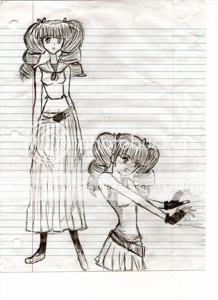
1st picture: In the full body drawing, her forearm on the right is rather long. The one on the left also looks a little long, but not that bad. The foot on the left seems to be lacking a heel. The neck is kinda long, but I think that's just a part of your style; I think it suits how she's so tall and thin (or at least compared to average anime/manga characters).
In the second drawing, her head looks like it's turning towards us a bit rather than facing the same direction her body is... which would be good in some scenarios and bad in others; depends what you were aiming for. Her fingers look a bit wobbly... Her rear arm appears to perhaps be shorter than the front arm, and her rear hand should be smaller than the front hand. The clothing around her rear shoulder... I think I'd maybe have it curve the other way with this angle.
Good drawings overall, I like the style.
2nd picture: She seems to be missing a lot of her torso; her arms would be reaching too low. Here forearm on the right looks too long, and the one on the left, as well, to a lesser extent.
3rd picture: The back view looks pretty good. The rough guideline on her face looks like it isn't being followed (she's facing down, but the guideline looks like she should have been facing up). I think it's normal to change some things from your rough concept as you go along, but that's a pretty big difference... make sure your rough concepts are useful.
I think her face would look better if it was following the guidelines... Something about how it is now looks odd to me.
4th picture: Forearms again... Maybe make the knees less pointy, and the toes definitely need work. On her peace sign, the thumb looks too long, the other fingers look too short, and the index finger seems a little bit disconnected from the hand. The V shape of it all sorta looks like a U instead. If she's doing a more natural peace sign, I think the thumb should be around the middle of that segment of the ring finger, not at the bottom of it. Oh, and the breast should connect to the underarm, so I suppose her breast placement is off, too.
|
|
|
|
|
|
|
|
|
|
|
|
|
|
|
|
|
|
Posted: Mon Mar 29, 2010 1:15 pm
Zantetsken 1st picture: In the full body drawing, her forearm on the right is rather long. The one on the left also looks a little long, but not that bad. The foot on the left seems to be lacking a heel. The neck is kinda long, but I think that's just a part of your style; I think it suits how she's so tall and thin (or at least compared to average anime/manga characters). In the second drawing, her head looks like it's turning towards us a bit rather than facing the same direction her body is... which would be good in some scenarios and bad in others; depends what you were aiming for. Her fingers look a bit wobbly... Her rear arm appears to perhaps be shorter than the front arm, and her rear hand should be smaller than the front hand. The clothing around her rear shoulder... I think I'd maybe have it curve the other way with this angle. Good drawings overall, I like the style. 2nd picture: She seems to be missing a lot of her torso; her arms would be reaching too low. Here forearm on the right looks too long, and the one on the left, as well, to a lesser extent. 3rd picture: The back view looks pretty good. The rough guideline on her face looks like it isn't being followed (she's facing down, but the guideline looks like she should have been facing up). I think it's normal to change some things from your rough concept as you go along, but that's a pretty big difference... make sure your rough concepts are useful. I think her face would look better if it was following the guidelines... Something about how it is now looks odd to me. 4th picture: Forearms again... Maybe make the knees less pointy, and the toes definitely need work. On her peace sign, the thumb looks too long, the other fingers look too short, and the index finger seems a little bit disconnected from the hand. The V shape of it all sorta looks like a U instead. If she's doing a more natural peace sign, I think the thumb should be around the middle of that segment of the ring finger, not at the bottom of it. Oh, and the breast should connect to the underarm, so I suppose her breast placement is off, too. OhMeGosh! Thanks so much all the points u have made really helps. I can see where I've made mistakes and now I think I can go back and watch out not to make the same mistakes like that. Ur right haha about the breast placement, I just now noticed xD Thanks so much I cant wait to put up a more improved drawing. I hope u will critique it for me. Again, Thanks <3
|
|
|
|
|
|
|
|
|
|
|
|
|
|
|
Posted: Mon Mar 29, 2010 11:13 pm
Looking forward to seeing improvements, and glad I could be of some use.
|
|
|
|
|
|
|
|
|
|
|
|
|
|
|
|
|
|
Posted: Tue Apr 06, 2010 11:31 pm
2nd picture: leg to the left looks detached
just something i saw right away.
|
|
|
|
|
|
|
|
|
|
|
|
|
|
|
Posted: Fri Apr 09, 2010 7:08 am
please use plain paper not loose leaf paper. The drawings are good just clean up the lines when you outline in pen or marker to finish up the drawings. It would look awesome and have life when you color them in. Till then keep it up!
|
|
|
|
|
|
|
|
|
|
|
|
|
|
|
|
|
|
|