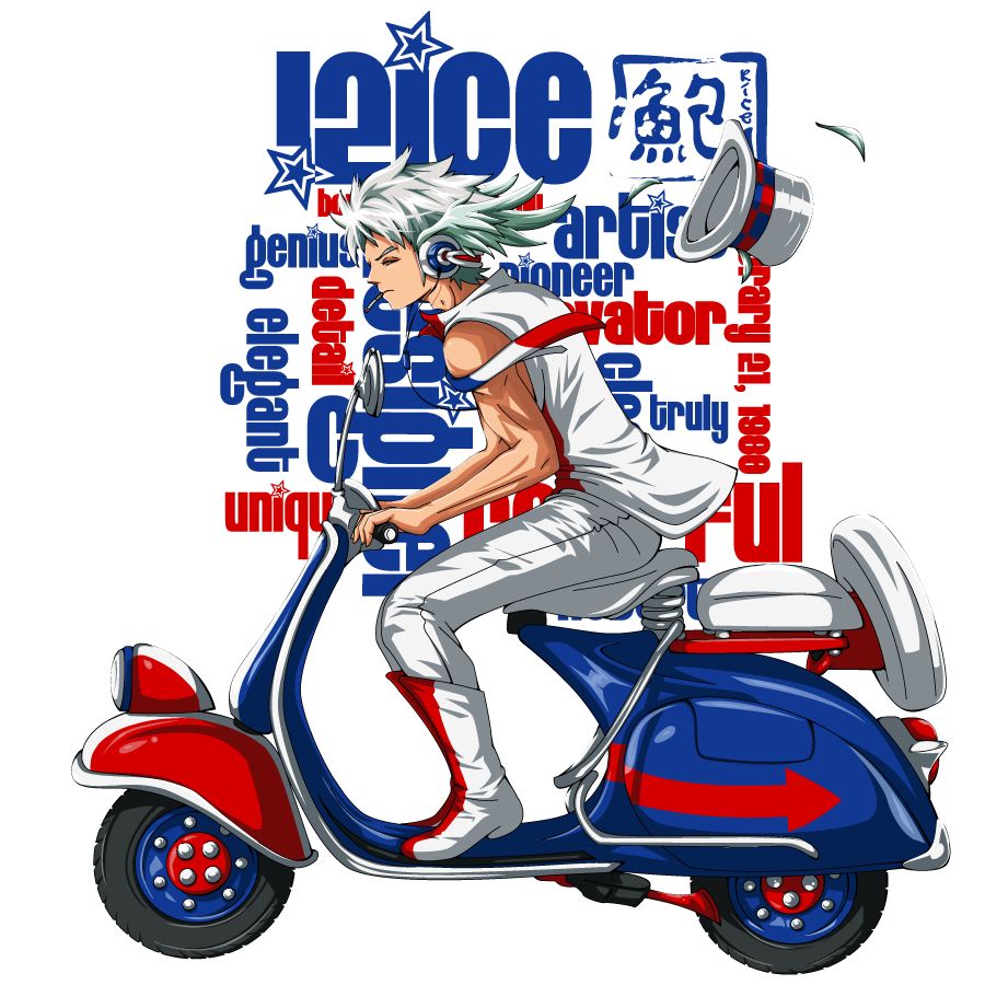
so im trying to stay away from saturating my pics too much so i went back to the basics heheh
Posted: Mon Jul 27, 2009 7:17 pm
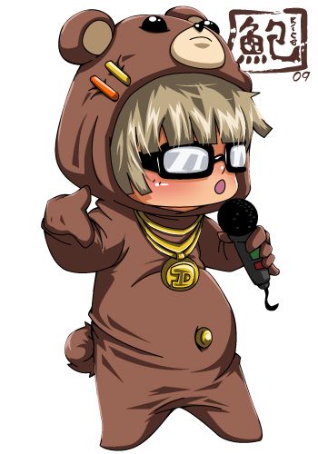
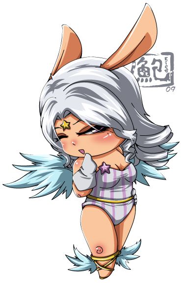
heheh those chibis crack me up biggrin very fun.
as usual, niiiice and clean lines & shading everywhere!
the typography behind the vespa boy is fun and works well too. since they look to be the same colors as the bike, it kind of blends in with the foreground and becomes a little more noisy/confusing. probably a white stroke around the character/bike/hat could separate them...unless of course, that sort of busyness is your intention =)