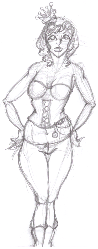
I love that you're attempting distortion in proportion, however, they still need to be proportonal.
First, general stuff.
1) Don't cut off the feet. If you run out of room, rip another page, add to it and tape the back. Never cut it off. That looks bad and you're blocking your creative process.
2) Don't forget that everything has mass and volume. Even a flat piece of paper takes up space. Her crotch isn't taking up space. That includes her hair. Hair is a separate volume that sits on top of the head. Don't draw them as the same mass. I like to draw the full skull then add hair when I'm working on the shape of the clothing.

Anatomy
While proportions get distorted, anatomy stays the same. The way the skeleton is pieced together doesn't change. It helps a lot to keep a picture on hand just to remember how it sticks together.
There is a knob of bone that comes out where your femur sockets to your pelvis. This you can see on the surface of the skin. This is where the hips are widest. People tend to learn the skin first, but you have to know how something is put together in order to understand how it works and replicate it. I do really enjoy that you're expressing distribution of fat on her body. Many people forget that there is fat under the skin and that it's distribution of fat that ultimately makes the female body alluring.
Pay attention to the distribution of weight. Your head is very heavy and it must be supported by the body. You will lose balance and fall if you try to stand that way. Keep the feet under the head when the feet are together in a standing position. (Or between the feet when they're parted.)


Now that that's out of the way, here's the part I
really think is important when it comes to your growing as an artist outside of technical skill. I like your self assurance in expressing the body as YOU like. I think you should stick with it and I think you're one of not too many people that I can say is actually developing their style as they learn.
When you're distorting propotions, it's important to keep the ratios of proportion (as I said before) and it's just as important to have a rhythm in form. You've got the start of one, but it's off. Think of it like a beat. You want it to be in the right rhythm.
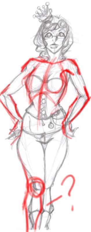
From now on, scan you rough sketches and then make a layer in a program and black out the figure to show the silhouette. (You can just print the scan and use a marker or something too.)

You can immediately see how strong your design is. What you look for is the pattern of symmetry and asymmetry. The body (in an attractive character) is symmetrical. You offset that by making things asymmetrical. You have great asymmetry in the hair and with the lean of the crown. (Crown should be symmetrical by the way, because it's a geometric shape. (Cylinder.)) The problem with your silhouette is that it lacks a pattern.

I straightened it out and simplified the form to show the symmetry. (I wouldn't try adding perspective just yet because it doesn't help to complicate things too fast.) See how the body line has symmetry? And where there is that asymmetry to break it up? Items worn by the character usually give the bits that asymmetrical.
Anyway, between them is what I was talking about with the pattern of distortion. Try patterning your exaggerations and see what you come up with.
3nodding