Welcome to Gaia! ::

Artist Alley Information

Back to Guilds


Tags: Convention, Selling, Prints, Crafts, Comics 

Reply Product Critique
Business Card Help? New Design in Post 3!

Quick Reply

Enter both words below, separated by a space:

Can't read the text? Click here

Submit

LavenderMintRose

Cheery Sweetheart

PostPosted: Thu May 28, 2009 3:27 pm


I'm living with false hope

And my eyes just want to see a ray of light

I'm gonna find it in my fairy tale...

User Image

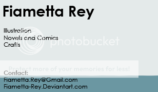
This is the design I have for my business card.

The DA page listed is not the one I use... it's a new one, that I plan to use for more professional stuff (the old one will be mostly for fanart and social stuff). Same with the e-mail.

I put a variety of the stuff I do on the card... is it to general? Should I get more specific?

Also the design... what's good, what's bad, what absolutely needs to be changed, is there another picture that you think would look better? (my DA gallery is linked in my signature).

Yeah... I want these to look the best they can.

Edit: I changed something small... I moved the name over because it's too close to the edge on this one. I'll post a new version of the .jpg when I change more.
PostPosted: Thu May 28, 2009 9:27 pm


Your design as-is isn't very legible, and not very memorable. I'd suggest that, when you get a chance, you take a graphic design class. But for now, I'll give you some pointers.

Your name is bigger than everything else, which is good, but the placement and font make it not stand out. That's bad, because that means people won't remember it. You have a lot of things centered, which is an inefficient use of white space. White Space is what a designer uses to direct the eye around the page, and assign significance to specific elements. When I first glance at your card, the thing my eye is drawn to is the art. Normally this would be desirable, but for a business card it is not. People take your card because they want your information, so that should always be the most important part of the card.

Make the art smaller, and align it to the lower-right corner. Maybe fade it a bit. Try a font alignment like so:

User Image

I'm pretty rusty, but this is a much more efficient use of white space and clearly directs the eye to the information. Font-wise, I used a font that is simple and easy to read from a distance. The most important thing I suggest with your new font choice is that it be one with both capital and lower case letters. Serif or Sans-Serif is up to you.

The textures you use in the background are pretty distracting, and make it more difficult to pick the text out on the page. If you decide to keep using them, make them a bit more subtle.

'Visual Arts' is a little vague.

[Kako]
Captain


LavenderMintRose

Cheery Sweetheart

PostPosted: Fri May 29, 2009 5:52 pm


I'm living with false hope

And my eyes just want to see a ray of light

I'm gonna find it in my fairy tale...

Thanks a lot!

That was really helpful. I'm planning on taking at least one graphic design class in college.

(I did sign up for a graphic design class in high school... but that fell victim to dumb high-school crap and ended up not happening. xp )

EDIT: User Image

This better?
PostPosted: Fri May 29, 2009 9:59 pm


I'd shift the email address to be slightly more in-line with the "Illustration, ect." part, and make the dA a bit larger. Possibly put your name a bit higher on the card. But yes, much better.

[Kako]
Captain

Reply
Product Critique

 
Manage Your Items
Other Stuff
Get GCash
Offers
Get Items
More Items
Where Everyone Hangs Out
Other Community Areas
Virtual Spaces
Fun Stuff
Gaia's Games
Mini-Games
Play with GCash
Play with Platinum