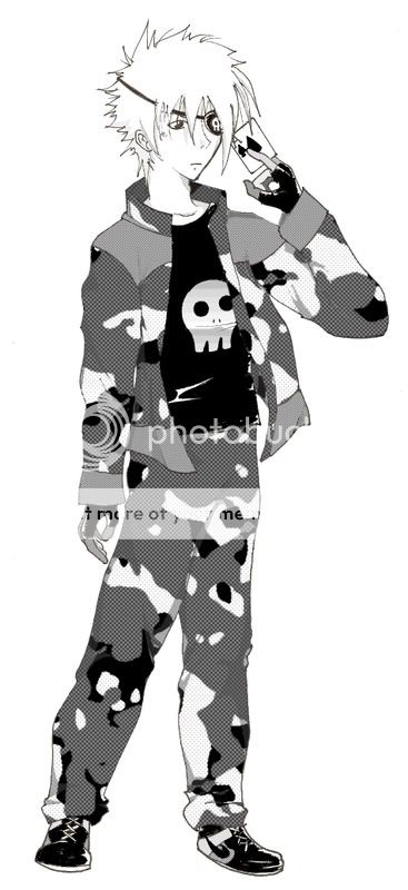
I would like some constructive critique on my newest drawing of one of my characters that I am planning on using in an upcoming manga.
His name is Ace and, even though he might look like one in this drawing, he's not a soldier... It's just his style.
This is the black & white version and I am thinking of making a colored version.
I made the screentones in photoshop.
Posted: Tue Jan 06, 2009 7:09 pm
Shocking...
Is this sized down? I like the use of tones, but it seems like if it is sized down, the shading on his hair and face disappeared. If this is it at full-size, then the hair and face could use more shading.
I really like the way this looks. I like the tones, shading, and how he has his right hand.
Well done. Clearly very planned out. However, I have a minor critique. He seems rather emotionless in this picture. If you make a picture to represent an important character, they should probably have some sign of emotion.
And as for the colored version, I'd say go for it.
Posted: Sat Feb 21, 2009 7:39 am
Thanks for all the comments guys!! ^^
Tenko: No, it isn't sized down so the tones are probably alittle too light.
Guitar, Shiny & Kiri: I often make hands and feet alitte too small but I am working on it >:3 I also make the legs too short pretty often but that's because I run out of paper ^^;
Winds: Ok, I try to give him some more emotions next time :3